Pedestrian Activation Buttons Almost Consistent
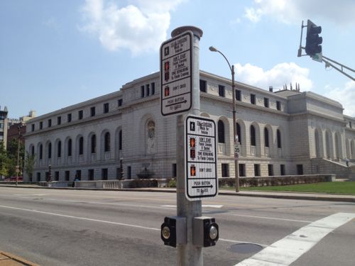
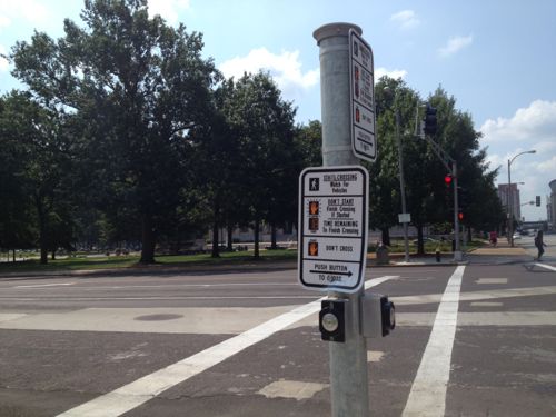
Most signalized intersections in St. Louis don’t require pedestrians to push buttons to get a “walk” sign, but this is changing as sidewalks & signals are updated. The biggest challenge is hunting for the right button to press. Take 14th & Olive, for example.


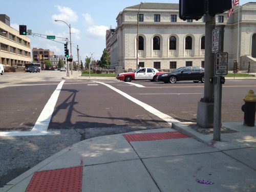
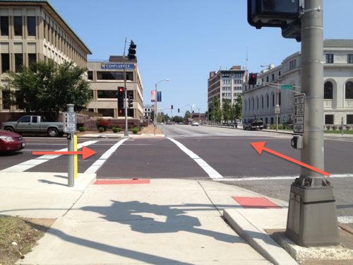
On the SW corner I’m not sure why both buttons aren’t on the same poll, with the top one for Olive, the one already controls the 14th signal. Typically when the buttons are separated from each other the one nearest a ramp controls that signal.
Every time I go through this intersection I forget and have to circle around to hit the right button. I’m not sure if this can easily be rectified, but I’ll find out.
— Steve Patterson
“Pole.”
Yeah, those arrows pointing in the designated direction are tricky to figure out.
It boils down to where buttons can be located (gotta be reachable from wheelchairs). In the last picture, one is on the big pole, one on a small, dedicated pole. In the other picture, the buttons share a small, dedicated pole. Between where underground utilities are located, where the big poles were originally placed and where ramps can be placed, the odds of consistency are pretty slim, especially if the goal is to minimize the number of discrete poles.
Once again you’ve rationalized, in your mind, why this is acceptable. Thankfully you don’t work for the city. It is being looked into already. This is new work that was completed within the last year, there’s no reason for it being this way. Having the button near the Olive ramp not control the Olive signal may be an ADA violation. Again, I’m glad the city employees I sent this to don’t rationalize things like you do.
Not “rationalizing why this acceptable”, just explaining why it likely happened.
There is no requirement (that I’m aware of) for consistency, although there may be some arguments for doing so. The biggest requirement is that they be reachable, which they are in all of the examples you presented. And in every example you presented as “consistent”, the only consistency is in which button is on top. In my mind, it would be more consistent if the button were always on the right side of the sidewalk, in the direction you’re headed, and not randomly on the right or left!
In a perfect world, there would either be push buttons on both sides of the sidewalk (for people with limited mobility on one side, typically from a stroke) or consistently on the right side for pedestrians approaching a crosswalk (which would require two separate poles). We don’t live in a perfect world, so we’re gonna get the cheapest solution that still complies with ADAAG / ANSI reach requirements.
So, because we don’t live in a “perfect world” we should stop demanding better and just assume that people are going to do things wrong and be happy about that?
No, we can “demand better”, but in doing so we’re going to see scarce resources being spent in fewer locations. In a perfect world, we’d be spending unlimited (or our limited) resources to retrofit wheelchair ramps at every intersection in the city. Instead, we’re spending money to install push buttons on a bunch of new poles at signalized intersections downtown, leaving many, many other intersections elsewhere in the city with no curb ramps, no signals and no push-button-activated pedestrian signals, at all! Now, Steve is expecting the city to spend even more money to redo some recently-completed work, just so he won’t have to figure out if a button is on the right side or the left side!
And while we’re at it, explain what somebody did wrong in any of the examples Steve provided. All of the new buttons are accessible, to both people with disabilities and to “normal” pedestrians. All of the new buttons have signs pointing in the direction they work. The ONLY thing “wrong” is where the button may be located in relation to the curb/ramp/intersection and/or in relation to the other button! Yes, you have to look for a button at each crosswalk. Are they hard to find? Hidden? No! So where is the “problem”?!
JZ…I totally agree with you on the first paragraph and the points you’ve raised. Even with Wumpus in that they should be automatic (don’t worry folks, the NSA cameras will soon take care of that). We do have limited resources and we should be using them to at least bring all intersections up to minimum first. Mediocre or not. For if we wait to plan out and set the gold standard, with how quickly technology changes, then that becomes the outdated standard before they are even implemented.
But unfortunately JZ, I have to disagree with part of your last statement. “Are they hard to find? Hidden? No!” Unfortunately for he sight-impaired, inconsistency can be a nightmare. Perhaps using wumpus’s idea, there could be motion sensors that make the buttons beep. But that will have to wait until the next generation of signals.
With scarce resources shouldn’t we expect the city and its private contractors to do the job right the first time?
the walk sign should be automatic, you shouldn’t have to press a button
Personally, I think the crosswalk signals should be built into the system as standard…no button-pushes.
It sets a consistent “standard of equality” for all parties…one that pedestrians can utilize and appreciate, and that drivers can recognize and accept.
In Boston, basically every intersection has push-button crosswalks, and it is appalling (not an overstatement) how little regard pedestrians give to them. People rush through ‘Don’t Walk’ signals or cross mid-block there more than in any place I’ve been — including St. Louis.
EDIT: I’d add that all crosswalks spanning more than six lanes (counting curb parking and medians) should be required to have countdown timers for their ‘Walk’ signals.
As far as I know there is only one place in the city where these buttons are actually hooked up which is at the Convention Center crossing Washington Avenue. When you press these buttons you actually get a response in a reasonable amount of time. I believe that all the others are there for show and have no effect on the timers.
You’re partly correct, rarely do the lights change so a pedestrian gets a walk sign. But unlike other intersections, at these pedestrians won’t get a walk sigh unless the button is pressed.
Oh, THAT’S what those buttons are for! Why in the world would the walk sign not come up automatically? Am I missing something or are these totally unnecessary?
if I come up to a cross walk and the light has turned green but I still get a don’t walk sign cause I wasn’t there in time to push a button I simple ignore the don’t walk sign. Works pretty well.
There COULD be a difference in traffic patterns based on whether you press the button. Like if you don’t push the button, it could be allowed for cars to make left turns through your crosswalk, otherwise no. So it would be less safe to cross without a walk signal. I don’t know if this is the case anywhere.
The worst pedestrian crossing button setup is at Broadway and Locust. The buttons there are definitely only for show. I’ve never timed the wait from but, anecdotally, the time from pressing the button to walk sign varies from instantaneous to 5 minutes plus. Couple this with routing the only accessible portion of the pedestrian crossing in front of a parking garage exit and you have a completely unacceptable pedestrian crossing.
when i was in chicago last month i realized that these buttons do not exist there (at least not in the neighborhoods we visited: pilsen, downtown, wicker park, belmont/clark, gold coast). it seems like Chicago has managed to appropriately time their intersections, and the pedestrians just learn to wait their turn (or jaywalk, which is quite common).