Home » Accessibility » Recent Articles:

Jefferson Commons: Very Good ADA Access With One Big Exception

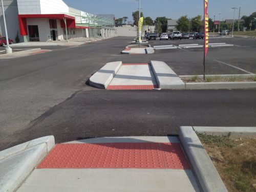
Jefferson Commons has done an amazing job retrofitting new tenant spaces into the old Foodland building on Jefferson (see Reurbanizing Jefferson & Lafayette Pt 2: Foodland). As I had hoped
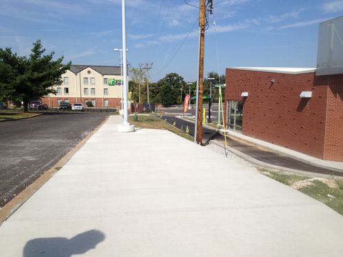
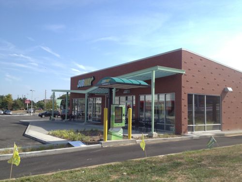
One of two newly created ADA access routes into Jefferson Commons, this is the south one.
From this access route you can see the newly constructed outlot building with two tenant spaces.
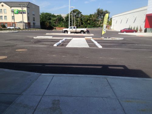
From this access route you can see the front of the newly constructed outlot building with two tenant spaces.
Turning to the north at the bottom of the route you can see pedestrian access was given considerable thought.
View from the new outlot building toward the ADA access route
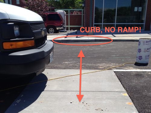
But approaching the building it was clear to me in May one detail was overlooked. Last month the problem remained.
But approaching the building it was clear to me during construction in May one detail was overlooked, but I wanted to wait to see just in case something was planned. Last month the problem remained.

UIC/Greenstreet Properties did a great job and, as required by the ADA, provided a non-drivewalk access route from each public transit stop. Shopping centers must do so, whereas stand-alone properties can provide access through a driveway. Yet an important detail for compliance was overlooked. It may have been shown on the drawings but overlooked during construction, or left off the drawings by mistake.

I’ve not seen any crossing paint here, drawing that in on construction plans can greatly reduce a design or construction error. I’ll be sending this to my contacts at the companies responsible and to city officials.

— Steve Patterson
 

Commercial Property Owners Need To Consider Accessibility When Making Alterations

Being an old city we have many old buildings that aren’t yet wheelchair accessible. When a business opens up they need to be aware of the ADA, especially when spending money remodeling.

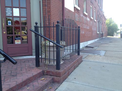
The building on the SW corner of Jefferson Ave & Winnebago St has had many establishments over the years, including quite a few since the 1990 passage of the ADA. Most changes over the years have been relatively minor. According to city records the previous owner owned the property from December 1977 to July 2007. In 2008 the current owner added a new patio out front, mostly in the public right-of-way. This was the perfect opportunity to make the first floor of this 1890 building wheelchair accessible.

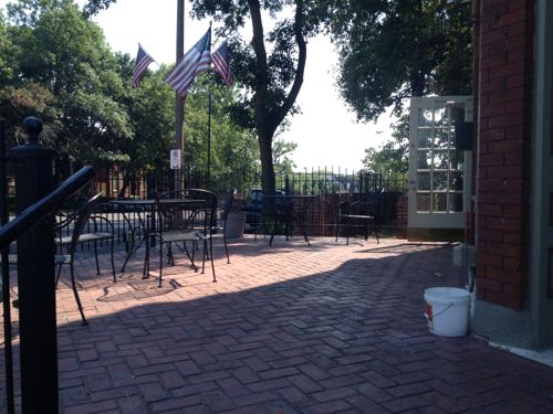
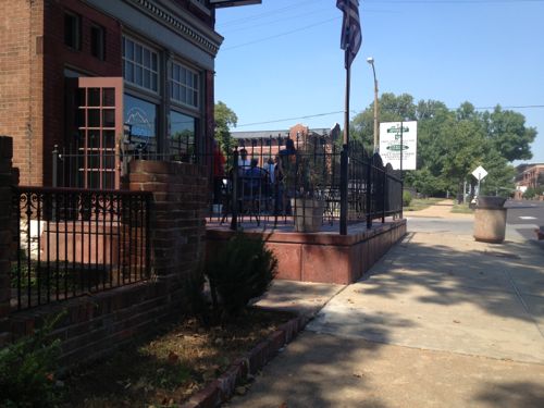
The 2008 patio at Jefferson Ave Bistro
Looks very nice!
Looks very nice!
But it has steps up from the sidewalk.
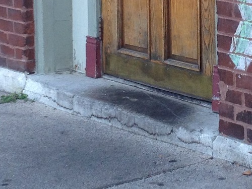
But it has steps up from the sidewalk, maybe the door on the side is the accessible entrance?
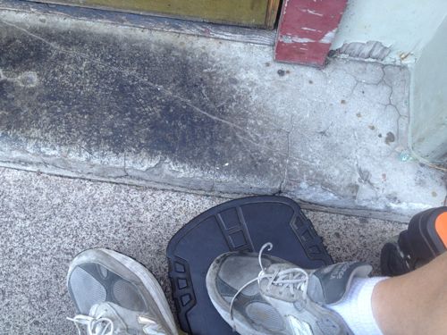
This door is unlocked and also used as an entrance, the step makes it impossible to enter
My footrest ran right into the step up
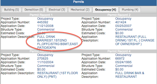
I didn't find a building permit for the patio online, perhaps it was built without prior approval. This occupancy permit mentions patio expansion
I didn’t find a building permit for the patio online, perhaps it was built without prior approval. This occupancy permit mentions patio expansion

When the patio was built the owner could’ve easily modified the sidewalk to provide access to the side door. It would’ve been a relatively minor add on to the patio project. To do it now will be far more costly.

— Steve Patterson


Independence & Pedestrian Access

September 19, 2013 Accessibility, Featured, Planning & Design, St. Louis County, Walkability Comments Off on Independence & Pedestrian Access

As a disabled person, my independence is very important. I assume no matter the disability. independence is important. Thus it isn’t a surprise to me to see it mentioned in mission a statement:

St. Louis Society for the Blind and Visually Impaired enhances independence, empowers individuals and enriches the lives of people who are blind or visually impaired and their families.

Yet their website illustrates auto-centric thinking, not independence:

The Society is located at the southeast corner of Brentwood Blvd. and Manchester Road. The corner of Brentwood and Manchester is approximately 2 miles south of the Galleria shopping mall. The Society’s facility is approximately 12 miles west of downtown St. Louis.

There are signs visible from all four directions at that corner indicating the “Society For The Blind Building”, with all addresses (8764 – 8798) of occupants of the building below the name. The Society’s entry is clearly marked above the main entrance.

There are reserved parking places in front of the main entrance, as well as handicapped parking next to the building.

Where’s the information from  public transit? I often encounter blind & visually impaired riders on transit.

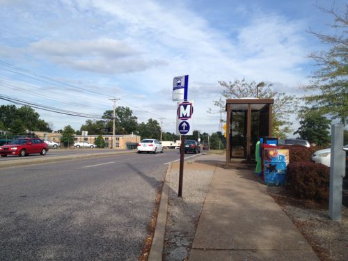
The eastbound #57 MetroBus stops directly in front of their building on the SE corner of Manchester & Brentwood

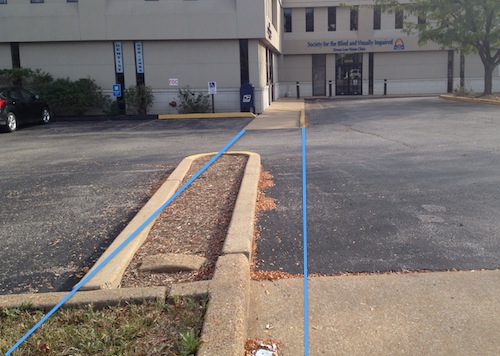
It would help their independence if the Society made a slight modification to provide an pedestrian access route separate from the auto driveway. It would be fairly straightforward:

Blue lines mark the ideal path an ADA access route would take

As you can see from the image above, building a pedestrian route would be a fairly simple proposition for them. I sent them a message a couple of days ago suggesting this. I’ll keep you posted if anything happens.

— Steve Patterson


Crossing Manchester Rd (MO 100) at McKnight

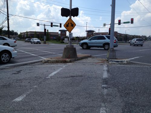
Recently I wanted to cross Manchester Rd, state highway 100, at McKnight. I quickly found out doing so is far from ideal in a wheelchair.  On the surface it looks good: crosswalks, pedestrian signals, etc.  Let me show you one glaring problem I discovered:

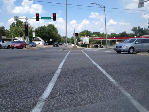
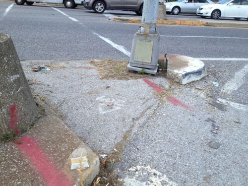
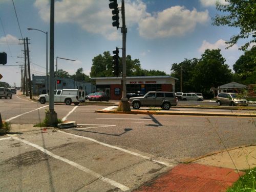
Looking north across Manchester at McKnight
Looking southwest from the NE corner of Manchester & McKnight
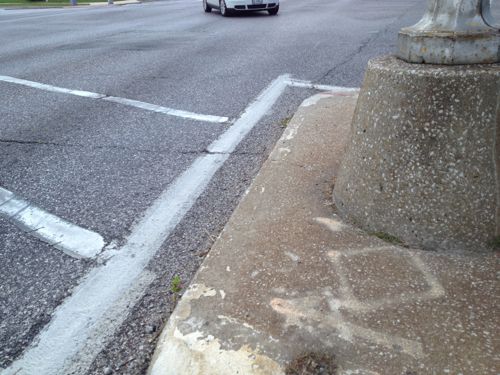
Close up of cut out for those crossing McKnight
Close up of cut out for those crossing McKnight. Attractive, huh?
But those trying to cross Manchester are out of luck

Over the last 20+ years three out of the four corners at this intersection have been redeveloped, and Rock Hill has been trying nearly as long on the fourth. Why is this still an issue? Who cut out part? How long ago?

2011
The cutout existed in 2011. I drove this day so I didn’t attempt to cross either McKnight or Manchester

Three possible culprits: Rock Hill, St. Louis County, or most likely, MoDOT. I suspect MoDOT because Manchester Road is Missouri State highway 100.  I hope to find out why this wasn’t addresses recently when a gas station replaced the stone Rock Hill church on this corner.

This is part of the problem with having too many entities: municipal, county, & state.

— Steve Patterson


Asphalt Accessibility

September 11, 2013 Accessibility, Featured 1 Comment

Recently I defended the city’s planned use of asphalt to bridge the gap between a sidewalk that sank next to a water main lid (see post).  One comment started an interesting side thread: “Then let’s do this at every intersection that lacks a curb ramp!”

So today I’m going to show you uses of asphalt that are both acceptable & unacceptable, and try to explain the difference.

Acceptable

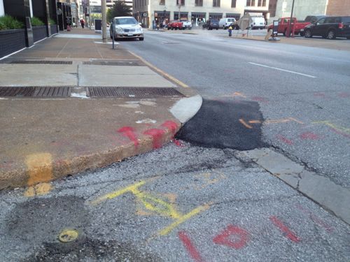
Asphalt was just added at 11th & St. Louis. This intersection has never been ADA compliant, still isn't.
Asphalt was just added at 11th & St. Louis. This intersection has never been ADA compliant, still isn’t.
Aspalt added to transition between two levels of the sidewalk

In both cases it looks like a half-ass fix, because they are. When you have very little money you must often make due. These weren’t ADA-compliant before and they still aren’t now. In both cases though, I can now get through where I couldn’t before.

Unacceptable

During the $70 million dollar library renovation I emailed this pic to director Waller McGuire, noting how high the ramp was above the street level.
Asphalt was the solution, but this isn't ADA-compliant. In such a major project I see no valid excuse. This was either poor planning or execution.
Asphalt was the solution, but this isn’t ADA-compliant. In such a major project I see no valid excuse. This was either poor planning or execution.

This case is like the step at Park Pacific across the street, a major project with new concrete that ended up non-compliant. Not only was this poured inches above the street level, it is pointing into the intersection. This corner should’ve had one directional ramp for 14th and another for Olive. The other ramps around the library have similar problems.

If I had to chose between non-ADA compliant where I had to pick another route or non-ADA compliant where I (and others) can still get through I’ll always pick the latter. Just as I’ll always expect new work to be done correctly.

— Steve Patterson


Advertisement


[custom-facebook-feed]

Archives

Categories

Advertisement


Subscribe