Home » Accessibility » Recent Articles:

St. Louis’ Office on the Disabled Reviewed Plans for Loughborough Commons

I hate admitting I am wrong, but when it happens I face the music and admit as much. All these past few months that I have been showing you the poor planning at Loughborough Commons I assumed nobody with the city reviewed the construction documents for ADA compliance. After all, ADA is federal civil rights law, not a local building code. But, a regular reader was kind enough to point me to St. Louis’ Office on the Disabled, part of the Department of Human Services.
The following are the list of duties for the Office on the Disabled, per their website:

  • Information and Direct Referral. Office on the Disabled provides current reliable information on services, programs, issues, etc. for persons with disabilities to callers or office visits or through the mail. Standards for accessible design are available to architects, engineers, design professionals, and the general public.
  • Interpreter for the Deaf. Office on the Disabled provides interpreting for the deaf services for all city services, programs, and activities.
  • Residential Disabled Parking Program. Office on the Disabled provides reserved residential parking spaces for city residents with disabilities. (Click here for more information)
  • Parking Meter Exemption Permits. Office on the Disabled issues permits exempting persons with disabilities unable to activate parking meters in the City of St. Louis.
  • Americans with Disabilities Act Coordinator. The Americans with Disabilities Act Coordinator provides information on the ADA; provides reasonable accommodations for applicants and employees; offers training on the ADA.
  • Awareness Training. Office on the Disabled offers training on issues related to disabilities.
  • Public Use of TDDs. Public use of TDDs is available to deaf persons needing to make phone calls.
  • On Site Accessibility Consultation. Office on the Disabled provides advice and recommendations on facility accessibility for persons with disabilities.

I spoke earlier today with Dr. Deborah Dee who heads the Office on the Disabled. Dee indicated Loughborough Commons was reviewed by her office and that all projects are reviewed as part of the city’s “one stop shop for permits.” To what extent does this absolve the developer, architect, engineer and Alderman for the numerous problems at this still unfinished $40 milllion dollar project? Without a doubt it certainly changes the picture and calls into question the permit review process within city hall.


Loughborough Commons is Not Finished Yet

When I started writing about the failures of Loughborough Commons a few months ago I was reminded by Ald. Matt Villa (D-11th) that it is not finished yet. He is correct, work is still progressing even though the two main stores, Schnucks & Lowes, are open.

In addition to a number of possible out buildings and the need to finish an ADA accessible route to a public street it seems Desco is working to correct some of the poor planning on areas that were already finished. Yes, the not finished yet $40 million project is already getting fixes.

IMG_7827

Above you can see a new black metal fence installed recently which blocks now former accessible parking spaces near the entrance. A similar parking arrangement on the other side of the entry remains.

IMG_7823

From this angle you can see how the angle of the main entrance would make it a challenge to see oncoming cars if you were backing out of one of these spaces. Accessible spaces, such as these near an entrance, are ideal for many so they do not need to cross a main drive. Still, these must be designed and placed in such a manner that someone using them is able to easily navigate in and out of them. This is also an example of where the minimum sidewalk width required by law is just that, mimimum.

IMG_5279.jpg

Before the change you can see how tight the space was. When extra shopping carts were stored in the area it completely blocked the sole planned walking route from Loughborough. Civil engineers are a critical part of any design team, they are necessary for a number of areas including water runoff concerns, accessing soil conditions, engineering curbs and other details on a given site. They are not, however, natural specialists in creating walkable & ADA accessible environments. Projects of this scale, especially those with over $14 million in public tax incentives, should have a consultant on board to ensure more than simple textbook minimum compliance. At this point I still question if they will be able to establish minimum compliance with respect to an accessible route.

IMG_5283.jpg

Above is an earlier image between the Schnucks and the Lowe’s, but as of 1/1/07 nothing has changed here. Pedestrians, including those using walkers, mobility scooters or wheelchairs are directed into the pharmacy drive-thru exit! At this point these pedestrians have only a couple of choices, those who can will simply walk through the plantings/grass and those who cannot must either turn left and exit the drive-thru lane with the cars out into the main drive for the development or turn right and go head-on with the cars in the pharmacy lane for about 5ft (just outside of view in this image) until they get to what appears to be a drainage area which provides a break in the planter. In this direction someone will have to hope the cars leaving the pharmacy drive-thru lane see them. This second route would allow pedestrians to go down that direction but the slope is too steep for a return back to the Schnucks and out to Loughborough. And forget wheelchairs for a minute, what about young families pushing a stroller! We do want young families with kids in the area, right?

What is more amazing than having such major projects built without a planning/access specialist on the design team is the idea that we leave it up to our elected aldermen to ensure the public’s interests are being considered. With our 28 mini-cities with a city mentality we get varying results from ward to ward. Some aldermen seem to know their limitations and consult the city’s Planning & Urban Design Agency. Others, like Lyda Krewson, have ideal developers like Joe Edwards so these issues are rare. But folks like Ald. Matt Villa, who assured me before construction started that pedestrians would be considered, are clearly incapable of distinquishing between token gestures toward access and good community design. Yes, he is certainly a “nice guy” but that only goes so far — not even remotely close in the case of Loughborough Commons. And just think, Loughborough Commons is not even finished.


ADA for Accessible Streets, Day 1

Today I attended a seminar on new guidelines regarding accessible streets — making sure all citizens can use the public space. We focused today on the physical sidewalk design, ramps and crossings. Tomorrow we will be looking at signals.

I want to thank Mayor Slay, Board of Public Service President Marjorie Melton, the Starkloff Disability Institute, and the Pyramid Companies
for putting together this excellent seminar. No, seriously. The speakers have been top notch and this has shown me that I need to know a lot more about this subject and I know all the engineers in the room certainly need to know more. This clearly demonstrates to me the City saw a lack of knowledge in a critical area and decided to take a very pro-active step to help raise the bar. Very commendable.

In a funny way, however, for the small sum of $100 they are helping me better understand new regulations relative to accessibilty in the public-right-of-way which I will turn around and use to be critcal of future projects. But maybe, just maybe, this will be good. They will have a better understanding of the new rules and knowing that I will be out there with my camera (and soon a new digital level) they will hopefully take the time to get it right.

Granted, they have projects already in the works at this point so I know something started next week will have been designed and contracted a number of months back. But future projects such as MLK streetscape and the Euclid streetscape will need to comply, no doubt!

I realize now I had only a very basic understanding of a portion of accessibility issues. We learned about differences between manual and powered wheelchairs, persons who walk with a cane or walker, people with various types of visual disabilities. In the afternoon we broke up into teams and went out around the hotel (downtown Hilton) looking at intersection design. Reports were mixed on both older sidewalk areas and new areas such as my team’s corner at Busch Stadium. Even at Busch some slopes were beyond the limits and details were off, but nothing major. The encouraging thing was seeing the engineers from HOK and the City talking with expert Bill Hecker (shown below with level).

accessibility - 02.jpg

The agency responsible for setting standards for accessibility is the U.S. Access Board. It should be noted that after the Americans with Disabilities Act was passed in 1990 they followed closely with standards for a number of areas including public buildings. Their guidelines help architects the exact specifications on things such as bathroom design, hallways and all manner of details in building open to the public such as restaurants, office buildings or civic structures. They’ve also had rules governing site design so you get things such as accessible parking spaces and connections on private developments. Yet, they are just now establishing guidelines for the public-right-of-way.

Yet another federal law requires that when local governments are repaving roads, they must make the sidewalks accessible. They’ve been using earlier guides for this purpose. Most likely your nearby corner has a ramp from the sidewalk to the street-level at the intersection. If not, don’t be surprised if your street doesn’t get repaved anytime soon. Most of the ramps that St. Louis has installed over the last 10 years don’t meet the new guidelines.

I took a break from writing this post, I just had to visit a couple of places (Southtowne Center & Loughborough Commons) to see if the intersections were as bad as I remembered. Yes, yes they are. But on the way I passed by some work being done at Gravois & Gustine. I’ve hesitated taking pictures of this yet because it is not done and didn’t want people going all ‘Matt Villa’ on me.

accessibility - 07.jpg

The cover in the PAR (Pedestrian Accessible Route) is not bad if done right. However, what you cannot see from this angle is how the concrete tapers off in a couple of directions, something we learned today could cause great instability on a wheelchair or someone using a cane/walker. From a lower angle you can get a better idea of what went wrong with this nearly finished project involving new signals and access ramps:

accessibility - 09.jpg

I fully anticipate that there will be mistakes, as we see above. It will be up to those designing the intersection to make sure the expectation is clear and the person inspecting the work must understand what is necessary. There will be times where the letter of the law cannot be met, where it is infeasible. At these times they need to show they considered alternatives and they did the best they could considering the circumstances. So while I do intend to buy a digital level I know it won’t all be perfect. I’ll be looking for more obvious mistakes, ones that some good ole common sense could have prevented. A really good example of that is just down the street at Gravois & Meramec:

accessibility - 04.jpg

Here we see brand new accessible ramps for crossing both streets and a brand new signal pole blocking a new sidewalk section. Can someone please tell me the logic behind adding accessible ramps only to block the sidewalk with the traffic signal? This is a good example of where someone along the process should have said, “Uh wait a minute guys, this doesn’t look right.” And the best time for that (read: cheaper) is while the project is still on paper, not set literally in concrete!

This project is either the responsibility of MoDot or the St. Louis Board of Public Service, I’m going to ask tomorrow. MoDot, you will recall from a post earlier in the week, just ripped out 300 ramps along Lindbergh because they were not constructed at the proper angle. Moving a newly installed traffic signal is not so easy. If anything is clear to me it is this workshop on accessibility did not come soon enough, I’m glad it is here now.

Helpful Resources:

Update 12/15/2006 at 6:00am:

Last night I forgot to quote some of the text from the invitation about this event. I posted it back on November 17th but I think it is worth repeating:

“Compliance is no longer a guessing game. There is a right way, a wrong way and a best way. Architects, engineers, other designers, developers, builders, contractors, and city inspectors and officials now have a chance to make our community a model. This seminar will provide an opportunity to learn about the new guidelines — from experts in the accessibility field who helped develop the guidelines, and by experiencing what happens when accessibility is not addressed.”

The bold emphasis is theirs, not mine. However, it does appear many have simply been guessing (and poorly). It was repeated a number of times at the event and deserves notation here — the standards set by the government are the minimum for compliance. Minimum. Not ideal, not best practices, and certainly not a world leader for modeling accessibilit. I think we need to work on getting to minimum compliance!

Update 12/15/2006 at 9:00am:

The intersection work being done along Gravois is the handy work of MoDot — the folks about to spend $500 million on highway forty.  Let’s hope it is better planned than these sidewalks.


I’m not picking on Brentwood. Really, I’m not.

November 10, 2004 Accessibility, Planning & Design, Plazas, St. Louis County, Suburban Sprawl Comments Off on I’m not picking on Brentwood. Really, I’m not.

This past Saturday (November 6th) I wrote about my dismay with the lack of pedestrian connection between Brentwood Promenade (Target/Trader Joe’s) and Brentwood Square (Whole Foods, REI, etc…). Less than a week later I look a bit closer at one part of Brentwood Square – the Bread Company.

In the interest of full disclosure I am a small shareholder of Panera (PNRA), the owner of the St. Louis Bread Co restaurants. OK, I’ve gotten that out of the way now I can bash the lack of connection to the surrounding neighborhoods.

For the record, Pace Properties is the developer/owner of Brentwood Square. Pace’s web site says, “The central location of Brentwood Square gives retailers an opportunity to access this highly desirable trade area – an area with density and wealth that is unmatched in the St. Louis market.” Density? Uh, OK. Compared to St. Peters maybe?!?

As a strip mall goes I actually like the building design of Brentwood Square. In a future blog entry I will go into more detail but I basically like the fact each store has a distinct look and size. Some stores are two stories tall while others are one story. This is closer to what a traditional main street would have looked like. But my like for the project stops there.

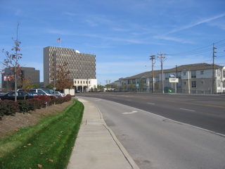
This entry focuses solely on pedestrian access from Brentwood to the Breadco. The picture below is looking North on Brentwood Blvd near the Breadco. In the background you can see two office buildings and new high-end apartments/condos. The question is how do you get from there to the restaurant for your pick two at lunch?

The closest pedestrian crossing for the above offices and apartments/condos is the main entrance two Brentwood Square. Granted you are crossing roughly 6 wide lanes of traffic which isn’t exactly conducive to walking. Let’s assume you don’t want to get your car out of the parking garage to drive across the street you decide to venture across Brentwood.

So you start walking down the sidewalk adjacent to Brentwood right? Maybe not. The sidewalk is not wide enough for you to walk side by side with your coworker. You are also next to traffic going at very high speeds so you don’t exactly feel safe. Walking on a good urban sidewalk you’ve got a row of street trees and a row of parked cars to separate you from the traffic. Not here. You are only a few feet away from a two ton SUV going 40mph.

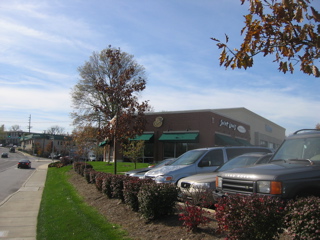
But for sake of argument let’s say you take the risks and walk on the sidewalk along Brentwood. The picture below shows that you’ve got the Breadco in sight and you can taste that yummy soup and half sandwich (remember, I’m a share holder. Forget all about that low carb diet and go to Breadco).

But wait, how do I as a pedestrian get from the sidewalk to the front door of Breadco? The front door is on the right side of the building hidden from view by the silver minivan. The Kinko’s location is the buff brick building behind the Breadco in the background.

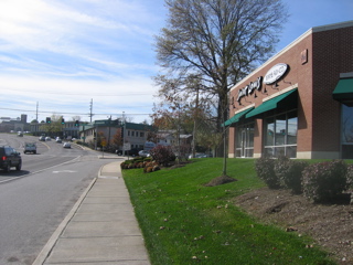
You keep walking because you can’t image the developer &/or city has all this public sidewalk and no way to get to the private area without walking over lawn and shrubs. You keep walking following the sidewalk. Oh look, there is the back of the Kinko’s store. You keep walking and eventually you’ve walked all the way around the Kinko’s store. So, the front door you could see from the public sidewalk is only accessible via sidewalk by going all the way around both buildings. Most folks would just walk through the grass and not think anything of it. But why? Is it too much to ask to be able to walk on a sidewalk to a restaurant?

If you look at the picture below you can see how close the public sidewalk is to the private developer sidewalk leading to the massive parking lot from the Breadco/Kindo’s. Yet the thought of connecting the two is a foreign concept.

Public sidewalks in the suburbs are something that is there to make the suburbanites feel like they live in a walkable city. They don’t. Stop fooling yourselves folks!

Below is a picture taken in front of the Breadco facing North toward the remainder of Brentwood Square. The Viking store is the closet store to the Breadco across the parking lot. BTW, I love the Viking Store!!!

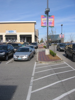
Ok, so the picture above is a pedestrian crossing connecting the Breadco to the stores to the North. I spent a half hour from noon to 12:30pm on Tuesday 11/9 observing people coming and going. I was pleasantly surprised to see many pedestrians coming from the North. But they were in suits so I doubt they had driving to the area to shop at REI. No, these were folks working in the office building in the background of the above picture and the two across the street in the first picture. The folks across the street realized when the get to this side of Brentwood they need to walk toward the REI store and then come South to the Breadco. That route keeps them on a sidewalk and not running circles around the Kinko’s.

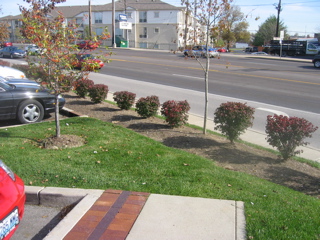
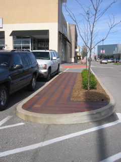
Isn’t is great that a connection is made between the two sections of Brentwood Square and that so many people are walking from one area to another? Yes! But look closer at the picture below:

The architects and developer didn’t plan such a connection. When Brentwood Square opened a couple of years ago the brick pavers you see in these planted islands did not exist. The stripes on the asphalt were not there. People were naturally walking from point A to point B because driving from your office to the Breadco that you could see from your desk would be just silly. People did the natural thing and walked.

The sad part is the designers & developers in their original design failed to anticipate such a need. What is basic human nature was an afterthought. The other areas where pedestrian access was anticipated have curb ramps for wheelchair access as required by the ADA (Americans with Disabilities Act). But not here as this wasn’t anticipated as a pedestrian crossing. Basically the grass in the two islands between Breadco and Viking was getting trampled by the pedestrians that didn’t want to get his by cars in the adjacent drive so the developer solved the “problem” by adding the pavers.

I long for a day when suburban developers, architects, traffic engineers, city officials and the commercial tenants all think about how the neighbors access a development as a pedestrian. Is that asking too much?

Steve


Advertisement


[custom-facebook-feed]

Archives

Categories

Advertisement


Subscribe