Kirkwood Station Plaza, another great idea with questionable execution
Nearing completion is Kirkwood Station Plaza in the affluent St. Louis suburb of Kirkwood. The site was, for several decades, a huge parking lot and a Target store. Prior to the Target store it was the site of a historic hotel. Some in Kirkwood opposed the project because they thought it was too dense. I personally think the density is appropriate for the location. Like many projects this one had the right concept but falls short in the details.
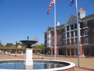
A plaza complete with patriotic flags, detailed paving and even a fountain does a nice job of welcoming the public to the project. The main building in the first photo is a bit too retro-colonial for my taste but this is the suburbs where originality is not considered a virtue. From an urban perspective it does a pretty good job. However, the ground floor is store fronts and from the sidewalk along the main road you really wouldn’t know it. The entire plaza has something like four trees. The only real shade is provided by the pavilion seen in the background – a mockery of the stunning Kirkwood train station across the street.
MLP had this to say about the project, “Designed with a pedestrian-friendly emphasis, a highlight of Station Plaza will be the European-Inspired plaza and fountain that will provide a community gathering point, directly across from City Hall.” Source.
In good urban fashion the developer, MLP Investments, has re-cut Madison street through the site and reconnected the project with the surrounding charming downtown area known as Kirkwood Junction.
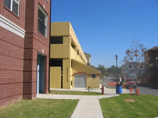
But take a closer look at the photo below. As you walk along the sidewalk heading toward other housing down the street you see this big yellow box forcing the sidewalk to jog out of the way.
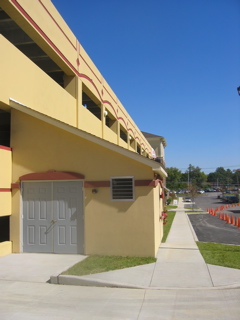
As you get closer (below) you see this mechanical box jutting out from a parking garage covered in the same yellow fake stucco. This is the main connector street from the housing to the East to the Plaza and main downtown district to the West.
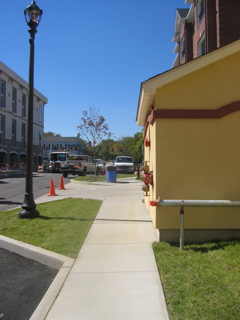
Below is the view heading West from the apartments on the East end of the project.
Aside from being really ugly, the structure is an assault to a pedestrian. This dramatically reduces the pleasantness of strolling from your new condo to one of the new shops or restaurants along Kirkwood road. So much for being “pedestrian-friendly!”
Additional mistakes abound. First, the sidewalks are not given any street trees to shade the pedestrian. Street trees also would have visually separated the pedestrian from parked cars. The sidewalk width is designed not for any real use but to give the illusion of being pedestrian friendly. Try to walk side by side past that ugly mechanical structure. The original site plan did not have these issues, click here to see the site plan.
Once the project is complete and businesses have moved into the retail/restaurant spaces I’ll take another look at the project and how it relates to the rest of downtown Kirkwood.


