New Target Store Not As Urban As It Could Be

No doubt about it, the new Target store currently under construction is far more urban than the store it is replacing. With the bulk of the parking under the new building and a front facade closer to Hampton Avenue this is the most urban big box we will have in the City of St. Louis.
The problem is I’ve seen a far more urban target in a less urban context. A few years ago, on a visit to Seattle, I visited their newest Target store. We were in North Seattle – pretty suburban and no different than most suburban areas. Seattle’s NorthGate mall was across the street. Both the mall and Target are visible from the always congested I-5 highway.
(Note: photo by Target – my helicopter is in the shop)
I asked a friend, Seattle Architect Richard Kenney, to take pictures of the Target for me.
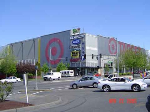
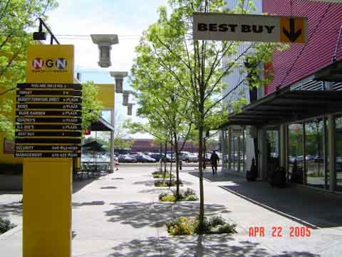
The NorthGate Target store is on the top two levels of the four story structure. You can enter/exit the Target from either floor and it contains internal escalators like you would expect in any department store. A Best Buy and other national chains are part of the building. Yes, this is not the most attractive structure in the world. But, compared to the typical mall across the street it is a major improvement.
Basically the building is divided into two sections – the Western section is the retail portion while the Eastern section is a parking garage. A plaza is in the middle.
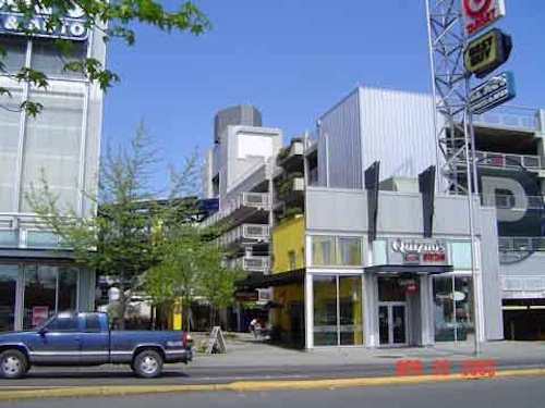
Looking into the plaza you can see the retail section on the left and the garage on the right. Smaller retail spaces front the main street and the plaza space.
The Quizno’s at right makes the corner of the parking garage more friendly (and toasty…).
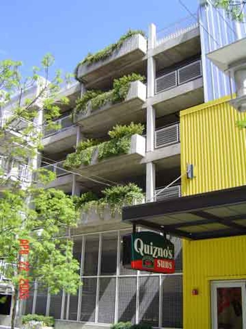 A closer look in the plaza you can see how plantings have been incorporated into the design to soften the concrete and steel. On my one visit to the building we parked on the top level of the parking garage. Some surface parking is also located behind the building.
As you can see, nobody is going to mistake this for a great street. Still, as big box developments go I will take this over sprawling parking lots and horizontal buildings any day.
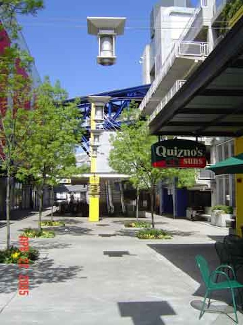 Another view looking into the plaza area.
 Looking from the plaza out toward the main street, with the typical suburban mall across the street.
When land is scarce and valued, developers and retailers will build more urban out of necessity. I’m not foolish enough to think that urbanity is their motivation. No, they are motivated by the all mighty dollar. In this case the result was far better than the sprawl surrounding it.
Better big box projects are possible. We just have to find ways to more sure they work for the developers and retailers as well as the general public.
– Steve
I hit this mall when I was out in Seattle, and it was most surprising, especially how much retail they fit into a relatively small footprint. And the plaza between the parking garage and the retail section actually made it feel as if you were shopping street level retail. One other notable item about the scale – it seems that they went for narrower frontage, and a deeper store, which strangely made the shopping less overwhelming. Your field of vision isn’t overwhelmed by the width of the store, and there is something inviting about entering the narrower confines of what must, on some subconcious level, feel like a bazaar.
Don’t know if anyone knows the psychology of shopping, but for me, the deeper the store, the more I feel enticed to go all the way to the back, especially to see if they have any open box bargains on the end caps that they don’t want you to see when you first enter.
I’m a St. Louisan living in Seattle. When I first came here I was amazed that many of the stores in the more urban part of Seattle are like this one. Parking in a garage, smaller footprint for retail, theaters, etc. Both of the movie theaters that we go to on a regular basis are on the top stories of multi-floor malls downtown.
When I go to Target, I go to the Northgate Target shown above. As different as it is outside, the inside is exactly the same as any Target, anywhere. I expected a high tech looking interior to go with the exterior. Nope, same old Target. The best feature of the Northgate Target is the escalators. They have cart escalators. You wheel your cart through a gate and it has it’s own contraption that keeps the cart level as it rides down. Then you get on the ‘people’ escalator and pick up your cart at the end. Simple but entertaining. I took my Mom there just to check it out and she got a big kick out of it too!
I used to shop at the old Target store quite a bit. I have always found Target to be by far the least offensive of the big box stores. So I am very interested to see how this project turns out.
Hopefully if it is successful it will promote similar projects in other parts of town.
I really like the “bazaar” feel that mall in Seattle used. Wouldn’t it be nice if St. Louis Centre had been designed in a similar way?
I can’t help but wonder if similarly small-footprint retail bazaar would work on the South Side of the city – say a bit southwest of the new stadium. Or better yet, as a replacement for the “Ballpark Village”.
Steve-
You’re kidding, right? Are you sure the residents of the 16th ward want to see their neighborhood developed in a more “urban” scale?
[5/2 – Kidding? Hardly. I’m not suggesting our new Target should have been part of a 4-story building. Just more urban than it is. Mixed with other stores and accessible by foot. I think the neighbors would have been open to that. – Steve]
When we pushed to have a more urban design at Kingshighway and Chippewa, the two most common objections were that 1) the area is not urban, it’s suburban (read auto-oriented), and 2) we were trying to “yuppify” the area.
[5/2 – that was because the main message received by most folks was that you didn’t want K-Mart. – Steve]
I raise this point to bring attention to the idea that urban design, historic preservation, and the many related topics differ widely from neighborhood to neighborhood across the city.
[The entire city is urban. Granted, some parts are more dense than others but for the most part we have walkable neighborhoods. The urban commercial development in a neighborhood should recognize the fact it is not downtown but it should still offer diversity of uses and a pedestrian-friendly scale. – Steve]
Recall the debate over whether the Virginia Mansion was “historic”.
A similar conversation took place re. the art deco apartments that were demolished to make way for the Walgreen’s at Hampton and Chippewa. Many questioned the historic value of the apartments. “They’re just old buildings” was a frequently heard remark.
[5/2 – I am not so concerned about what is historic and what adds to the urban fabric. Most of our old buildings are not historic but they are major contributors to the overall streescape and character of the city. – Steve]
Should the Southampton or St. Louis Hills neighborhoods be nominated for listing on the National Register of Historic places?
[5/2 – Nope! Should the new commercial developments be accesible by foot from those neighborhoods? YES! – Steve]
Personally, I think that would be a great idea. Would most neighborhood residents agree? I think you’d see a lot of opposition, mostly out of misplaced fear that once listed, any modifications to an existing structure would require historic district design approval. Not true.
RB
I have to agree with Rick, at least in that this isn’t a particularly ‘urban’ area to begin with.
Rather, it’s a suburb built before ‘suburban’ came to be synonymous with ‘single-use zoning horror ghetto’. What’s more, it’s a suburb that, by and large, works. If more of the commercial space nearby offered things people need on a daily basis instead of tires, plumbing supplies, etc., it would work even better.
[5/2 – that is part of my point. If this site were developed more urban you’d have a diversity of uses that could serve daily needs. The adjacent streets are very urban compared to today’s subdivisions. They are connected to the commercial streets. Hampton once served local residents. It can again. – Steve]
What I’m mainly interested in is whether the new building will present a blank wall to Clifton Avenue as the old one did. I’m not hopeful.
At the bottom of this page are a few pictures I took just a few blocks west (south? down Chippewa at any rate) because I always use the area as a my example of a functional suburb that’s not weighed down with all sorts of explicit urbanist philosophy.
One interesting aspect at Northgate North in Seattle is Target’s signage. The name and logo are painted on perforated metal panels, mounted with an air gap behind. The name and logo are HUGE, and the color is bright red, yet by applying the signage to perforated metal, it gives it a much more subdued, screened quality. This must have been why they were allowed to do it, because Seattle’s sign ordinances would never allow commercial signage that large without some sort of mitigation. It also adds to the industrial aesethetic of the project.
Tino-
“use as my example of a functional suburb that’s not weighed down with all sorts of explicit urbanist philosophy”
Can you elaborate on what you mean?
“What I’m mainly interested in is whether the new building will present a blank wall to Clifton Avenue as the old one did. I’m not hopeful.”
I drive by this facade nearly every day, just to see how fast the building is going up.
It appears there will be vent openings in the Clifton wall about every ten feet, but other than that, that’s about it.
RB
[5/2 – Again, a blank wall faces residents. Had this been more urban we might have seen some shops at least at the corners and perhaps some sort of pedestrian access through the middle of the site. – Steve]
yep, just windows along the garage. It will be about 10 feet off the street with landscaping, so it chould be softer.
Steve, you say that it should not necesarilly have been part of a four story building. I actually think that would have been a good idea. Target could have been on the floor, with office space, etc. on top.
BTW, the last few wall pannels are being set today 5/2, and brick work is getting ready to start. I want to see a wall with brick to really get a sense of how it will look.
Would you want a dying white elephant to lay down on your most prime development site?
http://www.freep.com/money/business/kmart2_20020702.htm
There’s a long history to the redevelopment at Southtown. Opposing Kmart was a big part of the effort at Southtown Coalition, but that came very late in the process. Before Kmart’s name was ever mentioned, the neighborhoods lived for years an ugly, scorched earth vacant lot at the corner of Kingshighway and Chippewa.
The Southtown Coalition raised the issues of bringing an urban scaled design and quality stores to the site. Instead, they were offered a bottom of the barrel, worst in its category, Kmart.
Had the Southtown Famous never been demolished in favor of a variety of stores that were ultimately never built (Venture, HQ, Kmart), things might have been a lot different.
RB