Making A Setback Less Objectionable
In urbanized areas I like buildings to “hug” the public sidewalk, with active facades. Â By active I mean numerous doors & windows, like you’d get with storefronts. Â But not every area can support that many storefront spaces. Â In the past buildings were often set back behind large blank plazas or surface parking.
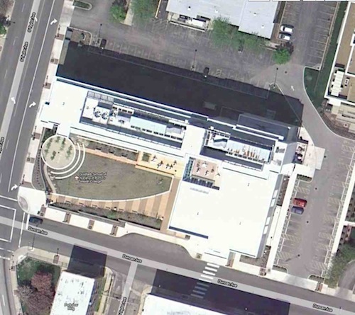
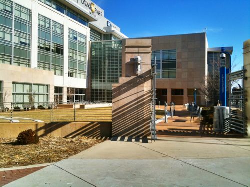
The Goldfarb School of Nursing at Barnes-Jewish College is an example of new thinking about how to build in an urban context where storefront spaces just don’t work and where some public outdoor space may be desirable.  Just a block from the busiest MetroLink station in our system, pedestrians are a sure thing.

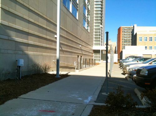
The building is open at the corner of Taylor & Duncan but it does extend to both sidewalks away from the corner. Â Parking is placed on the back sides, not between the building & sidewalk.


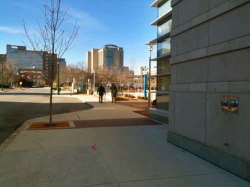
Pedestrians approaching this building have several options on where to enter. None require the pedestrian to walk in a driveway designed for automobiles.
To recap how to make a setback less objectionable:
- Extend part of the building to each public sidewalk
- Extend building line with a low fence
- Do not place parking or driveways between the public sidewalk and building
- Provide multiple routes for pedestrians to enter the building
– Steve Patterson
I really like that parking is placed behind the building here. Even as a kid, I never understood the large urban strip malls set far back from the street with oceans of asphalt in front. This, plus the credible pedestrian walks and layout make this an attractive and intelligent and practical urban development IMO.
Steve: I thought you didn't like blank walls!
As a general rule I don't like blank walls. In this case the wall is not long and it is adjacent to a glass area.