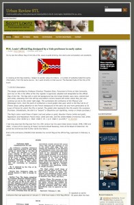
Urban Review STL’s New Look

Usually on Wednesdays I share the results of the readers’ poll from the prior week, but I had no poll last week as I was changing the look of the blog. The prior theme, the 3rd I’d used since starting the blog on Halloween 2004, had been in use since January 2006.
So much has changed since January 2006, integrating social networking sites like Facebook & Twitter are now a must. Â I did my best with the old theme but it was written many years ago and could no longer be patched. Â It was time for change.
I know basics of WordPress but for the job of updating the blog I hired Justin Chick to do the heavy lifting. We aren’t finished but at this point we are just tweaking the settings.
I started over on links, weeding out old links and adding new ones. Â Hopefully they are better organized too. Â Those listed under “research” are very helpful sites. I’ll be adding more links, especially in organizations and places.
This week ads returned – a horizontal banner (728×90) at the top and a rectangle (300×250) in the sidebar. As before, non-profits should email me about free ad space to promote your organization. For businesses, the rates are very reasonable ($10 CPM). Â $150 buys 15,000 ads which is 41 ads per day, every day, for a year. Not getting rich, just trying to cover my costs.
Your support is appreciated, thanks for reading!
– Steve Patterson
On the positive side, it does look nicer. On the negative side, it takes longer to load. You may think that “integrating social networking sites like Facebook & Twitter are now a must”, I sure don’t. I come here for the words first, the responses second and the pictures third. I don’t need or want tweets or most videos and I sure don’t want any automatic links to other sites like Facebook. I may be a Luddite, but I like my world compartmentalized, not all mashed together. And before you get any more crazy ideas, there’s now something out there called “meebo” that has ruined more than a few newspaper sites in other cities.
I understand the need for advertising, what frustrates me is the apparent need by computer wonks to push as much data through, much of it irrelevent or way out on the periphery, just because they can. A classic case happened on the NextStopSTL website, when they linked a pdf of the entire system map to a post, and changed a 1-2 second load time to what felt like 30 seconds. Not all of us are willing to invest in the latest and greatest equipment, nor are we willing to pay for the highest download speeds that Charter or AT&T offer. If it worked fine in 2006, it should still work fine today – if it ain’t broke, don’t fix it!
On the positive side, it does look nicer. On the negative side, it takes longer to load. You may think that “integrating social networking sites like Facebook & Twitter are now a must”, I sure don’t. I come here for the words first, the responses second and the pictures third. I don’t need or want tweets or most videos and I sure don’t want any automatic links to other sites like Facebook. I may be a Luddite, but I like my world compartmentalized, not all mashed together. And before you get any more crazy ideas, there’s now something out there called “meebo” that has ruined more than a few newspaper sites in other cities.
I understand the need for advertising, what frustrates me is the apparent need by computer wonks to push as much data through, much of it irrelevent or way out on the periphery, just because they can. A classic case happened on the NextStopSTL website, when they linked a pdf of the entire system map to a post, and changed a 1-2 second load time to what felt like 30 seconds. Not all of us are willing to invest in the latest and greatest equipment, nor are we willing to pay for the highest download speeds that Charter or AT&T offer. If it worked fine in 2006, it should still work fine today – if it ain’t broke, don’t fix it!
As always, I appreciate your feedback. The old site was broke, patched together too many times. I must appeal to a broad audience and many like to share articles via Twitter & Facebook. Not giving them the tools to do so would be foolish on my part. Also, anyone using Internet Explorer is advised to get a more modern browser like Firefox.
As always, I appreciate your feedback. The old site was broke, patched together too many times. I must appeal to a broad audience and many like to share articles via Twitter & Facebook. Not giving them the tools to do so would be foolish on my part.
Using Chrome, new computer and a 10mbps connection….the new site loads noticeably slower, annoyingly slower at times.  That said I like the redesign.  I can echo JZ71’s comments on my disdain for social media and the growing obsession with accommodating it but understand the need for it’s integration here.  Keep up the good work.
Using Chrome, new computer and a 10mbps connection….the new site loads noticeably slower, annoyingly slower at times. That said I like the redesign. I can echo JZ71’s comments on my disdain for social media and the growing obsession with accommodating it but understand the need for it’s integration here. Keep up the good work.
Thanks. I’ve noticed some issues on the back end so we need to see if some plugins are conflicting with each other.
I just made a tweak which may improve performance.
Thanks. I’ve noticed some issues on the back end so we need to see if some plugins are conflicting with each other.
I just made a tweak which may improve performance.