McKinley Heights Code Made New Family Dollar Better Than Their Boilerplate, Still Has Room For Improvement
In case you haven’t noticed, Family Dollar stores are popping up all over St. Louis. From November 2012:
Family Dollar Stores Inc. will expand its store base by 500 this fiscal year as it looks to capture a bigger share of the dollar-store market. (Charlotte Business Journal)
A good number of those 500 new stores seem to be in St. Louis, I’ve spotted new locations next to Jefferson Commons, Grand @ Magnolia and now Jefferson near Gravois.
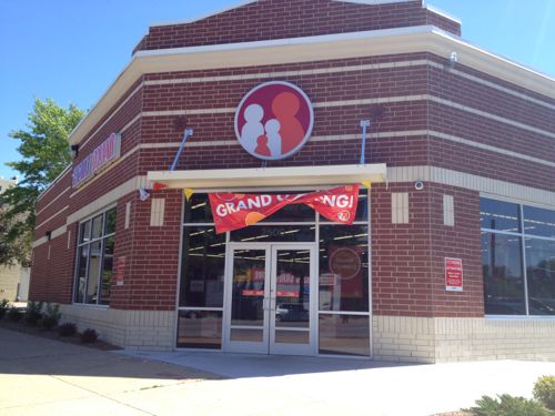
So what does their typical new construction look like? Not much architecturally, with little to no connection to the sidewalk.
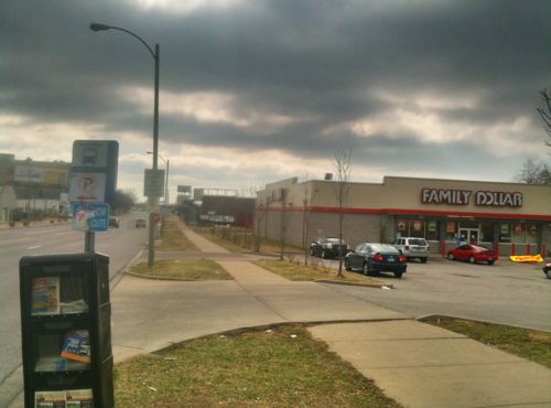
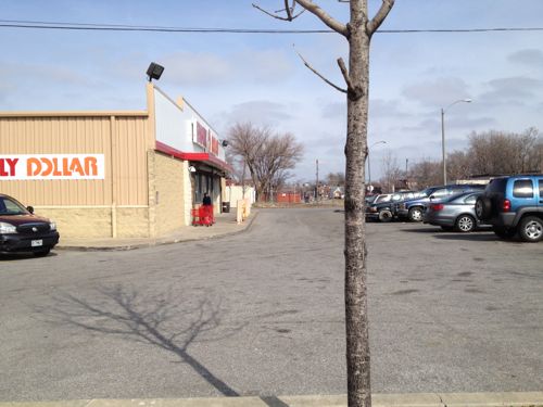
When building these two stores in 2006 & 2007 they used a pretty auto-centric approach and the cheapest materials. Now let’s take a look at the south Jefferson location where they built their newest location, starting with the Burger King that occupied the site for years.
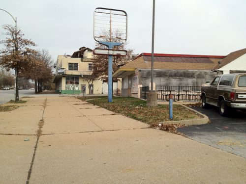
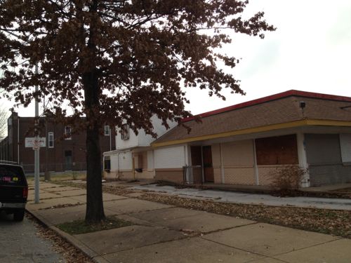
The Burger King was a typical suburban design in what was previously an urban location. Years of chipping away at the urban fabric devalued the urban experience, but money was made. That is, until it got old, then the money stopped flowing. Uses for former fast food restaurants are limited, often to check cashing places or other businesses that could care less about the city where they are located. Okay, back to the site on Jefferson.
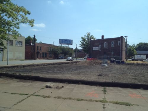
b
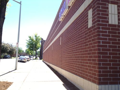
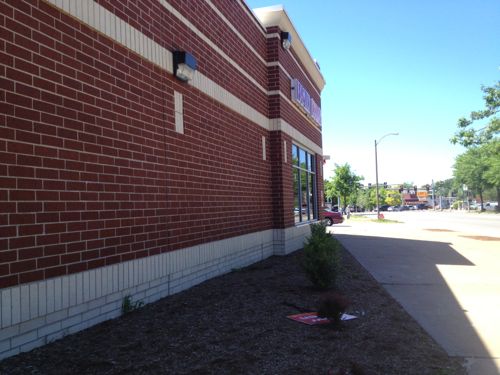
The McKinley Heights Historic District Design Standards is to thank for the fact this store isn’t awful like the prior examples. The follow section, in particular:
ARTICLE 5: COMMERCIAL DEVELOPMENT CORRIDORS DESIGN STANDARDS
501 NEW CONSTRUCTION AND EXISTING NON?HISTORIC COMMERCIAL BUILDINGS
All new construction within the designated Commercial Development Corridor (the Corridor) must be reviewed and approved by the Preservation Board taking into account the following considerations:
501.1 Height
New buildings must be constructed within 15 percent of the average height of existing buildings on the block. Any additions must be compatible with both the existing building and the surrounding structures.
501.2 Scale
The scale of all proposed new construction in the Corridor must respect the existing scale of any surrounding historic structures by seeking to minimize the difference in height, mass, fenestration and location. Any additions must be compatible with both the existing building and the surrounding structures.
501.3 Location
New or moved commercial structures shall be positioned on the lot to not only enhance the character of the commercial location but also to be compatible with the surrounding streetscape. Any additions must be compatible with both the existing building and the surrounding structures.
501.4 Exterior Materials
All new building materials shall be compatible in type and texture with the dominant materials of adjacent buildings. While artificial masonry such as “Permastone” is not permitted, introduction of new materials for new construction will be considered. A submission of all building material samples shall be required prior to approval. Any additions must be compatible with both the existing building and the surrounding structures.
501.5 Details
Details on new structures should be compatible with the surrounding built environment. Any additions must be compatible with both the existing building and the surrounding structures.
I have numerous problems with the code:
- The code is 41 pages of text! Not a single diagram to illustrate what is desired, or what is discouraged. Lawyers might like to read written code, but those trying to design to codes are often visual learners. The general public can benefit greatly from diagrams, increasing understanding.
- If someone wanted to build a 5-story urban/mixed-use building on this site, it wouldn’t be allowed because it would be greater than 15% above the few 1-2 story buildings on the block. Never mind that we have 2 story buildings next to 5+ story buildings in many historic neighborhoods. Increased density, if allowed, not required, would be good for area businesses.
- The code is too general: compatible, respect, and enhance are all subjective terms.
- Form-based codes, for example, deal with issues such as width of the building facing the primary street, more building should’ve faced Jefferson.
I’m very glad this code is in place, but I’d like to see it and others improved.
— Steve Patterson
Good review. This section of Jefferson has some real latent potential.
The brick facade really helps, unfortunately the blank walls are still hostile to pedestrians. You need to give them at least something to look at. Here’s an example of the Whole Foods in Madison. It’s entrance faces the parking lot to the side but the wall facing University Ave has windows, artwork and, next to the bus stop, has deep window wells and awnings which double as a kind of a bus shelter:
https://www.google.com/maps?q=&layer=c&z=17&iwloc=A&sll=43.075083,-89.444405&cid=8899181393492354590&cbp=13,182.2,1.6,0,0&panoid=FoINPvvKXb8T8coEiz2PkQ&q=Whole+food,+madison,+wi&sa=X&ei=ieetUcCzHKr4yQHA_oDAAQ&ved=0CKkBEKcfMAo
I agree that the code should be improved (or a form-based code adopted) but at least it prevented another anti-urban shed from being built. Keep being a thorn in the side of city officials and developers! This is the only way things will change.
Their new store at 7700 S Broadway in Carondelet looks pretty good, too . . . .
I’ll have to check it out.
http://stlnabedev.tumblr.com/post/48057821064/new-commercial-building-rises-on-south-broadway-7700
Thanks! Only 1-story but appropriate otherwise.
While Family Dollar is obviously occupying these structures, it would be interesting to know if they were actually built by Family Dollar or if they were “build to suit” projects, where a (local?) developer built the structure to meet Family Dollar’s interior specifications while retaining ownership of the site and structure, leasing the finished project to FD as a tenant. And if it is a build to suit, it would be interesting to get the developer’s take on both new, “better” projects (since I’m pretty sure that FD is more interested in signage and parking than in brick color and site orientation). Is/are the developer(s) just meeting the minimum requirements for an established historic district? Or, do they see more upside, the potential for greater revenue, from doing more-urban structures? All regulations are minimums, excellence in design comes from clients willing to move beyond the minimums. Understanding why it happened on these two projects will be key to reinvigorating St. Louis’ urban character.
While Family Collar does lease space, these new construction projects are company-owned.