Better Big Box Development
Recently I was critical of a proposed big box development along Forest Park Ave, adjacent to the main Saint Louis University campus. My issue isn’t with big box retail stores themselves, my issue is with how big box developments are typically laid out: massive surface parking lots, large blank walls facing public sidewalks, too few pedestrian connections to the outside & internally.
From page 12 of a 2010 Brookings report:
Considering the economic benefits, walkability should be a critical part of all strategic growth plans. The implications of this study cut across the federal and state, metropolitan, and place levels.
Public policy should become more favorable toward walkable placemaking. Currently, many federal and state subsidies substantially favor low-density development and tip the scales against walkable development. Further, many local zoning codes make walkable development illegal, necessitating costly and time-consuming zoning changes with no guarantee of success. Federal, state, and local policy makers should conduct a systematic review of existing public policies that are biased against walkable development, and adopt new measures aimed at facilitating (or at least removing roadblocks to) this type of development.
For their part, local and regional planning agencies should incorporate assessments of walkability into their strategic economic development plans. Planning entities should identify where regional- serving and local-serving walkable urban places exist within a metropolitan area, seek out those places that are positioned to become more walkable, and determine potential locations of future walkable places. This type of assessment will help determine where infrastructure and other built environment improvements are needed. Since high-density walkable urban places seem to account for a small amount of a metropolitan area’s existing land mass, it is probable that the infrastructure cost per dwelling unit or commercial square foot will be a fraction of that of existing low-density drivable suburban infrastructure costs.
At the same time, the apparent supply-demand mismatch for walkable places may be contributing significantly to the price premium these places demand. To the extent that this is the case, the short- and medium-term shortage of walkable places makes them inaccessible (unaffordable) to many people who desire to live in such places. As such, it is important to have an affordable housing strategy in place while those improvements are being implemented. (Walk this Way: The Economic Promise of Walkable Places in Metropolitan Washington, D.C. Christopher B. Leinberger and Mariela Alfonzo)
The proposed “Midtown Station” project would turn its back on both Vandeventer & Forest Park Avenues, which is only marginally acceptable pattern out in suburbia, but unacceptable in an urban context — especially adjacent to a major university.
In searching for alternatives I remembered a project I visited about a decade ago and blogged about in 2005. This development has multiple big box stores including a 2-level Target, a Best Buy, a Sport’s Authority, and a Ross. Smaller size spaces front the sidewalk.
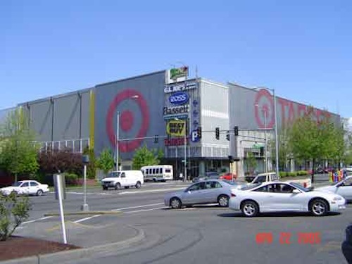
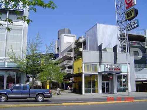
This project isn’t located in downtown Seattle either, it’s nearly 8 miles up I-5 (map). The main mode in this part of Seattle is private automobile, but thankfully newer development isn’t geared solely to motorists.
The best local example of rethinking big box development the Market at McKnight in Rock Hill, with a 36,000sf Stein Mart that opened in October 2007. Ok, not exactly a big box, but a big portion of the 130,000sf development.
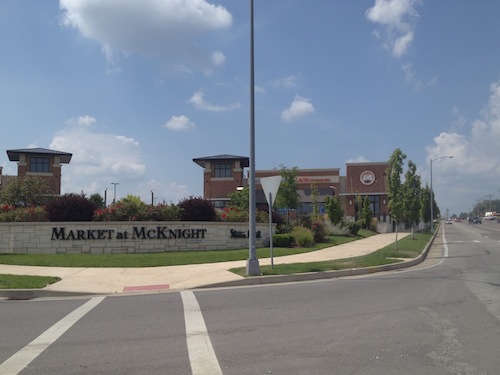
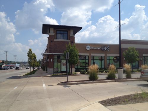
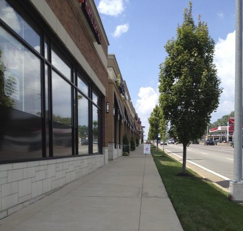
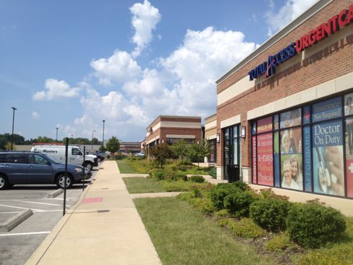
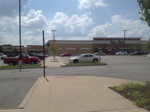
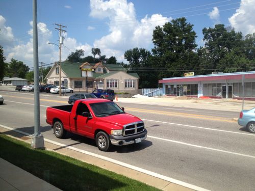
The view isn’t great, but the point is there’s a relationship with the sidewalk & street. From inside I could see others going by and they could see me. Instead of creating something active along Forest Park Ave. Midtown Station wants to create something like this:
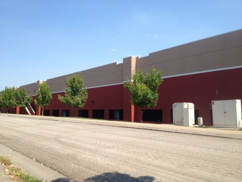
Dreadful anywhere, but especially so close to a college campus and near public transit. Developers have shown there are alternatives to the standard big box project of the last 15-20 years.
— Steve Patterson
>Living wage for all employees for all proposed “big box” type retail stores, to support the workers as well as other local small businesses
>Business front to be friendly to pedestrians, people on bicycle and those using public transit shall be close to the street, with the reduced-size parking lot on the side or back of the building
>Pay a parking cash-out to all employees who do not drive to work. ( employee) parking is expensive!
Town and Country Crossing and Woods Mill and Clayton is similar in design to the Market at McKnight. I wonder if it was the same developer?
According to their website: “Town & Country Crossing is a unique pedestrian friendly shopping center located in one of St. Louis’ most prominent communities.”
http://www.townandcountrycrossing.com/about/
I thought about mentioning it but decided not to because the storefronts are set so far back from Clayton Rd. Good for suburbia, but not a good model for midtown.
The Market at Mcnight seems to be a flop, There is a large portion of that center that is vacant. Same with the Town and Country Crossing. Maybe this model does not work well for retailers?
Or perhaps the recession is partly to blame?
Place big box stores along Forest Park, with entrances on FP. Integrate offices and apartments/condos in the development. Include a piazza area.
Big box stores that integrate with urban areas is done, e.g. near northside of Chicago or the building housing Target and multiple small retailers at the corner of Flatbush and Atlantic Avenues in Brooklyn. Let’s go urban!
Ron Fagerstrom