Stifel Missed Opportunity For Good Urbanism
I’m a fan of public art, but I’m a bigger fan of active urban corners. I’ll explain the missed opportunity at the end, first let’s look at the corner of Stifel’s building known as One Financial Plaza.
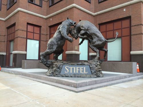
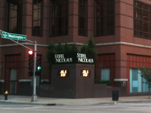
a big solid corner with financial updates
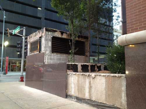
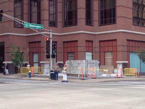
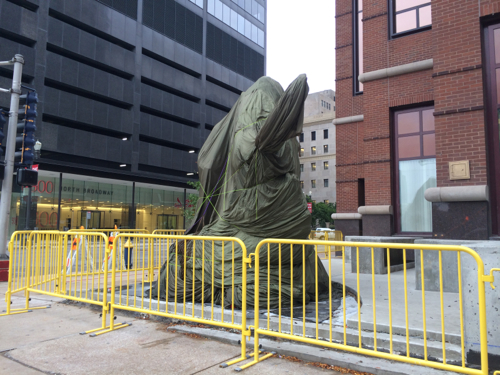
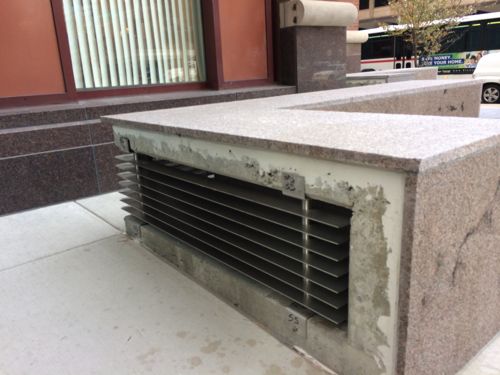
So what’s the missed opportunity? This would’ve been the perfect time to activate the street level of the building, the corner in particular. Imagine a 24 hour Walgreens or CVS with a glass corner entry. Or a coffee shop/cafe, newsstand, etc. Something more interesting than seeing the closed vertical window blinds of office workers.
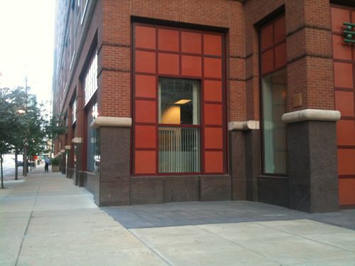
They can still create an active corner on the west side, at 6th — facing MetroLink.
— Steve Patterson
Maybe the sculptor should have refused the commission and “educated” Stifel on the need for “good urbanism” . . . . yeah, right. This is just another example of a client knowing what they want and be willing to pay for it – they don’t want to be “educated”. This is also another example of urban life being messy, with many “right” answers to what is “urban”? Not everything is going to be a 3-6 story brick building with retail on the ground floor! Stifel is not in the pharmacy business or the restaurant business, they’re in the financial services business. This is a multi-story office building, they’re an office user. Holding the building back from the corners serves several valid design purposes – it creates relief / space for pedestrians waiting for the light to change, it creates the opportunity for more corner offices and it allows a more articulated facade on a large structure. You may not like it, but Stifel apparently does, and is willing to pay for this exact “answer”!
There are many, many vacant storefronts downtown. Creating more storefronts, here, won’t “activate the corner”. Filling the current vacancies, FIRST, along with filling the vacant office space, will both demonstrate the demand for commercial space and help convince property owners that converting existing ground floor space (and surface parking lots) to retail spaces will MAKE THEM MORE MONEY! This sculpture isn’t what I consider great public art (it’s pretty derivative), but it does make the statement that Stifel, a viable, stable, rent-paying tenant, wants to make to move THEIR business forward. A cafe or a pharmacy would not; if anything, they would diminish Stifel’s presence.
I get it, you “want” to have a 24-hour (or not) national chain pharmacy within walking distance of your loft. There’s a reason your nearest Walgreens is either at 1530 Lafayette or 1400 N Grand and your nearest CVS is at 3925 Lindell. IF Walgreens or CVS could see a business model for opening a downtown location, one (and probably both) WOULD! Lack of available retail space is NOT the problem, a lack of enough / the right kind of customers, combined with the (perceived?) lack of an ability to do a drive-thru window and a (perceived?) lack of parking, added to the very real crime issues associated with operating a 24-hour business in downtown St. Louis, conspire to prevent this from happening. You gotta make the business argument before you make the design argument!
One’s art is another’s trash. This piece (I think) came from another of their properties. Stifel is committed to downtown and didn’t move out to Clayton. This piece speaks to what that do. Sculpture ADDS to urbanism. They could easily have put this in their lobby, hidden from the public. In any case, this is good for that corner. Maybe not as good as Steve would like, but better than an air vet.
And JZ….education still has to happen in the planning stage…that be the architect.
IF the client / tenant is unsure of what they want or need, then yes, absolutely, the architect should educate them and give them a range of good options. But, if it’s like the case that was apparently here, and the client had/has a pretty clear vision of what they want to accomplish, trying to educate them on other options would be a waste of time and an exercise in futility. I know of few architects who would turn down this commission (to modify the existing air handling systems and to provide a stable base for a large sculpture) because it doesn’t meet their design standards or urban aesthetics. Architects are in business to make money and this was a done deal, design wise, before the architect walked in the door.
In this case as cited, yes, the owner …rather willing to bet the CEO or someone on the top floor said ‘I want our statute there’ and the minions did all the work. But this isn’t building 4 walls and a roof for retais and the importance of educationl as discussed on the other post. You know that, I know that. This is comparing apples and oranges.
And I can see where many architects throw up their hands and just do the commission. With every big box build, the voice for unique, blended urban design gets harder and harder to hear which means the architect has to speak louder and louder.
Urban happens because density demands it – high land costs demand frugal use of a scarce, expensive resource. Suburban happens because land costs are low and can be wasted on low densities and surface parking. We architects can “educate” our clients until we’re blue in the face, but it’s the rare commercial client who’s more interested in urban design than the bottom line.
When we had our house addition built and met with ‘award’ winning architects, we went round and round about what WE wanted to blend into the neighborhood. Despite 4 plans later, they finally returned to our original design concept. So bull….we were lucky in that we knew what we wanted. If not, then we would have been stuck with some suburban, simple crap design. So throw your hands up at being blue in the face, but there was no education and worse, no care about blending into the surroundings by a supposedly ‘award winning’ firm.
Congratulations, you’re the rare client that’s better educated than the architect that you chose. You’re also the client who knows what you want(ed) and will push your architect to get exactly that – in that way, you’re no different than most clients!
Not better educated, but we did know somewhat what we wanted by talking to our neighbors than talking to the architects. To us, we look at the inside, the neighbors are the ones that have to look at the outside. We didn’t settle for what they put in front of us: bland, boring, vinyl clad crap. And if my brother wasn’t a builder, we probably would have accepted their crap. For example, it was my brother that suggested vaulted ceilings for the bedroom, not the architect. To the outside, it looks the same, but for a few hundred dollars, the benefit far outweighs the costs. But the bottom point is that they were and are in a position to lead the client. They didn’t. And how many other’s don’t? Too, too many. So again I say, education must begin at the drawing table. And since the architects are suppose to ‘know better’, then they should be the ones leading the discussion.
the lafayette walgreens in not 24 hours. there is a (limited) cvs downtown. there is a schnucks downtown. there is a 24 hour 7-11 downtown. you always talk like you know so much about the market, but your facts are always off.
OK, Mr. Know It All, a “limited” CVS pharmacy and a 24-hour 7-11 do NOT define a thriving urban market (and the “limited CVS” does not appear on their corporate website). Culinaria is not a true Schnuck’s, it’s a Schnuck’s Light, positioned to serve an urban market with a limited selection and focused services. A thriving urban market is the Loop, Michigan Avenue or Bucktown in Chicago, downtown Portland or Seattle, and Manhattan or, these days, Brooklyn in NYC. Rents are high, as are revenues for the tenants, and there are few vacancies. But my point isn’t which specific stores or types of stores are or are not downtown, my point is that there is little reason to be creating more speculative, vacant storefronts / retail space given the amount of vacant space that is already currently available downtown. Doing so makes about as much sense as playing the TIF game that county “cities” are playing, stealing a chain store from a neighboring jurisdiction, just rearranging the deck chairs in the local retail scene. If anything, creating more space will just serve to depress an already-struggling market.
the loop doesnt even have a grocery store. but i do like your plan of doing nothing, that will probably work
My “plan” is to fill the current vacancies, first, before we create more.
Good point Wump…everyone seems to look to the great cities….Chicago, Denver, Portland, etc. as to how dense urbanism is working….yet they seem to overlook the fact that even in those cities, it is NOT the entire city that is some urban oasis Eden. They merely have sections of blocks that have dense urban retail/living. The loop for instance, the CWE, and in places like Portland or Bar Harbor ME. Short of NYC, all cities have zones of urbanism and dead or non-thriving zones.
I definitely want a walgreens or cvs downtown. I live quite close to Stifel, and pass that statute regularly. I’m not sure it’s a great place for a walgreens, first because the space apparently available is not great. But also, there are plenty of convenience stores within three blocks of there, none of which stay open 24 hours. James Henry and Arch Mart on 4th st both close 10-ish on weeknights, and sometimes close early. At Broadway & Olive, there are convenience stores in the two office buildings on either side of the street, neither of which stay open until seven. Maybe the Wash Ave location would overcome these problems, but I’m not certain they would.
Sad to say, because the dearth of 24 hour downtown drugstores is ridiculously inconvenient.
I think ballpark village is actually a great location for a CVS or Walgreens, close to transit, hotels, residential. Not to mention 30,000-40,000 fans pass by 80+ days a year.
I would take it. Though it may make more sense to have something more accessible to all the Wash Ave lofts and apartments.
While we’re wishing, how about CityTarget in the REx building?