Will the Urban League’s New Ferguson Center Be Urban or Suburban?
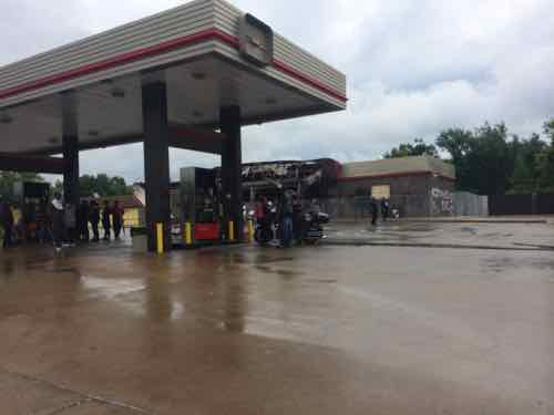
This afternoon the Urban League is going to give more details about something they released on Friday, a new center at the site of the burn-out QuikTrip on West Florissant in Ferguson:
On Friday, the Urban League said the center would be “an important extension of its services in North County to further the League’s mission of empowering communities and changing lives.”
The center will “expand the Urban League’s work to broaden access to education/job training, employment and economic self-reliance for residents of the St. Louis metro area,” the League said in a news release.
A news conference is set for Monday afternoon to announce details, which the Urban League would not provide Friday. (Post-Dispatch)
Job training is needed in Ferguson, a better-trained workforce will benefit the entire region.


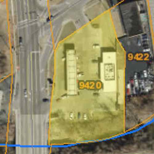
St Louis County records list the property as being 1.14 acres with irregular borders. This afternoon we might see preliminary ideas for the planned building. Hopefully the Urban League is planning to build the structure out at the street corner, close to the public sidewalk. My fear is they’ll set a building at the back, behind parking. The latter would send the wrong message to a community with many who use sidewalks and public transit. Since they’ll be starting with a cleared site I’m hopeful, I applaud the effort but remain cautious until I see specifics.
The press conference will be held 3pm at the Urban League’s non-walkable St. Louis County Operations Center at 8960 Jennings Station Road. To be fair, it’s located in a rented former grocery store built in 1967.
— Steve Patterson.
Good luck with that . . . current Zoning is C-1 (http://www.fergusoncity.com/documentcenter/view/1632), minimum front setback is 25′, maximum lot coverage is 40%, one parking space is required for every two students, plus one parking space for each employee (https://www.municode.com/library/mo/ferguson/codes/zoning?nodeId=CH49ZO_13.0GECODI).
I don’t know anything about racism, other than that I hate it, it’s complicated and bad. It definitely plays a major role in what is going on in Ferguson, but the way we run the city also plays a major role in these inner ring suburbs.
We got to ask ourselves if the city collects enough in tax revenue to fund the infrastructure maintenance. If not, we need to look at why that is.
Is it the zoning codes? Is it off-street parking minimums? Is it euclidean zoning?
In my opinion our zoning code is a joke. No reason to put random restrictions on development and use when we can’t even fill our abandoned buildings.
There are these things called “variances”& “waivers” to get around arcane codes. These are another area that needs examination throughout the region.
Of course, there are multiple ways to “get around arcane codes” – all it takes is time, money and political will. However, if the goal is to get something done quickly, working within the existing restrictions is far easier.
We’re all going to have to wait for the “big announcement”, but my guess, given the size of the site and the optics to do “something” quickly, that whatever is proposed will fit the existing zoning or that the wheels are already in motion to grant any waivers or variances quickly.
As for tbatts666’s observation that the city needs to “collect enough in tax revenue to fund the infrastructure maintenance”, then putting a non-profit at this location is a poor decision – the QT produced sales tax revenue – this won’t!
Hopefully they won’t conform to the quick fix mentality — that’s a lot of the problem. The institutionalize status quo in Ferguson — from the police dept, to the courts, to zoning — must change if real change is going to be realized.
Let’s hope the rendering in the PD announcement article came from some architect’s archives and doesn’t actually reflect the building that is actually planned for that site. Perhaps the rendering was submitted just as a filler of sorts, to appear opposite the disgusting photo of the QT that WAS BURNED DOWN (it didn’t just burn down, as the feature article reads!–there is a difference). In my humble opinion, the building doesn’t appear to have much of urban feel about it, although it does remind me of some of the Karl Nicoloff designed buildings along Hampton Avenue south of Chippewa, built in the late 60s and 70s.
I was at the press conference — that was the design they showed. No site plan was available so I asked. They said it would be at the same spot at the old QT because of remediation. I didn’t argue, but it didn’t make any sense. Generally you can remediate a site to allow an office function, but not residential.
Guys, this not an urban area, this is a suburban area – there are no other “urban” buildings anywhere nearby. Good designers respect the context, the surrounding area, and try to blend in, not stick out like a sore thumb. The rendering shows a building that is sensitive to both the site and the surrounding community. It may not be the ideal that you want to impose, but it is obviously tailored to fit its surroundings . . . and it includes bike racks!
Stop living in the past! Decades ego this was new and dominated by residents with cars. Today its residents are low-incone — many who walk & use public transportation.
As new buildings are built they should reflect the fact 2015 Ferguson is very different than 1960 Ferguson.
I’m very much living in the present! I would bet that there are more registered vehicles and more daily drivers in the Ferguson of 2015 than there were in the Ferguson of 1960. Even if “many walk and use public transportation”, the majority still drive. It’s probably not the 95%+ (driving) to less than 5% (transit dependent) split that you find in most suburban areas, but even if it’s an 80/20 split, drivers remain a dominant majority! Whether it’s personal choice or deficient infrastructure – chicken or egg – driving defines suburbia, not walking or using public transit!
Sorry, but I’ll disagree with you on this one, although I have no basis for disagreement other than personal preference (for the most part). You’re the architect. My job is to help make them structurally sound. The rendering shows a building that, IMO, is largely unremarkable, soulless, mass produced, empty! Drive South on Hampton Avenue and you’ll see dozens of similar unremarkable structures that are likely rarely on your “have-to-show-my-out-of-town-guests list.” Drive (or walk!) around the industrial area of the Hill, where you’ll see dozens of similar examples of office-warehouses and union halls that are mercifully hidden from most public view. And why would anyone install a floating canopy on a new structure. Ten years after a floating canopy is installed, I always find myself looking up at the soffit and seeing water stains. Imagine what’s going on between the roofing and the finish ceiling material! And the rendering shows an impractical design, IMO, for that neighborhood, with a full-height glass entrance and several window panels which historically have tended to invite acts of vandalism. And what’s with that infill surrounding the showcase window? It looks like someone ordered a window that didn’t quite fill the bricklayer’s M.O, so the carpenter was asked to fashion some sort of wood infill–or the mason was asked to be “creative” to avoid the appearance of a dimensional construction error. I’m certainly not suggesting a Frank Gehry’s Binoculars Building design, or anything necessarily similar, although less glass at ground level might be a practical and worthwhile consideration, but surely to god something can be designed and built on that site that doesn’t look like something taken from a Cannon copy machine. But…. on the other hand, maybe something totally (sic) unique would be appropriate, since the surrounding community may not be blessed with architecture worth being “sensitive” to. I wonder: Is Frank still alive?
We have a 50,000 sq. ft. site. The current zoning code allows the construction of a 20,000 sq. ft. structure. The $500,000 construction budget implies a much smaller structure, probably something somewhere between 3,000 and 5,000 sq. ft., given current construction costs and parking requirements. We shouldn’t be focusing on specific architectural details – “beauty is in the eyes of the beholder” – but we can certainly be discussing both siting and building bulk.
Given the size of the site, ANY structure placement should offer the ability to provide good pedestrian access. Given the suburban location of this site, the majority of the clients (and the vast majority of the staff) will be driving, today and for the forseeable future. And given the large delta in the construction costs for adding a second floor, a single-story structure remains the prudent choice.
And that leaves siting. There’s no real reason (other than current zoning requirements) that the structure can’t be built next to the sidewalk. The real-world usability challenge is that being built next to the sidewalk(s) does NOT guarantee that public access will be provided from said sidewalk(s)! Yes, they “should” provide it, but given the large number of patrons driving, the front door is gonna take some “persuading” to give up any location that is not convenient to parking.