Kiener Parking Garages Need A Major Facelift
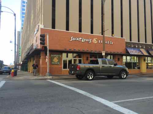
Work has started on the “$19 million revamp of Kiener Plaza”, which will help guide visitors to the upcoming city-facing entrance to the museum under the Arch. With the 1980s Arch parking garage razed visitors will be directed to existing parking garages in the central business district (CBD) — largely the two Kiener garages — across Chestnut Street from Kiener Plaza.
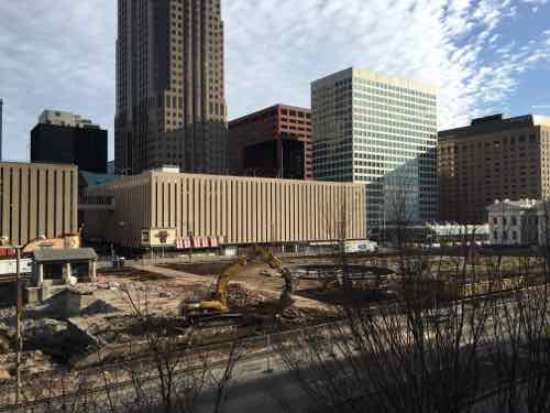
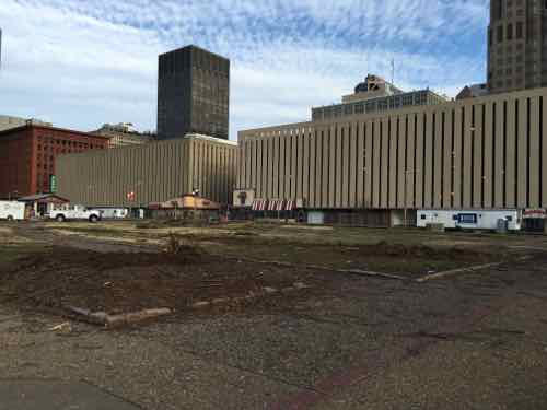
After investing a billion in changes to improve the Arch experience and connectivity to downtown, the first & last thing many will see are the Kiener garages. Today I want to discuss the problems and how we might solve them.
The Problems
- They’re privately owned
- Owner has little financial incentive to make them more attractive
- They’re in too good of condition to buy & replace
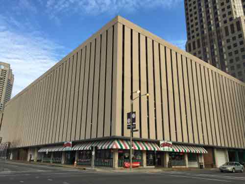
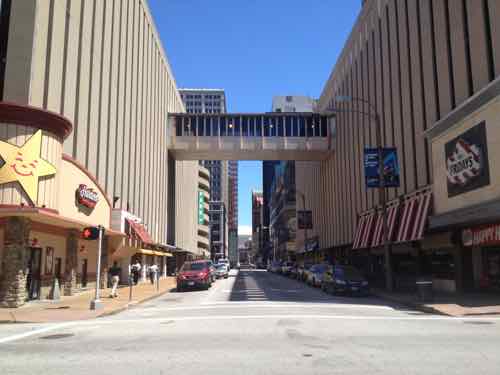
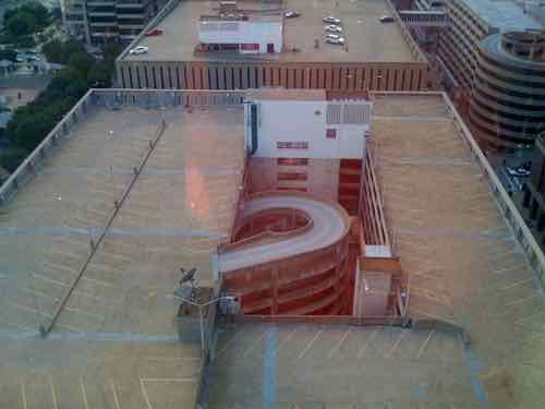
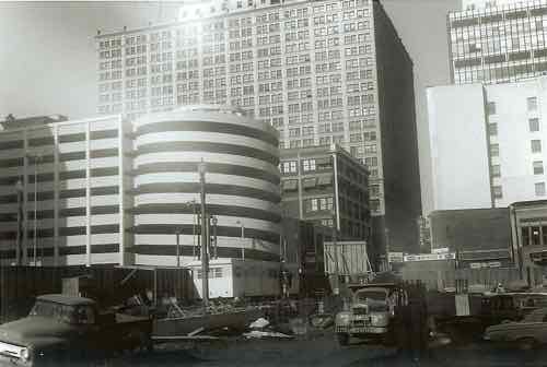
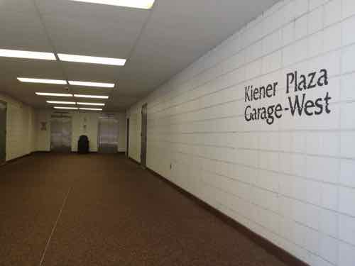
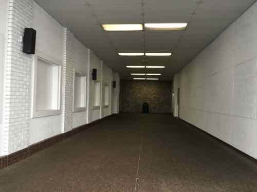
There is some good news…
The Solutions
With the ugly concrete panels being attacked to the structure one solution is to remove them and reskin it. Easier said than done, but worthy of discussion. Before I go any further let me say I don’t know how this would be paid for. The city has offered facade grants to building owners before, but otherwise using public money on a private building has issues. Perhaps tax abatement if the owner does it? I think this can be figured out — let’s discuss the design.
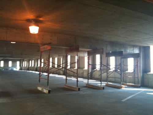
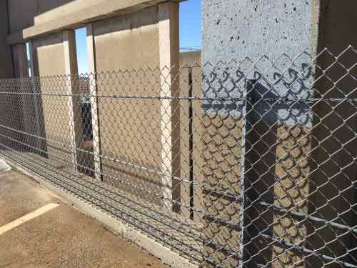
The old anchors into the structure might not support a new skin after the concrete skin is cut off. Despite being open in the center the exterior walls should continue to allow for airflow — natural ventilation eliminates the need for costly mechanical systems.
I think creative types could come up with some interesting ideas on how to reskin these. I want to share one such parking garage I saw in Cincinnati in November.
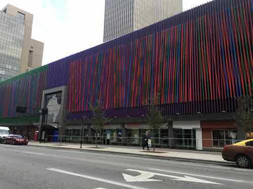
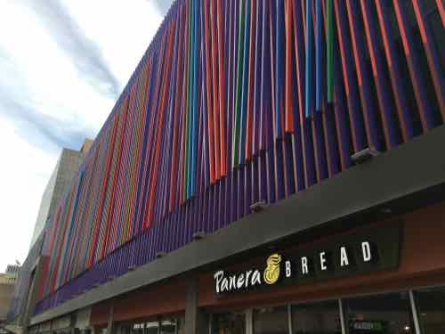
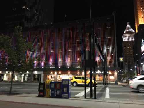
This screen on an old garage was the work of artist Julian Stanczak, it is titled “Additional”. I like that the Cincinnati garage only had this colorful side facing 6th St.
In St. Louis each of the two Kiener garages could have something unique for each, for each side, or both. I think everyone would agree the South facades facing Kiener Plaza are the most visually important. All facades should look good day & night — same for the pedestrian entrances for each.
In the past people have mentioned giant video screens but those are costly, cut off airflow, and contribute to light pollution. Steel mesh, colored aluminum, LED lights, etc. are just some of the materials that come to mind. I’d like to see solar panels on the South facade and a new roof canopy to generate power for new LED lighting.
Thanks to reader “Mark-AL” for technical advice.
— Steve Patterson
If nothing else, redoing / modernizing the street level facades / experience would help, A LOT! And you’re right, “energizing” the upper-level facades would be wonderful, as well, but in the universe of things to spend money on, downtown, I see many, many other priorities, in both the private and public sectors.
The upper facade — at least the South facade — must change it. It forms an imports wall for Kiener Plaza.
I’m not personally offended by the precast panels. They almost give the buildings a “municipal” look–much like the Abrams Building– which in my opinion isn’t horrible–especially in the middle of a city. But a creative architect capable of upgrading the storefronts would serve as a cool breeze in the summer heat.
Steve, I’ve seen the Cincinnati garage at night and in the daytime. And while I agree with you that a screen of sorts would be worthy of consideration on at least the south facades of the Kiener garages, I wonder if the Cincinnati screen might be a bit bold–clownish, bringing too much attention to the garages, vs helping them to quietly blend in. The Feds used a quiet screen yet attractive design on the Federal Reserve garage on 4th Street (?). It’s possible that a similar screen could be used OVER the existing south-facing precast panels, without compromising the free-air ventilation minimums and requiring mechanical ventilation to be installed.
I wouldn’t want us to copy the Cincinnati screen — especially not two blocks worth. I’m suggesting we explore options. Once at the sidewalk level it isn’t top bad, but the monolithic civic nature of the concrete panels doesn’t attract people — it repels them.
A creative team of artists, architects, engineers could made the garages into a good background for the new Kiener Plaza now under construction.
The overwhelming wall of brown doesn’t help much, especially from the plaza looking north at 2 full blocks. Perhaps something like a combination of the garage above Pastaria in Clayton, but more colorful like that shown above? The movement of the scales is at least a little more interesting. Not sure how color would look though. LED light bars at the top that the scales could reflect? Something like SLU Law.
https://www.google.com/maps/@38.6499507,-90.3346653,3a,75y,255.57h,87.91t/data=!3m6!1e1!3m4!1sLSpQYjASXHoa5YVYFtbiow!2e0!7i13312!8i6656
Rather than having a giant video screen I think it would be good to look at projecting art images onto an improved facade… having the goal of allowing the garage aesthetics to become more in harmony with the Old Court House/Arch “show” during the daytime while having the structure provide some life of its own at night.
Also, I think having a bit of expanded sidewalk to allow for more outdoor dining and taking in the extraordinary view would be a help for street-level vitality and help attract strong tenant demand.
It’s not just the aged concrete color, but that the design is vertically monotonous to a dreadful degree and replicated on adjacent blocks. I think other materials could be judiciously affixed to the panels to improve the look without necessarily removing the underlying concrete panels. There’s no doubt, though, that there would still be a considerable cost due to the size of these buildings.
I wrote about my idea of using a building wrap on my website: http://top50stl.com/top50stl-economic-development-idea-of-the-week-building-wraps/