Not Impressed With Aesthetic of CityWalk Apartments
I love seeing new mixed-use buildings going up in the Central West End neighborhood, along Euclid Ave. Unfortunately, I’m not excited about the aesthetic of the nearly finished 7-story CityWalk. When construction began in late 2013 it was expected to be completed by last Summer:
Bruce Mills, whose Mills Properties is developing City Walk, said construction will begin in early November. He said construction will take 22 months, meaning that City Walk, with 177 apartments, will be completed in late summer 2015. (Post-Dispatch)
Let’s take a look…
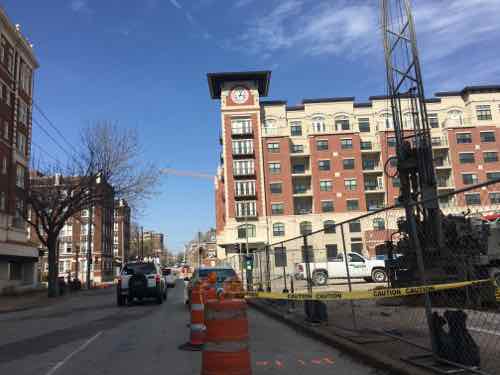
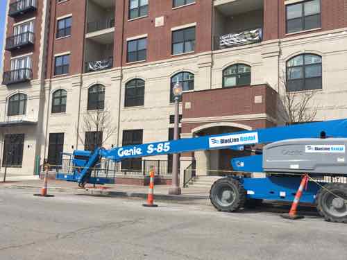
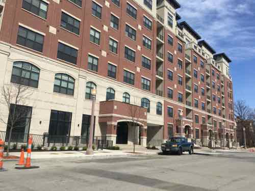
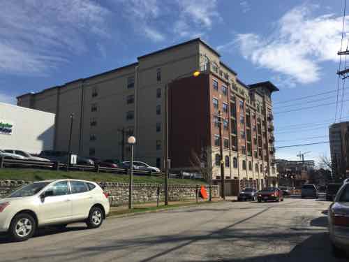
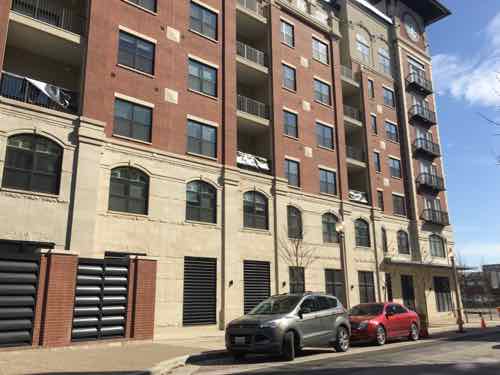
The facades are a hodgepodge of elements, the window are proportionally too small & horizontal. However, the building is large and the mass has been well-maslked. The parking garage is hidden.
I look forward to taking the #10 MetroBus from downtown to shop occasionally at the Whole Foods after it opens.
— Steve Patterson
Interesting observation. I view the building differently. I drove past the building a month or so ago during my last visit to STL. I was impressed with the detailing the Mills’ architect had introduced in an attempt to blend the building with those in the neighborhood: the limestone ashlar stone facade with what appear to be wide horizontal rustication joints at street level (consistent with other CWE buildings), the arched above-window detailing; the stepped, stone pilaster heads at the stone/brick interface and the other classic detailing.. Even the brick/stone color selection seems “right” to me. (I will admit that the elevation shown in your photo looking south does look a bit awkward. In your photo it almost looks like a warehouse where stucco was used to upgrade waterproofing over deteriorated masonry. ) Can’t see the white doors, but I agree that the black windows look OK. Don’t understand your comment that the windows are “too small and horizontal”. I view them in-scale with the building and more “vertical” than horizontal, at first look. I personally view the tower as too “cutesy”, but I got tired of towers when architect J. Morissey overused them in several Trivers’ buildings around the City over the past 10 years. It’s funny how we all view building architecture differently. But I don’t take my personal observations too seriously when viewing a building, because I’m not an architect and don’t have the training to be too critical. And I would personally like to see MORE parking garage prominently displayed!!!!
Never heard of anyone liking parking garages as much as you. I am assuming that your passion for them is because you are involved in the construction of them in someway. Is this correct?
Yes, they put food on my table and my kids through school! My kids make me promise not to visit parking garages when we’re away on vacation. My wife has learned to live with it.
I don’t know. I was expecting a lot worse.
While I like this building better than most modern construction I see in St. Louis, I’ve come to expect that most modern construction will either be ugly, boring, or a cheap imitation of historic architecture.
What are some examples of modern building in St. Louis that you find aesthetically pleasing?
Roberts Tower downtown & Metrolofts on Forest Park Ave are both attractive.
I do like Roberts Tower. Lukewarm on the Metrolofts.
I despise Metrolofts. Nothing attractive about cinder block architecture IMO.
I like Metrollofts more than this one, IMO, and Roberts Tower is very nice looking, too. I’m less concerned with the exterior appearance, of any of them, and more concerned with seeing quality materials used, maintenance performed, as and when required, and creating an environment where the city starts attracting a large number of new residents, again. And part of that is giving potential residents a range of options, not just “cinder block” modern and/or not just faux “traditional” brick architecture!
I’m fine with a range of options I’d just like them all to be well-designed.
Just like Lake Woebegone, “where all the children are above average” . . .
Firstly, I can’t stand that show. Secondly, I don’t see how that relates to my comment.
Define “well-designed”. By definition, not everything can be above average, because “average”. No matter where you draw the line, some designers will do a better job than other designers. Every law school, every medical school and every police academy class, just like every architectural school class, has a qualified graduate who finished last in that class! Ask any designer which projects they’re most proud of, and they will identify projects where (they think) they excelled; they may or may not claim projects that are NOT so great . . .
I find all the parking garages in STL to be especially striking! But I have to say that my favorite building in STL is Bank of America in the 4600 block of Lindell Blvd. I admire its “stature” and its brick and architectural board-formed concrete facade. The board formed concrete was done in the days of STL when carpenters and finishers took the time to properly form and pour an exposed concrete wall, without honeycomb and with careful placement of form ties. The building doesn’t attempt to blend in with adjacent buildings and makes its own bold statement. (IMO)
My first 6 months in St. Louis I lived next door in The President — it was Boatman’s Bank then. From my urbanist viewpoint, it is not a good design. That said, I don’t think CityWalk will age as gracefully.
I suppose from an urbanist’s perspective, new developments should build on surrounding architectural styles–cohesive and orderly relationships between existing and proposed buildings, visual connections and homegeneity, etc. But don’t those types of restrictions attempt to overly regulate and limit the creativity of the architect? I remember driving through downtown Mobile with my wife five years ago, and she commented that the two new high rises there appear to be out of place. I agreed that they were totally dissimilar (except for some roof details) from the New-Orleans style and Southern plantation style buildings often found in and about downtown Mobile, but I didn’t find either of the two new buildings to be offensive or “bad design”. I guess I don’t consider “different” to be a synonym for a four letter word. All up and down Lindell, you’ll find that many of the newer structures are architectural stand alones, and I find it to be often interesting.
From my view it’s about the relationship with the sidewalk — not mocking neighboring properties. I like new buildings to use quality materials, details — not tack on details to give the casual observer the impression it is older than it it. When I visit other cities I see new construction that’s refreshingly modern in aesthetic, and good in terms of massing, scale, etc.
That having been written, then I take it you like the Argyle Garage!!!!!! It’s built up to the sidewalk on two elevations, and all the materials used are honest. Nothing’s tacked on! It complements adjacent buildings but imitates nothing. I always knew you had an eye for architecture!
Actually, I just googled the old Boatman’s Bank Bldg on LIndell. The photo shows it is built just about as close to the sidewalk as safety would allow. It was probably intentionally held back from the sidewalk to give drivers a clear view of the sidewalk before entering Lindell. I guess the alternative would have been either a lovely surface parking lot in front of the main structure, or perhaps one of those erector set parking garages, similar to the one that serves the Annex Lofts in your neighborhood,
A building’s relationship with the public sidewalk is only partly about distance. The low walls & steps near the sidewalk are a perceived barrier — not welcoming. The entrance faces the auto driveway, it isn’t visible from the sidewalk. These have nothing to do with the distance between the sidewalk and building line.
Well…..maybe the low walls are a consequence of providing underground parking; they usually are, especially on smaller land parcels. Sure the ramp leading to the underground garage could have been located on the north elevation, but then the surface parking would probably have been moved to the south face, since transient bank customers certainly wouldn’t have relished the idea of entering and exiting a parking garage for 5 minutes of banking activity. Customer convenience is an important design factor, maybe moreso than urbanists will admit. I wonder if the better decision wasn’t, in fact, actually made by the architect! And while the front door is somewhat obscured by trees and geometry, the presence of the grand stairs eliminates any question about how to get into the building. Anyone who can’t figure it out probably doesn’t belong in the building. Sometimes the ketchup bottle isn’t big enough to fit as many tomatoes as we’d like, so we have to either find a bigger empty ketchup bottle, or put fewer tomatoes into the bottle that we have. For the ketchup lover, even a weak blend is better than nothing. At the time this building was developed, I’m fairly sure the county had several extra boxes of bigger empty ketchup bottles sitting around in their storeroom, and they would have been anxious to share one with the developer, in which case perhaps a 905 liquor store, perhaps a surface parking lot (like existed across the street for decades), a Marathon gas station, or even a 7-11 mini-mart, now converted to an eyeglasses store with a Kelly green mansard-type roof line, might have been built on that parcel.
The underground parking extends beyond the building footprint — toward the street. Since they started with a clean slate, the parking beyond the building could’ve been behind the structure. But in 1971, useless plazas were the thing. It could’ve been designed to be much more welcoming — it just wasn’t.
Sure, the underground garage could have been designed “behind the structure” (under the current surface lot, I assume).But a whole lot of additional work/$$$ would have to have been thrown at the project: duplicated footings, grade beams, piers, columns and a redundant level of beams (vs larger ones to carry both the garage structure and the building structure); duplicated and extended storm sewers; a major expansion joint system to separate the garage from the building structure; a major waterproofing effort to seal the surface level parking from buried parking; and probably a different bank of elevators to serve the garage, depending on the lobby layout…..and depending on soils conditions, the proximity of the garage to the office structure might have required major shoring and soldier piling. And the sheet piling required to retain the alley and all the buried utilities contained under and around the alley would have resulted in another significant job cost. You’re really talking about a more costly and complicated project. And with all due respect, there are “useless” plazas all over Europe and Asia that residents, employees and visitors use every day of the week…..and appear to enjoy. Many are much smaller than at the Lindell location. Why would this be an exception? A few tables and chairs placed on the plaza would have rendered the plaza very usable, providing an outside escape from “air-conditioned comfort” for smoking/lunch or just conversation. I would bet that the original design architects (Murphy, Downey, Wofford and Richman???? I think) and their engineers carefully assessed the site and recommended to the owner its best use and most cost-effective development plan. That’s kinda what we’re trained to do!
While I’m lukewarm on this design, I’m just glad to see increasing reinvestment in the city . . . . http://www.seattletimes.com/seattle-news/politics/homeowners-demand-halt-to-stalinist-looking-cityscape/
https://www.google.com/url?sa=t&rct=j&q=&esrc=s&source=web&cd=1&cad=rja&uact=8&ved=0ahUKEwjc4-yQwNrLAhXBMSYKHbM3Ci0QFggfMAA&url=https%3A%2F%2Fen.wikipedia.org%2Fwiki%2FGehry_Residence&usg=AFQjCNGTDFbKCOa_L-uGdGwhTygbvdPsLg&sig2=XDCC17j9D_Wfr-3lHBSMQQ&bvm=bv.117868183,d.
I have to admit that I do have certain opinions about zoning restrictions and controls and limitations placed by municipal building officials on allowable “improvements” that residents can make to their personal properties in a neighborhood setting. As an example, consider architect Frank Gehry. He and his house were my across-the-street neighbor when I lived in Santa Monica. If you click on the link above, you’ll see what I had to look at every time I walked out my front door. Enuf said!
If the link doesn’t open (which will probably be the case), just type into your browser: Frank Gehry, Santa Monica.
And that’s the true balancing act in urban living. At one end is boring, safe and repetetive, at the other is “interesting”, “cutting edge” and “unique”. Arby’s said tha “Different is good”. Sometimes it is, sometimes it’s just weird!
…..and sometimes it’s offensive!
Notice that the west facade looks nothing like what was promised in the renderings. In the renderings it was all windows along the ground floor. What we actually got is a bunch of HVAC vents and a giant garbage pen that blocks half the sidewalk.
Probably what happened is that the building was over-budget and therefore went through a “value engineering” process, which is a poor choice of words because the result of such an activity produces neither “good value” nor “good engineering”. The contractor benefits MOST from the exercise, in that he has opportunity to cover oversights he made during the bidding process by giving only partial credits for reducing project scope or “re-engineering” systems (this reads “cheapen” systems) in order to reduce the project costs. The owner eventually bends over far enough as necessary to reduce the project cost so that he can build his project, and in the process the contractor has covered all his bidding oversights!!!! In certain jurisdictions of the US and in a greater number of jurisdictions in Europe and now in Israel, value engineering changes (over a certain $ amount) must be resubmitted to the permitting jurisdiction before being implemented in the field. In Israel, building officials will shut down the job, force the contractor to remove the V-E changes, AND THEN they will gladly review the redesign. Fair play, accountability and integrity among developers and contractors help to prevent “eliminating entire elevations of window openings” and other surprises that are revealed only at the grand opening…..but not all developers and certainly not all contractors behave altruistically, even in a business sense..
Apparently there is a venting system that faces Euclid as Steve’s west facade shows. Not good for pedestrians. I think there was a $10 million tiff for this project. In my estimation there is too much parking given the access to MetroLink, the #1 bus and short walk to BJC-WU medical center.Less parking would have negated the need for the tiff.
This building is a textbook example of bad urban design…walls and vents and trash enclosures facing the main pedestrian street and a hidden entrance to the side with an inward-looking store. This complex was to be a flagship redevelopment, and is now a dead hole in the street scene of Euclid. Thanks Bruce Mills and St Louis planning for botching what could have been an area centerpiece.