Poll: Would You Support Or Oppose Walmart Express Stores In The City Of St. Louis?

Retail giant Walmart is looking to reverse declining sales by opening smaller, more convenient, stores:
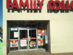
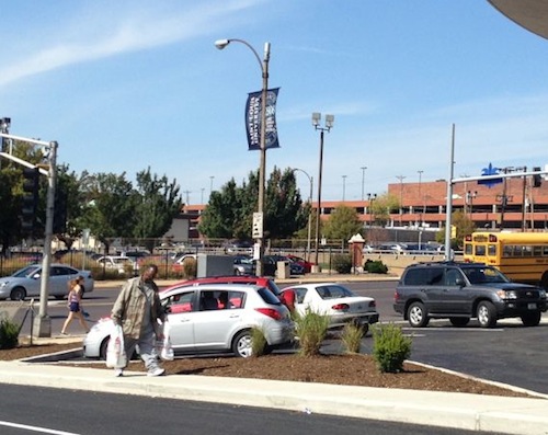
ABOVE: Walmart Express stores will compete with numerous dollar stores like this Family Dollar on Gravois near Bevo Mill.

Express stores are less than one-tenth the size of Wal-Mart supercenters and offer groceries, general merchandise like tools, and pharmacies. Neighborhood Markets are more than twice the size of Express stores and offer perishable food, household supplies and beauty aids as well as a pharmacy. (USAtoday.com)

The new Walmart Express format is just under 15,000 square feet in size, a fraction of Walmart’s other formats:

  •  Supercenter: 185,000 square feet
  • Discount stores: 108,000 square feet
  • Neighborhood Markets: 42,000 square feet (source

Their Neighborhood Markets format is a grocery store, not seen in St. Louis but already dominant in some markets, like Oklahoma City. The Walmart Express will give other retailers strong competition:

Dollar-store chains have expanded quickly in recent years and pose intense competition to Walmart. They open stores closer to customers’ homes, a big advantage in times of high gas prices. According to a Credit Suisse analyst, the average round-trip to a dollar store is six miles vs. 30 miles for a typical Walmart trip. These stores have enjoyed strong revenue growth as they’ve lured more shoppers with bargain prices and wider selections. (source)

My concern is these national retailers with generic store designs will continue buying up every corner they can, making our city less urban every year, rather than more urban.

The poll this week wants your reaction to the idea of Walmart Express stores popping up in our neighborhoods near Family Dollar and Walgreens locations. The poll is the right sidebar, mobile users switch to the full site to vote.

— Steve Patterson
 

Please Keep Sidewalks Clear Of Foliage

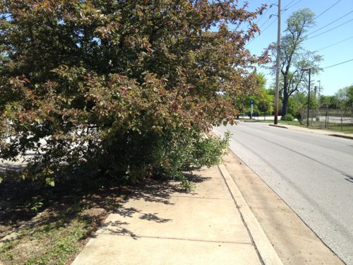
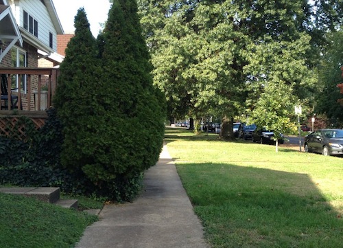
There are many sidewalks that I am unable to use. The reasons vary: no curb cut, broken/rough, etc. But I often encounter another problem: foliage.

ABOVE: Public sidewalk along Loughborough significantly narrowed by overgrown shrubs.

I was able to get past the above just by pushing my way through but a senior walking with a cane, for example, might not be able to get by. Stepping onto the lawn increases the risk of a fall.  This is an odd area since the public sidewalk is so far away from the curb and so close to the houses, but those overgrown shrubs need to go.

ABOVE: I couldn’t get past this growth to reach the #94 MetroBus stop/Wellston MetroLink station, I had to backtrack and take another route.

Keeping tree canopies high enough the average person can walk on the sidewalk without ducking is a good thing. Imagine if roads were similarly blocked with foliage, crews would be dispatched immediately to clear them.

— Steve Patterson


Bike Lane Ends…Start Sharing The Road

October 12, 2012 Bicycling, Featured, Planning & Design Comments Off on Bike Lane Ends…Start Sharing The Road

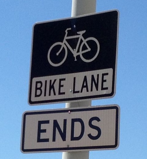
Each year more and more bike lanes are added to roads in St. Louis. Unfortunately, they are often disconnected from each other because they are placed where the road is excessively wide and/or where an alderman was willing to fund the paint and signs.

ABOVE: Sign posted on westbound Lafayette Ave just before Jefferson Ave. Click image to view the Bike St. Louis website.

For years I biked, even commuted 10+ miles to work, without bike lanes. But some like the designated space, I get that. What do they do when the lane ends, turn around? If someone is biking westbound on Lafayette Ave and wants to turn left onto southbound Jefferson Ave will they know how to do so properly? Probably not.

— Steve Patterson


Pedestrian Access To Council Plaza Residential Towers Marginally Improved

Last year I wrote about pedestrian access to the two high rise towers at the Council Plaza complex on Grand (see: Pros & Cons of Saving the 1960s Flying Saucer at Grand & Forest Park).  With the renovation of the saucer the pedestrian access for residents of the two towers has improved…somewhat.

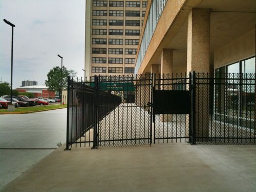
ABOVE: recently added fence cuts off the two east towers to Grand, residents forced into long auto driveway, June 2011

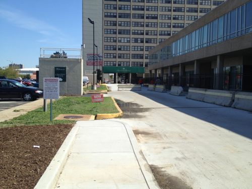
The problem noted last year was the developer fenced off an area around the lower building between the first tower and Grand. This forced residents, many seniors and disabled, to use the long auto driveway. This change reduced access — a clear violation of the ADA.

ABOVE: As part of the Saucer renovation, a new sidewalk was added along the north side of the drive into the Council Plaza complex.
ABOVE: Unfortunately it stops well short of reaching the first tower, much less the 2nd tower.

Hopefully the developer plans to continue this sidewalk as part of a future project. Unfortunately it is not as wide as the sidewalk that got fenced off — two wheelchair users going in the opposite direction couldn’t pass each other.  At this site, that might happen several times a day.

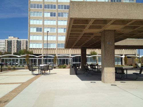
ABOVE: The 2nd tower at the far east end of the site has always been for seniors, it was just renovated.

Access was fine until the fence was installed a year or two ago, and now a narrow sidewalk that doesn’t go far enough is s marginal attempt to fix the problem they created. We need local regulation so seniors and disabled do not have to walk in auto driveways to get home.

— Steve Patterson


Readers: Saucer Impressive; Patterson: Saucer Totally Fails On Pedestrian Access

I had high hopes when it was announced the Saucer on Grand would be renovated rather than razed. Finally an opportunity to improve pedestrian access to what was originally built as a Phillips 66 gas station. I’d watched the construction going on but couldn’t get close enough to see any specifics.

I didn’t rush over on the morning Starbucks opened last week but I was encouraged when I saw a KMOX photo on Facebook with a highly visible blue crosswalk. Encouragement immediately turned to disappointment once I saw it in person.

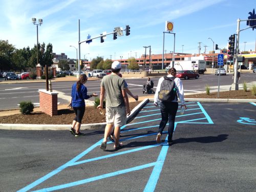
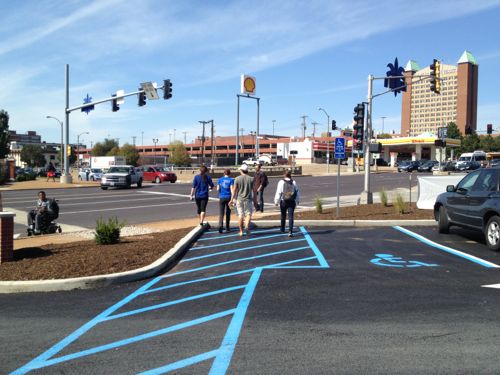
ABOVE: A group of students leaving the Starbucks at the Saucer on opening day. What’s the problem, they’ve got a designated walkway? Note the wheelchair user in the roadway because the public sidewalk still has unpassable areas from the construction.
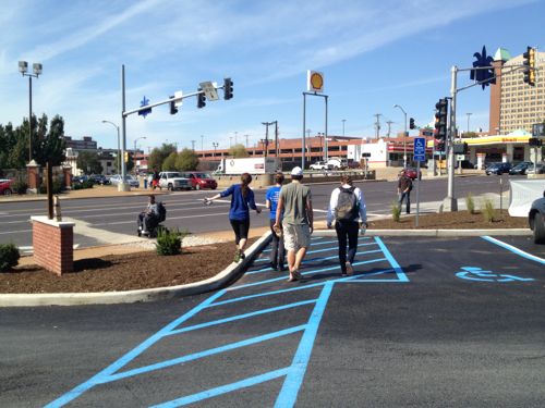
ABOVE: The wheelchair user is further toward the auto exit and the pedestrians are closer to the public sidewalk.
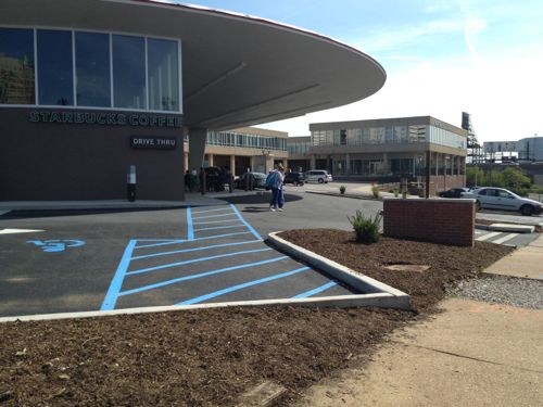
ABOVE: Now it’s clear that blue crosswalk serves a disabled parking only.
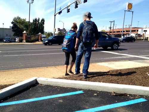
ABOVE: Up close we see these pedestrians using what appears to be a route to the sidewalk along Grand have to step over a newly poured curb and walk through a newly mulched area that’ll presumably have plants.
ABOVE: From the public sideway we can see how short the distance actually is, it would’ve been so simple to have the blue stripped walkway connect to the public sidewalk! Two people stand in the driveway because clear pedestrian space isn’t defined.
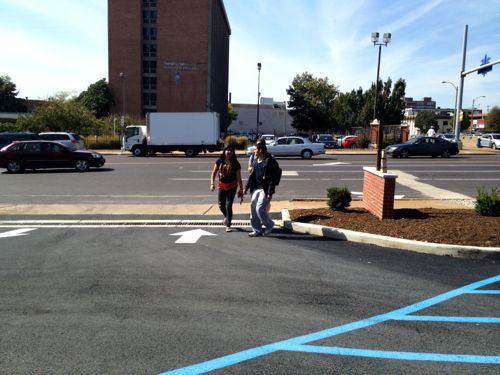
ABOVE: These two decided to walk in through the automobile out lane rather than walk through the mulch. Walking into the path of drivers as they’re just getting their coffee isn’t good, crossing the path perpendicularly in a marked crosswalk is safer.

The Saucer will be a huge draw for students who’ll very likely arrive as pedestrians. Most will come from the north. Others will come from the dorm across the street or from the medical campus to the south. No consideration was given to pedestrian from the west or south and a fix isn’t as simple as to the north.

ABOVE: Students walk over curbs and through mulch, parking & a drive to reach the Saucer.

Yeah but it’s hard to make changes when working with an existing building…except if you recall everything was stripped away from the site except the Saucer’s roof structure!

ABOVE: Fast forward to July 20th of this year and the structure was stripped down to just the saucer roof and the columns

This was poorly planned new site work. New curbs, new asphalt. The perfect chance to acknowledge the bulk of customers will be pedestrians from Saint Louis University.

Here are the results from the poll last week:

Q: Initial Reaction To The Updated Flying Saucer (Formerly Del Taco)?

  1. Impressive 62 [46.62%]
  2. I knew it could be great 48 [36.09%]
  3. I favored demolition but this renovation makes me glad it wasn’t razed 8 [6.02%]
  4. Unsure/no opinion 7 [5.26%]
  5. Other: 5 [3.76%]
  6.  They still should’ve razed it and built a more conventional building 3 [2.26%]

And the other answers:

  1. Good re-use of an old structure…but not mind blowing.
  2. It’s still a fast food joint.
  3. Could have been cool but disparate design elements are hideous.
  4. Meh
  5. Dishonest architecture doesn’t endure on its own merits.

I’m thrilled and disappointed at the same time.

— Steve Patterson


Advertisement


[custom-facebook-feed]

Archives

Categories

Advertisement


Subscribe