“A Good Old Building Is Better Than A Bad New One”
I ran across an interesting commentary on St. Louis:
Except for the arch and the old courthouse, which form some genuinely provocative urban views, downtown St. Louis is a monument to chamber of commerce planning and design. It is a businessman’s dream of redevelopment come true.There are all the faceless, characterless, scaleless symbols of economic regeneration — luxury apartments, hotels, a 50,000 seat stadium and multiple parking garages for 7,400 cars. Sleek, new, prosperous, stolid and dull, well served by superhighways, the buildings are a collection of familiar profit formulas, uninspired in concept, unvarying in scale, unrelated by any standards, principals or subtleties of planning or urban design. They just stand there. They come round, rectangular, singly and in pairs. Pick your standard commercial cliche.
The new St. Louis is a success economically and a failure urbanistically. It has the impersonal gloss of a promotional brochure. A prime example of the modern landscape of urban alienation, it has gained a lot of real estate and lost a historic city.
Wow, pretty harsh words. Tragically they are nearly as true today as the day they were first published — February 4, 1968. Yes, the words above are from nearly forty years ago.

Ada Louise Huxtable, Architecture Critic for the New York Times from 1963 – 1982, had plenty to say about Architecture and planning. I read a compilation of articles called Goodbye History, Hello Hamburger: An Anthology of Architectural Delights and Disasters while I was in architecture school in the late 80’s. Today while boxing up some stuff I ran across the book, long since forgotten. I recall enjoying her writing when I was in college so I look forward to re-reading the book to see how her views have stood up to the test of time and my own personal experiences in the last 15 years.
I’ll leave you with another quote from Huxtable. Remember that in 1968 our symphony hall, Powell Hall, had just opened:
The success of Powell Symphony Hall in St. Louis is probably going to lead a lot of people to a lot of wrong conclusions. In a kind of architectural Gresham’s law, the right thing wrongly interpreted usually has more bad than good results.
The first wrong conclusion is that Powell Hall represents the triumph of traditional over modern architecture. False. The correct conclusion here is that a good old building is better than a bad new one. Powell Hall represents the triumph simply of suitable preservation. And, one might add, of rare good sense.
Ms Huxtable was awarded the first Pulitzer Prize for distinguished criticism in 1970.
– Steve
 The South Broadway bluffs overlooking the Mississippi River in South St. Louis offer some of the most stunning views in the region. Seldom does a week go by that I don’t stop at Bellerive Park and take in the view. The view of Illinois is rural and lush while barges and industry remind me of the long history of the Mississippi as a working river.
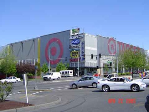

 A closer look in the plaza you can see how plantings have been incorporated into the design to soften the concrete and steel. On my one visit to the building we parked on the top level of the parking garage. Some surface parking is also located behind the building.
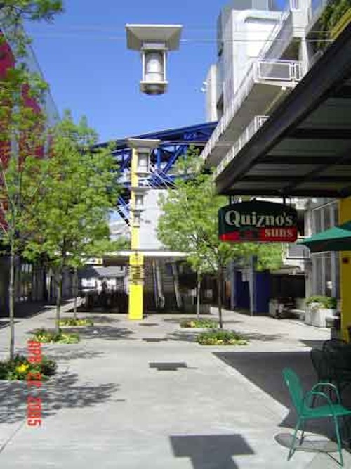 Another view looking into the plaza area.
 Looking from the plaza out toward the main street, with the typical suburban mall across the street.