Home » Central West End » Recent Articles:

More Changes Coming To Central West End Light Rail Station

December 23, 2019 Central West End, Featured, Public Transit Comments Off on More Changes Coming To Central West End Light Rail Station

When our light rail line, MetroLink, opened in July 1993 the Central West End (CWE) station was one of the original.  This was prior to the city vacating Euclid Ave. for vehicular travel. For the next 13 years the station operated with two separate platforms — one for eastbound and one for westbound — with the tracks in the center,

In August 2006 the new Blue Line opened further west.  But the CWE station had been rebuilt from two platforms to one center platform. This reduced elevators from two to one.
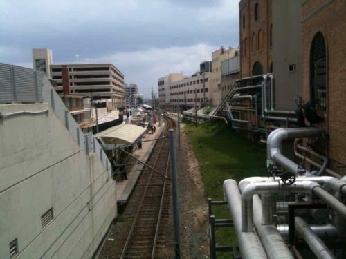
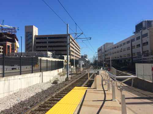
July 2010 looking down on the station from what used to be Euclid Ave on the west.
Looking east toward Taylor from the CWE MetroLink platform, 2014

The station, the busiest in the system, remain largely unchanged until last year when the platform was extended in length. The trains aren’t any longer, but the eastbound trains now stop further east from the stair/elevator. This was done to reduce pedestrian congestion.
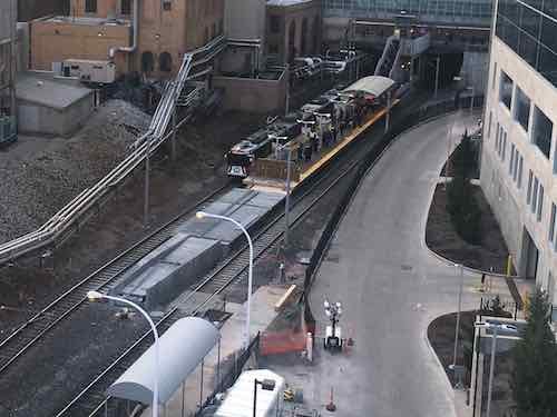
Construction on the platform extension, November 2018.

So what’s changing? From Metro’s December 20th press release:

Station Redesign Details:

  • New, monitored entrance/exit at the street level from Euclid Avenue on the west end of the station featuring a welcome center at the top of the stairs that lead down to the MetroLink platform
  • A new, wider staircase with a center handrail connecting the new Euclid Avenue entrance/exit to the platform to better accommodate passengers
  • Relocating the elevator on the station platform to relieve congestion
  • New, upgraded platform lighting
  • An expanded canopy to cover 70% of the MetroLink platform. The current canopy covers 30% of the MetroLink platform.
  • Safety improvements including a speed bump, stop sign, and new lighting at the entry to the MetroBus area of the garage which connects to the east entrance/exit of the platform.

Construction begins today, the elevator will be closed starting Thursday (12/26/19). When the station was reconfigured in 2006 they should’ve made the platform wider. Hopefully the new station will have a substantially larger elevator — and that a wheelchair user waiting for the elevator won’t block others.

Obviously during the construction those of us that need the elevator will have to use the east end of the platform and enter/exit via the CWE MetroBus Transit Center. Metro’s release indicates other closures may happen throughout the project but that advance notice will be given.  Unfortunately, they did not indicate how long this project will last.

— Steve Patterson
 

Two Urban Medical Campuses Compared: Big Differences Despite Similarities

September 16, 2019 Central West End, Featured, Planning & Design, Travel, Walkability Comments Off on Two Urban Medical Campuses Compared: Big Differences Despite Similarities

I often spend days, weeks, or months thinking about a post before writing it. I’ve been thinking about today’s post for over 5 years now!

It was May 2014 when we first stayed at friend’s newly purchased vacation condo in Chicago’s Streeterville neighborhood — across the street from Northwestern Hospital. Not a wide boulevard either, Erie Street is like most of Chicago’s streets — two drive lanes and two parking lanes.

We experienced the busy sidewalks but also the internal walkway system connecting the campus’ numerous buildings, complete with bridges over roadways. I immediately thought how different it felt from St. Louis’ Washington University Medical Campus (WUMC)/Barnes-Jewish Hospital (BJC).

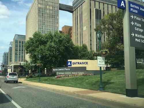
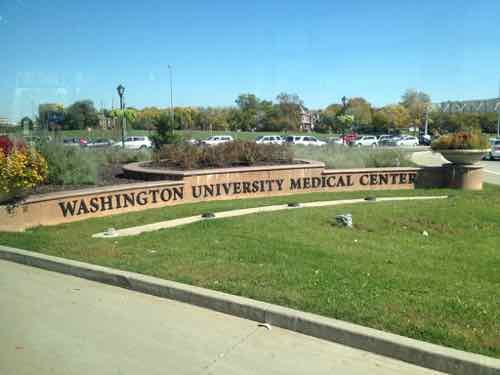
St. Louis’ Washington University Medical Campus is prominently identified along Kingshighway, Forest Park Ave, etc
Points along Kingshighway are now labeled A, B. C, etc…

In the Fall of 2017 I had an unexpected emergency surgery and an overnight stay at BJC, I got to experience the walkway going from the Center for Advanced Medicine to Barnes. Then again the next morning going to the bus transit center. Yes, usually you don’t leave hospitalization via public transit, but that’s how I got there with my power wheelchair and a very broken wrist.

I’ve visited the Northwestern campus numerous times while visiting Chicago and I’ve returned to WUMC/BJC for numerous appointment and to photograph/observe the walkway.  I’m finally in a position to compare observation of the two.

First, the similarities between the two:

  • Were built over decades, slowly expanding.
  • Began life in an affluent neighborhood of gridded streets.
  • Comprised of generic beige buildings, parking garages.
  • Lots of people & cars.
  • Have an internal network to help people navigate from building to building indoors.
  • Have one hard edge (Lake Michigan in Chicago, Forest Park in St. Louis)

Given all the above similarities you’d think the two would function the same. But no, the end results are vastly different! This post will hopefully explain the differences I’ve observed and their impact on each campus and surrounding neighborhoods.

In short, the major differences can be reduced to:

  • Sidewalk level activities: Many of Northwestern’s buildings, especially newer ones, have “active” ground floors — mostly restaurants.
  • Street grid: Northwestern didn’t alter the street grid, WUMC/BJC has decimated the grid.

Let’s start in St. Louis (map):

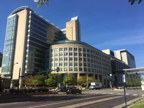
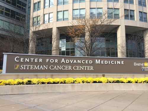
The Center for Advanced Medicine (CAM) building on the SW corner of Forest Park & Euclid avenues is a very busy place
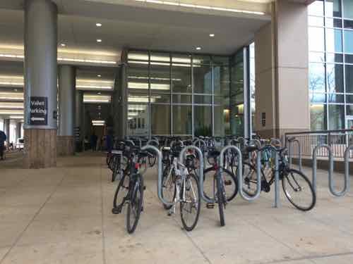
As a pedestrian you can’t enter the building directly off of either major avenue.
Pedestrians have a narrow walk next to the large auto drive to reach the actual entry.
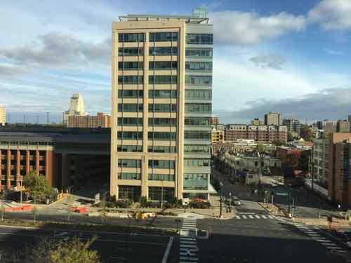
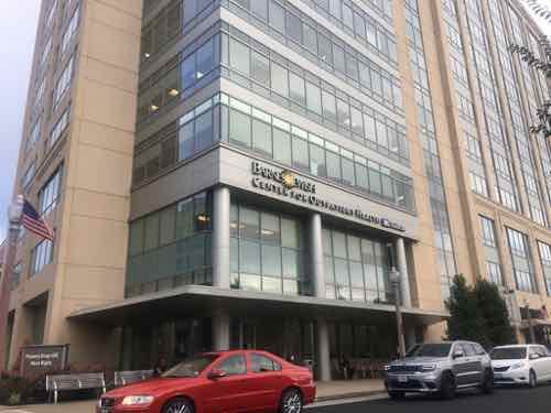
The newer Center for Outpatient Health across Forest Park Ave did not repeat the pedestrian access problem of CAM.
It is built right up to Euclid. An auto drive for patient drop-off is on the back side.
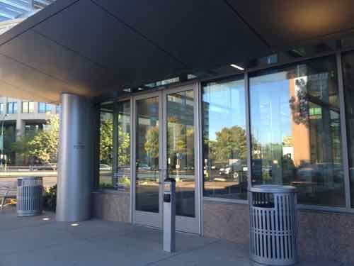
Pedestrians get their own entrance right off the Euclid sidewalk.
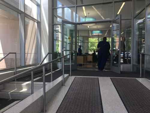
There’s a change of level but the ramp is wide and direct, the steps are narrower and off to the side. Through the windows you can see the automobile drive & patient drop-off entrance.
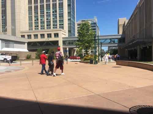
Looking North on what used to be Euclid Ave., the CAM building is on the left.
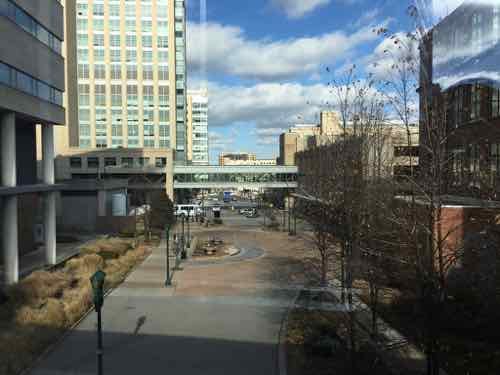
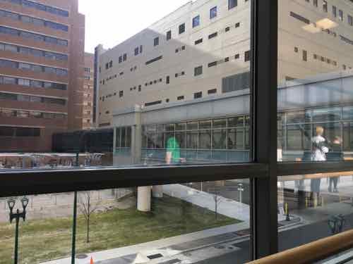
Looking at the closed Euclid from the WUMC/BJC walkway system — called LINK. Entering LINK from CAM is pretty natural, but the rest is convoluted.
Back on the ground for a moment, another closed part of Euclid, the LINK is visible.
In the background is the busiest light rail station in Metro’s system. LINK overlooks it, but they don’t connect.
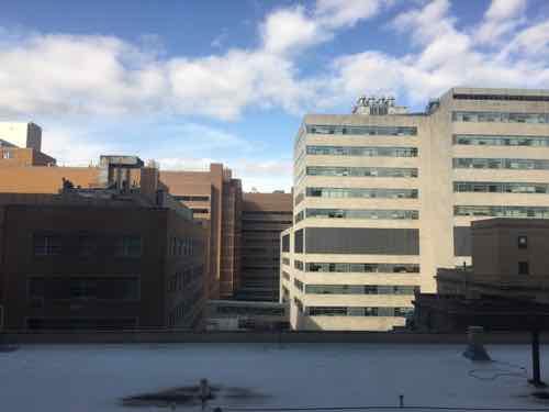
This was the view to the North from my hospital room in November 2017.
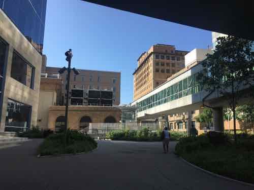
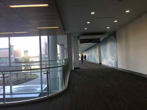
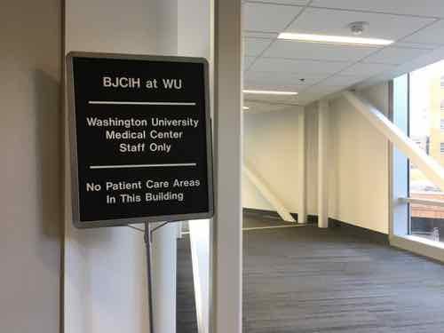
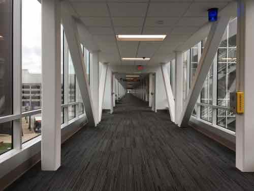
The LINK winds its way around connecting all the buildings.
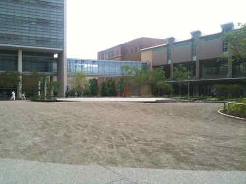
Sometimes it is in a spacious area
There are a few retail outlets, but not many. There was also a tiny Sprint store.
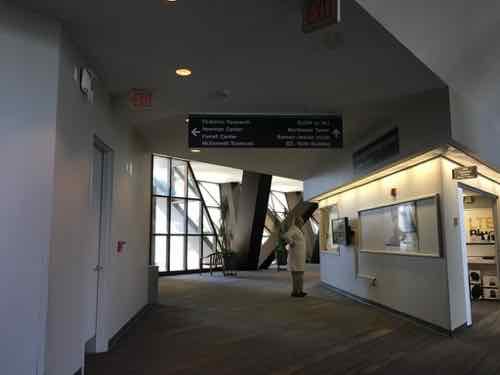
Windows give you a glimpse of where you are.
When I was discharged a nurse had to escort me to Metro’s bus transit center because there is no good public route from the BJC hospital to transit! Her card had to be used a couple of times along the way.
Finally I’m on my way to the bus. This walkway also connects to massive parking garages for staff.
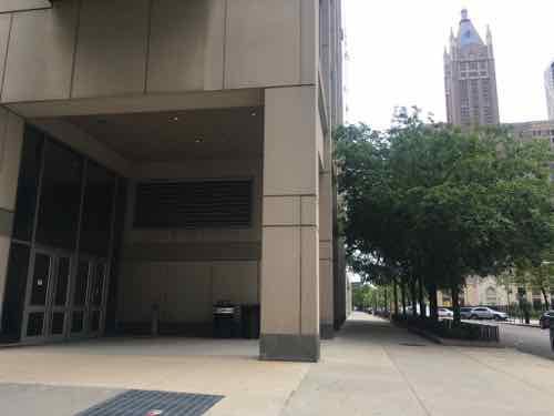
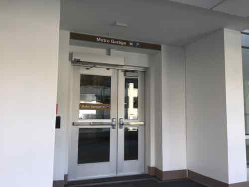
Here we are, the entrance to the garage where the buses converge on the ground level.

Before moving on I should note that I was very pleased with my treatment and all those who took care of me that visit and my other appointments, cataracts surgery, etc.

Okay, now Chicago (map). Starting outside.

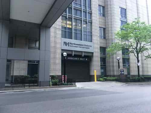
Am ambulance only drive for the emergency department
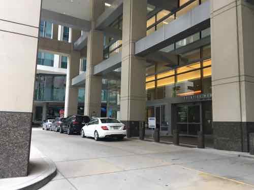
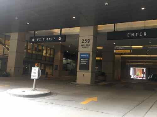
An auto area for the outpatient building next door to where we stay while in Chicago. You can see all the way through to the next block. To the left there are three retail spaces spaces — including on both street corners.
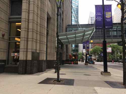
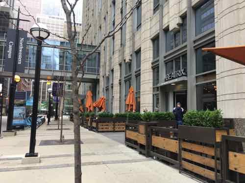
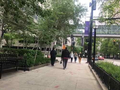
The sidewalks are wide with street trees.
There are some truly awful buildings along some of the sidewalks. No retail, no life.
But old historic buildings, including ones not owned by Northwestern still exist within the street grid.
One of the oldest campus buildings is very attractive — much more so than most everything around it.
Another example of not everything along the sidewalks was interesting. That’s mostly reserved for the corners at intersections.
One of the newest buildings. Being located mid-block it didn’t have any sidewalk retail.
Another older building, not exactly inviting.
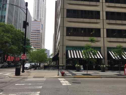
Here is a corner, which is very active.
Another corner
And another corner
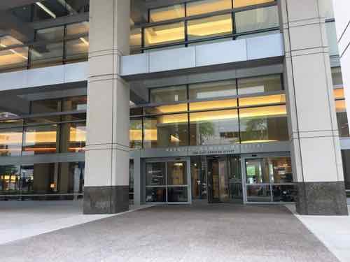
Medical entrance mid-block
Another auto drop-off area
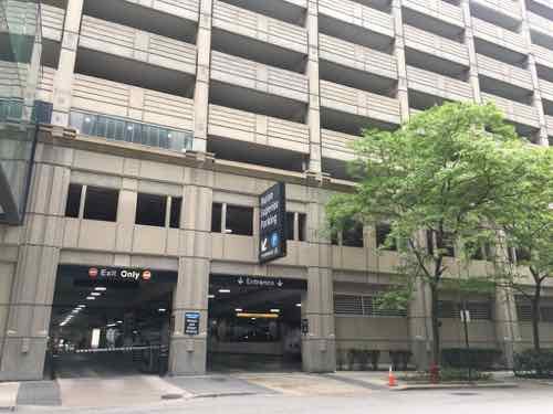
An older parking garage with a mid-block entrance

Now let’s go inside their walkway system.

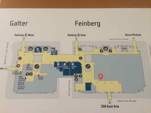
There are numerous maps posted, all showing how to reach the street grid outside and other buildings
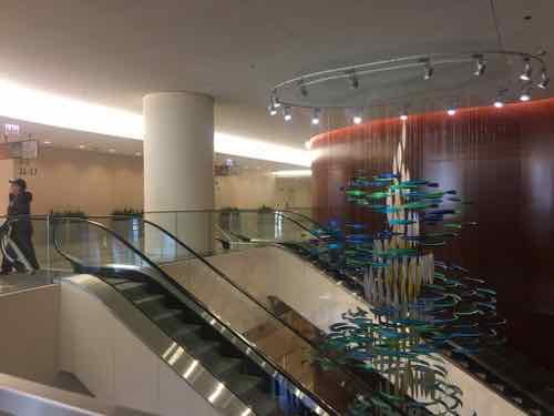
Building lobbies invite you to the walkway system.
An internal intersection in a central building. A couple of food court areas are very close to this point.
One of the newest food court seating areas with lots of seating
There are many different food retailers located along their walkway system, most concentrated in a couple of central areas.
Another restaurant
Their walkways always seen to be busy.

CONCLUSION:

Both medical campuses have good & bad buildings. While Northwestern does a far better job activating corners it is the fact they still have corners that explains why the sidewalks are so full of people. The non-medical public, like us, are able to easily get through the campus on the sidewalks or via the enclosed walkway system. Northwestern’s campus isn’t a monolithic fortress to go around — you can go right through it just like you would elsewhere in Chicago.

I’m firmly convinced the many closed streets within St. Louis’ Washington University Medical Campus are largely responsible for the relative lack of pedestrian activity. Short of reopening the closed streets, I don’t think there’s anything we can do to fix the problem.

There’s a lot more detail I’d hoped to include, but I knew I just had to get this post finished. I might do some followup posts.

— Steve Patterson
 

Our Visit To St. Louis’ Shake Shack

January 29, 2018 Central West End, Featured Comments Off on Our Visit To St. Louis’ Shake Shack

I love trying new restaurants, though I usually wait months to give them time to work out any kinks. However, last month my husband really wanted to try the new Shake Shack that opens on Monday December 11, 2017. No way was I willing to brace the cold on opening day, but that Friday I had a few hours between appointments at the Center for Advanced Medicine. That day my husband, a home health aide, would finish with his morning client at 10:30am and had the rest of the day off.

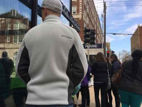
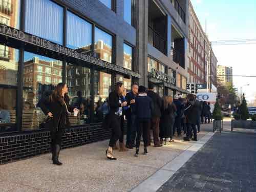
We agreed to meet at Shake Shack for lunch, the first to arrive would get in line.We’d discussed where my husband would park beforehand, both agreeing the Argyle Garage a block North would be the easiest. My first appointment ran longer than expected, though I enjoyed seeing the X-ray of all the metal hardware in my left wrist. The line was around the corner from the Euclid entrance, so on the Pine sidewalk.

11:03am we’re in line.
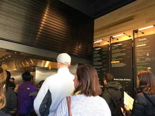
11:20 we’re in the door, the line now split into 2. I think we got into the slower of the 2. Just glad to be inside where it’s warm.
11:32am: While my husband fished up our order and paid, I went and found a table. I usually like leaving my wheelchair in a corner and sitting in a regular chair, there was no empty space anywhere. A nice person moved to a different table so I could roll up to a 2-seater. It seemed noteworthy the table tops were made from old bowling lanes, which got me thinking about the numerous lanes razed in my 27+ years in St. Louis.
11:39am: my husband returns with our food after the buzzer went off
My Shroom burger looks good — it was excellent
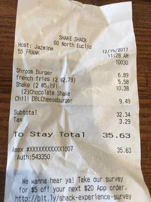
Our lunch was quick & delicious, but $35+? Ouch!
12:05pm: When ew left the line was still around the corner on Pine. In warmer weather they’ll have outdoor seating in the dark area on the right.
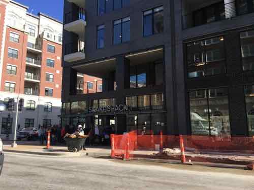
The Euclid view with work still being done on the sidewalk and building. While we were eating the building’s fire alarm went off, which can happen during construction.

Before visiting Shake Shack I argued it was kinda a big deal. Even though I don’t see us going back anytime soon because of the high cost, I still think it’s a big deal. A restaurant from an international chain in a mixed-use building with no parking lot is a very good thing.

The weekend before we did our annual December visit to Crown Candy Kitchen — another place where you have to wait in line — for a table. We each had a sandwich with a huge shake — our bill with tax and 20% tip was $28. Our eating out budget isn’t big, so I’d rather patronize places where I know the owner than one I can buy stock in.

I’d like to see more local places learn from the big guys:

  • List calories on their menu
  • Have smartphone apps to place to-go orders
  • Though I like servers, consider the order first model. Yes, local places like Porano Pasta do this.

We may return to Shake Shack this Spring or Summer so we can enjoy our expensive meal outdoors while people watching. Perhaps in the evening so I don’t feel as bad about spending nearly $35.

— Steve Patterson
 

Opinion: Shake Shack Kinda A Big Deal For St. Louis (UPDATED)

December 6, 2017 Central West End, Featured Comments Off on Opinion: Shake Shack Kinda A Big Deal For St. Louis (UPDATED)

The origins of Shake Shack were hummbl;e…a cart. From their website:

Shake Shack sprouted from a hot dog cart in Madison Square Park in Manhattan to support the Madison Square Park Conservancy’s first art installation. The cart was quite the success, with Shack fans lined up daily for three summers.

In 2004, a permanent kiosk opened in the park: Shake Shack was born. This modern day “roadside” burger stand serves up the most delicious burgers, hot dogs, frozen custard, shakes, beer, wine and more. An instant neighborhood fixture, Shake Shack welcomed people from all over the city, country and world who gathered together to enjoy fresh, simple, high-quality versions of the classics in a majestic setting. The rest, as they say, is burger history.

Founder Danny Meyer is originally from the St. Louis region. Meyer founded Shake Shack in 2004, but he was well-established in NYC by that point.

The fancy-casual flagship of Danny Meyer’s empire, opened in 1985—which led the way for a hit parade of restaurants including Gramercy Tavern, the Modern, Blue Smoke, North End Grill, Untitled, Shake Shack, and, for a time, Eleven Madison Park—closed at the end of 2015, because of an untenable rent hike, with a promise to reopen within a year. Meyer is nothing if not trustworthy. In December [2016], the U.S.C. revamp débuted in the old City Crab space, still close enough to the greenmarket to stock up on winter rutabagas and retain its farm-to-table ethos, an idea it pioneered. (The New Yorker)

Meyer has built a huge culinary empire, survived in the highly-competative casual dining marketplace. From 2015:, Compared to its peers, Shake Shack has a much higher P/E ratio than the average of 32, but because Shake Shack is growing rapidly through expansion and is still a new company, the company’s earnings may yet rise in the future to bring the P/E in line with the industry. The relatively low profit margins and return on equity might also be attributed to its rapid expansion. On the other hand, it might point to the company trying to grow too much too quickly for its own good. (Investopedia)

St. Louis now joins cities that have a Shake Shack. There’s the usual suspects like NYC, Chicago, LA, and Dallas. Ahead of us were cities like Lexington (KY), Detroit, and San Antonio. Some bigger regions don’t have a Shake Shack yet: Seattle, Portland, and Denver.

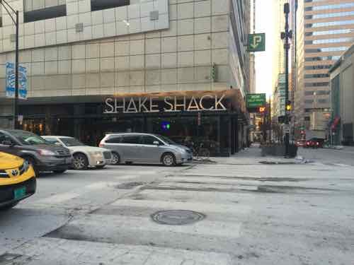
I’ve never been to a Shake Shack before, though we’ve passed by one a block West of Chicago’s Michigan Ave numerous times.

Shake Shack just West of Michigan Ave, Chicago

I recently told my husband we could go next year…he wants to try it this year…so we’ll brave the lines in the next few weeks. St. Louis’ Shake Shack is located at 32 N Euclid, in The Euclid building.

From the recent non-scientific Sunday Poll;

Q: Agree or disagree: Shake Shack opening in St. Louis is no big deal, we have plenty of burger & shake joints already.

  • Strongly agree 6 [16.22%]
  • Agree 7 [18.92%]
  • Somewhat agree 8 [21.62%]
  • Neither agree or disagree 4 [10.81%]
  • Somewhat disagree 4 [10.81%]
  • Disagree 6 [16.22%]
  • Strongly disagree 1 [2.7%]
  • Unsure/No Answer 1 -2.7%]

We’ll see if it lives up to the hype. I’m looking forward to trying their ‘Shroom Burger (“Crisp-fried portobello mushroom filled with melted muenster and cheddar cheeses, topped with lettuce, tomato, ShackSauce™”)

— Steve Patterson
Note: This post was updated at 7:45am on 12/6/2017 to correct location information.


Readers: New CWE Apartment Project Isn’t Too Much Density

July 12, 2017 Central West End, Featured, Planning & Design Comments Off on Readers: New CWE Apartment Project Isn’t Too Much Density

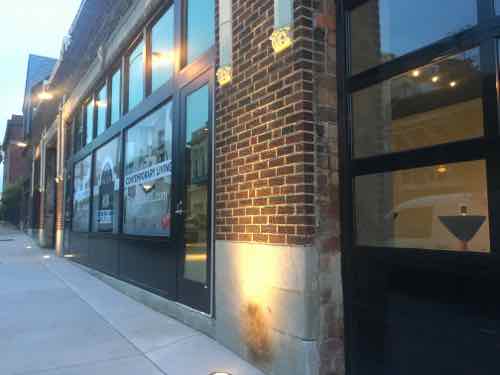
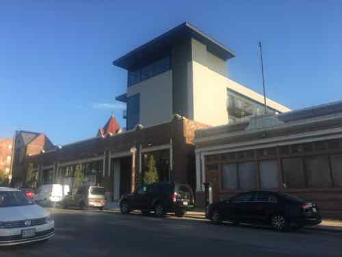
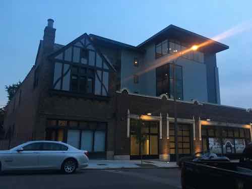
In the non-scientific Sunday Poll, an overwhelming majority of those who voted felt a new project wasn’t adding too much density. I agree. Much greater density would’ve been good too, but the number of units was limited by the amount of parking that could fit into the former 1-story warehouse. I applaud the developers for leaving a small storefront space along the street.

Along the public sidewalk you have no sense that a tower emerges from within.


The Milton is located at 4534 Olive.

Here are the poll results, the response was slightly higher than in recent weeks.

Q: Agree or disagree: Adding a 4-story tower w/30 apts to a 1-story warehouse is just too much density.

  • Strongly agree 2 [4.08%]
  • Agree 1 [2.04%]
  • Somewhat agree 0 [0%]
  • Neither agree or disagree 1 [2.04%]
  • Somewhat disagree 3 [6.12%]
  • Disagree 10 [20.41%]
  • Strongly disagree 30 [61.22%]
  • Unsure/No Answer 2 [4.08%]

I’m curious about the few that do think it’s too much density.

From across Olive the tower is obvious.
Different angle
Another
With the tower set back from the front, the roof becomes common outdoor space for residents
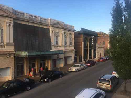
You can easily see Olive when looking over the front parapet.

While I’m glad the front faced was reused, and I like modern contrasting with old — there’s something just not quite right about the new tower. It’s not displeasing, just not outstanding. Proportions and detailing — or lack of perhaps?

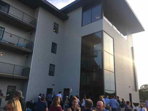
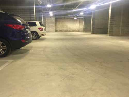
Opening night I entered unto the parking garage area, lots of concrete block walls to support the structure above. Pretty straightforward.

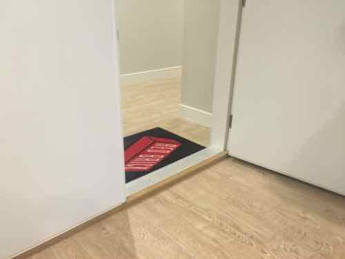
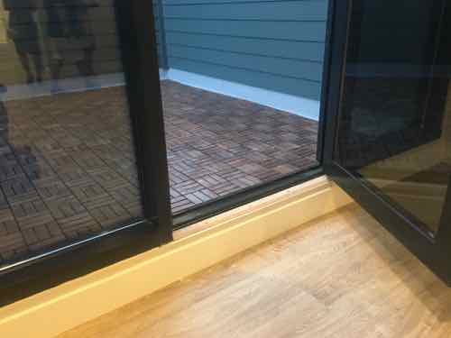
There were two interior details that were a miss — thresholds at each unit and out to each balcony.

The wrong interior threshold was used — both sides should have a beveled edge — these are a trip hazard or a major pain in a wheelchair.
And the huge step over to the outside is another area where these fall short. Try carrying a tray of drinks to guests with this tall step over.

So it’s not a perfect project, but it is a good example of how to retain a nice old facade while adding living space. In the next 5-20 years as fewer people own cars hopefully we’ll see less space & expense to accommodate car storage in new projects.

— Steve Patterson
 

Advertisement


[custom-facebook-feed]

Archives

Categories

Advertisement


Subscribe