Home » Planning & Design » Recent Articles:

Most Readers Keen On Sunken Public Spaces, But Many Not
img_0963
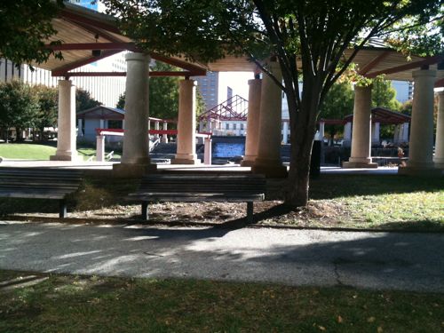
ABOVE: sunken amphitheater at Kiener Plaza

Readers like the changes of level offered by sunken spaces, here are the results from last week’s poll:

Q: How do you feel about sunken public spaces like the May Amphitheater?

  1. I like the change of levels. 62 [52.1%]
  2. Not good, it is hard to see activity going on. 36 [30.25%]
  3. Unsure/no opinion 12 [10.08%]
  4. Other answer… 9 [7.56%]

The other answers were:

  • I don’t care for them; they are just plain ulgy!
  • Ok for certain uses, like an amphitheatre, but not really a good idea otherwise
  • Not sure, this needs a refresh on its look.
  • great for events like Macy’s Holiday Celebration
  • Doesn’t work unless their is natural contours to work with
  • Nice to have elevations as long as one elevation feeds to street level
  • It depends on context
  • It makes a great place to skateboard.
  • Love em, they draw my attention right to em
img_0984
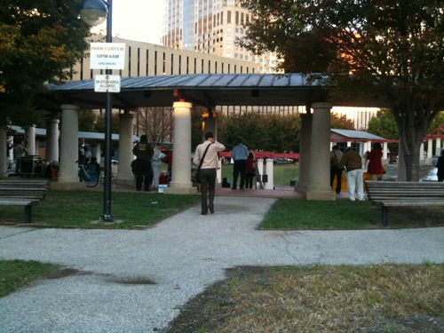
ABOVE: sunken amphitheater at Kiener Plaza during an anti Prop A rally

So you can see people around the edge during an event but you have no clue how many are inside.
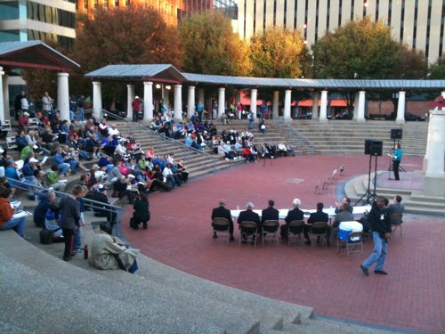
img_0983From the outside you can’t see the stage or get any sense of the activity happening within.  Some changes of level, such as at Citygarden, is good but  a hidden hole is bad.

– Steve Patterson
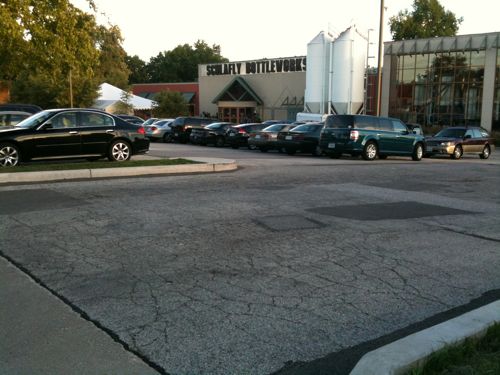
 

The Schlafly Bottleworks Lacks Pedestrian Route To Front Door

img_0282
ABOVE: One of two automobile entrances at Bottleworks with the entrance in the background

Twice now I have visited Schlafly’s Bottleworks in Maplewood (map) using public transit. Being disabled, I arrived at the site in my power wheelchair after departing the bus. The issue of access is the same for the able-bodied using transit or by walking from the surrounding area.

While it is great Schlafly reused an old grocery store building it is unfortunate their architect/engineer didn’t include a walkway to connect to the public sidewalk on Southwest.  During the $5 million construction work, in 2003, a patio was added out front and the parking lot was reconfigured. It is at this time that a walkway should have been added to connect the public sidewalk to the front door.

img_0283
ABOVE: pedestrians can see, but not reach, the front door from the sidewalk

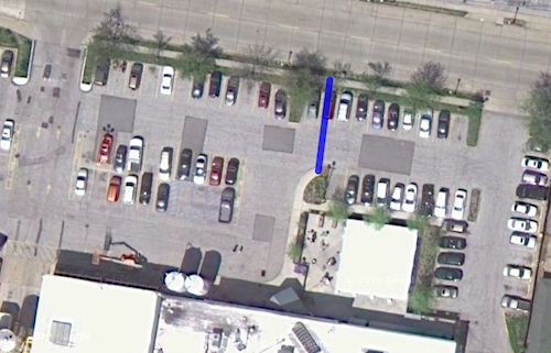
As you can see from the above photo the distance to reach the walk next to the patio just isn’t that great. From an aerial view it looks like this:

bottleworksaerial
ABOVE: the blue line represents the short path to connect to the public sidewalk

The amount of effort that would have been required, at the time the work was done, would have been minimal.  Even today the effort isn’t much, including the loss of one auto parking space.

Hopefully Schlafly’s will see fit to correct their pedestrian access deficiency. Based on my conversation with the manager last night I think they will.

– Steve Patterson


Accessible Not The Same As Walkable

Walkability & accessibility are two subjects that are important to me. Ideally places would be both walkable & accessible, but that is rare.  The minimum, for me, is accessible.  But being accessible, ADA-compliant, isn’t remotely close to being walkable.

ABOVE: Downtown Belleville is an example of walkable with narrow streets and buildings up against the sidewalks.  Main St is also accessible.
ABOVE: Downtown Belleville IL is an example of walkable with narrow streets and buildings up against the sidewalks. Main St is also accessible.

Walkable, in my mind, requires active tree-lined streets with generous sidewalks.  In residential areas the buildings may be set back a bit from the sidewalk, but not too much.  Someone on the sidewalk should be able to converse with someone on a front porch.  Residential sidewalks should connect to a nearby commercial area no more than 1/4 mile away.  The commercial district will have a variety of adjacent buildings all fronting onto the public sidewalk.  Building fronts shall mostly be glass windows & doors, not blank walls.  Public transit is available in walkable areas.

Accessible, in my mind, means a disabled person can navigate the area.  This includes someone in a wheelchair as well as deaf or low vision/blind persons.

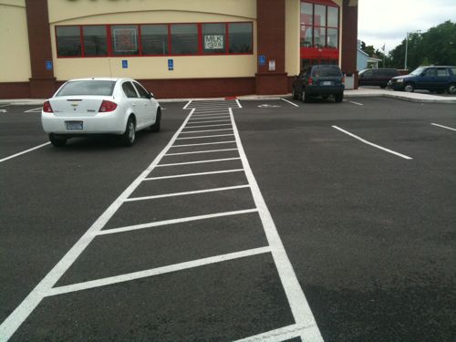
ABOVE: ADA-compliant access route to CVS at Gravois & Hampton/Germania
ABOVE: ADA-compliant access route to Arby's on Lindell

The CVS and Arby’s are both accessible but neither is walkable.  Yes, someone can walk there along the accessible route but neither contributes to a walkable environment.

I reluctantly accept that not everyplace is going to be built walkable but I refuse to accept anyplace not being accessible from the public sidewalk adjacent to the property.

ABOVE: short-lived Starbucks in Soulard is neither walkable nor accessible
ABOVE: short-lived Starbuck's in Soulard is neither walkable nor accessible

The Starbuck’s, above, closed after being open less than a year.   It was drivable, but not walkable or accessible.

– Steve Patterson


The Galleria Revisited

On October 11th I posted Reaching The Galleria Not Easy For Pedestrians and noted the accessible route let to the one entrance that didn’t have automatic doors.

img_0310
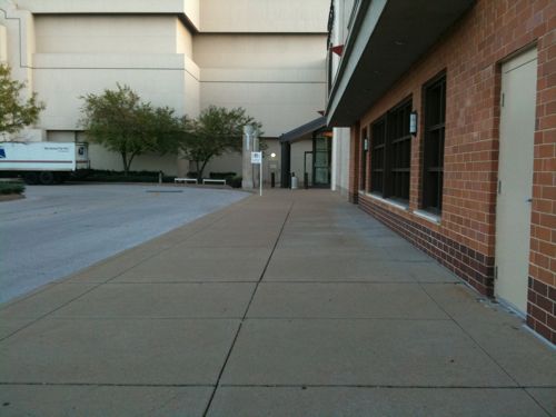
ABOVE: The entrance directly inline with the access route from post on the 11th

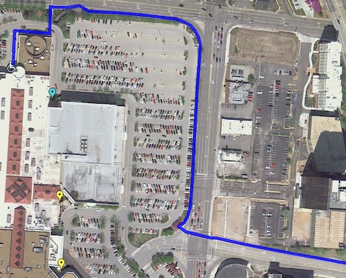
I wrote: “On my next visit I will see if I can go around the former Mark Shale space to reach the entry by Restoration Hardware.” I visited again on Wednesday and discovered I could reach an entrance with automatic doors.

img_0845

img_0846More distance but hey I’ve traveled a long way already.

ABOVE: Blue line represents my path from the nearby light rail station

So I can access the mall without working my way through the parking lot or struggling with a manual door.  But nobody should have to travel that far to reach an accessible entrance.  The Galleria needs to look at building some new structures between Brentwood Blvd and the mall, aligned with the Galleria Parkway that leads to the transit station.

– Steve Patterson


Pedestrian Improvements At Utah Place & Gustine Ave

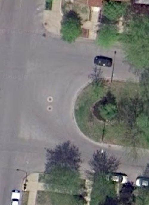
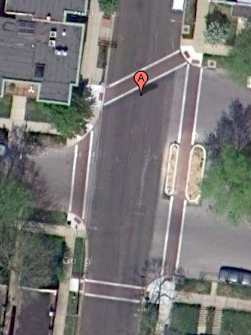
I recently noticed some pedestrian improvements at Utah Place & Gustine Ave.  To note the changes we need to look at a similar intersection, Utah Place & Spring Ave:

utahspring
ABOVE: Utah Pl & Spring, pedestrians are exposed when crossing Utah Pl
utahgustine
ABOVE: Utah Pl & Spring, pedestrians now have a refuge when crossing Utah Pl
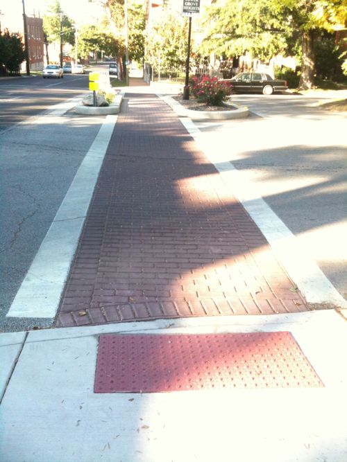
img_0544
ABOVE: Looking north across Utah Pl
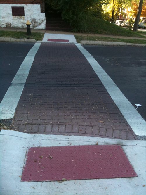
img_0543
ABOVE: Looking west across Gustine Ave, note the detectable warnings point in the direction a blind person should walk
img_0542
ABOVE: SE corner of Gustine & Utah with ramps/detectable warnings pointing in the right direction.

Scroll up and look at the aerial again, the ramps on west side of Gustine crossing Utah point into the center of the intersection, not at the crosswalk.  These new improvements are a step in the right direction, but not without flaws.

– Steve Patterson


Advertisement


[custom-facebook-feed]

Archives

Categories

Advertisement


Subscribe