Home » Suburban Sprawl » Recent Articles:

Predictable and Anti-Urban Loughborough Commons Has Begun

Demolition work has begun on the site of the new “Loughborough Commons” at Loughborough & I-55 in South St. Louis (map). It will continue to Loughborough and Grand but it is the all mighty highway that sprawl developments cater to. I talked about this development before in a post from January 25th.

Before the sprawl apologists comment that we need development and progress let me say that I agree. We cannot simply say nothing is ever going to change. Cities change, I accept that. It is the type of change I have issues with. To call this development or any of its kind “progressive” is highly laughable.

This development is the least progressive way to redo this site!

What we are getting in the name of progress is a couple of big boxes which ignore the neighborhood and cater to the highway crowd. How is this progress? This is what suburban sprawl is all about. We’ve seen this same thing being built in every American city over the last 50 years. Making the City of St. Louis look more like Fenton or St. Peters is destructive in the long term.

St. Louis’ best assets are our architecture and street grid!

… Continue Reading


McDonalds May Move Across Grand to Former Sears Site

A few years ago now the old Sears store on S. Grand near Chippewa became a pile of rubble. The massive parking lot to become new in-fill housing in a development known as Keystone Place by Pyramid Construction.

keystone_02.jpg

Fast forward today and you see more vacant lots than new houses. The city’s website says that as of August 2003 12 out of a possible 27 have been sold. But, the purpose of this post is not to critique what when wrong at this site. i’ll have to save those thoughts for another day. This post is to tell you that word on the street is McDonald’s located at the NW corner of Grand & Chippewa may move to the old Sears site at the SE corner of Grand & Winnebego.

I’m thinking if I really wanted to kick start sales of the home lots backing to this vacant parcel the very last thing I’d put there would be a McDonald’s complete with bright lights and fumes from cars in the drive-thru lane.

Alderwoman Jennifer Florida inherited the Keystone Place during redistricting a few years ago. Nothing seems to have changed.


keystone_01.jpg

A new McDonald’s combined with the windowless International Institute will really liven up this part of Grand – not. Why they didn’t add any windows during their renovation and, I don’t know, place an entrance on the public side of the building? I have no clue what they were thinking. The Blockbuster with front parking and Aldi across the street certainly don’t help the area.


keystone_03.jpg

The current McDonald’s isn’t exactly an asset. The parking lot takes up the corner and the extra wide street with right turn lane makes crossing Grand by foot a major chore. Access to the drive-thru lane is off Chippewa and a hassle for most. I can see why McDonald’s would want a better location.


keystone_04.jpg

So why put the McDonald’s here – on the SE corner of Grand & Chippewa on the corner of what was a former National grocery store? It is already a dreadful corner so the McDonald’s won’t make it any worse. That leaves the old Sears site a block North vacant for something more urban – with a building up to the street and any parking behind.

– Steve


Loughborough Commons will be Common indeed!

Desco’s proposed Loughborough Commons is a case study in thinking only about the box and certainly not outside the box. Tonight’s public meeting had some pretense of a public input forum but in reality it was a ‘here is the generic strip center we are giving you let us know what color flowers you want planted under the monument sign’ type of meeting.

Prior to the meeting I had a chance to speak with Alderman Matt Villa as well as an representative from the engineering firm and Desco. First let me say that I like Matt. We are close in age and I’m personal friends with his wife’s sister and her husband. But, any association with someone on a personal level can’t an excuse for keeping silent on a bad proposal. To Villa and the engineer I raised concerns about connecting the public sidewalks to the development. The woman, I believe her name was Denise Coleman (she didn’t offer a card), said at this scale they couldn’t show sidewalks but they be there. Hmmm… [Note 8/31/06: Her name is Dennice Kowelman]

loughborough_01.jpg

At right is the overall site plan for the proposed project. Loughborough is on the far right and is the Northern boundary of the project. To the bottom (East) is the railroad line and I-55. The top of the picture is Grand. For those of you that know the Grand Blvd which goes all the way from North St. Louis to Carondelet Park this Grand is much different – it is residential street. The part of the site on the left is the old Nordyne site.

Apparently in the last year Nordyne just closed up shop and moved out of the area – not bothering to tell the city they were leaving. Nice. Villa says it was a call from Desco that alerted him to the fact Nordyne was selling the property.

The upper right corner of the site plan – marked Outparcel A is where 18 single family homes now sit. With room enough for three out parcels, 50,000sf of additional retail and more parking than is required by the city I just don’t get why they need to take the existing homes. Two answers are most apparent. One is the home owners, if left, would hate backing up to such a boring big box development and second developer wants maximum exposure. Houses along Loughborough will block the view of the side of the Schnuck’s store. With the houses gone and some sort of typical fast food establishment on the corner people passing by will quickly realize this isn’t a pleasant residential neighborhood but a boring strip center.


… Continue Reading


THF Realty sprawls big box development over region

November 17, 2004 Big Box, St. Louis County, Suburban Sprawl, THF Realty Watch Comments Off on THF Realty sprawls big box development over region
From a recent Deb Peterson column in the Post-Distpach:
BUSINESS PER USUAL: THF Realty took the acronym out of its name and put the words back in – To Have Fun – at the company’s annual meeting Thursday night at the St. Louis Zoo’s Living World. About 300 people – including 100 employees and 200 business partners – listened and danced to rock ‘n’ roll Hall of Famer Johnnie Johnson. The revelers were toasting THF for being recognized as the fastest-growing privately held developer in the country. 

The Post-Disptach reported a few days ago that THF is seeking TIF financing for a project in Arnold. In the way is a VFW Hall. Municipalities across the region are doing whatever they can to increase their budgets. Unfortunately, many seek auto-centric big box developments.


So who is this THF Realty and is big box so bad? THF Realty is a privately held developer responsible for projects in nearly 20 states. Many of these include either a Wal-Mart, Sam’s or Lowes. Given that Wal-Mart is the largest retailer in the US this is hardly a surprise right? But it isn’t really a coincidence. The chairman of privately owned THF Realty is Wal-Mart heir Stanley Kroenke. The THF website bio of Kroenke says he is a member of Wal-Mart’s board but a check of that site does not list him.

Wal-Mart is pro sprawl and therefore anti-urban.

Maplewood has been doing everything it can to take in more tax revenue – at the expense of its once-charming urbanity. The new Shop-N-Save grocery store along Manchester road subtracts from the charming main street buildings across the street. Their latest attempt to destroy their city is a massive suburban center along Hanley. Two of the three boxes are complete – Wal-Mart and Sam’s. The third, a Lowe’s Home Improvement is still being constructed. All three are Wal-Mart owned stores.

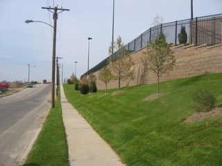
The picture below is the view a pedestrian has as they leave the remaining neighborhood and walk toward the development. I think the highline wires will be removed once the project is complete so I am not faulting those. However, those are the only thing that separate a pedestrian from passing cars. While the grass may be green and the shrubs attractive this is not a pedestrian-friendly environment. You’ve got a massive retaining wall to one side and cars flying past you on the other. You have no shade because street trees are not being planted around this project. People walk when they have something engaging to look at but here it is plainness all the way to the entry.

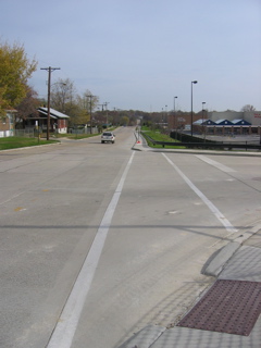
Below is a picture from the side street on the North edge of the development. In the far left you can see the residential houses adjacent to this super-sized project. Facing the pedestrian is the cross walk from the street into the development. The distance to cross this entry is far greater than crossing the actual street! The generous radius of the entrance is designed to keep the cars moving in and out at great speeds – never mind the safety of pedestrians crossing the drive.
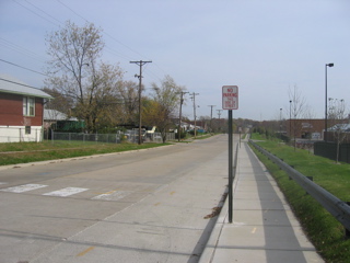
Continuing down the same road (see below) we see the sidewalk is pushed up against the curb. Funny how a project with over 30 acres can’t afford a 3ft strip to plan trees. The side of the street adjacent to the development is now marked as ‘No Parking.’ Not that anyone going to Wal-Mart is going to park on the street and walk through the holiday season sized parking lot anyway. But, if I lived in a house across the street it might be nice if guests could park on the street. A row of parked cars would give pedestrians a greater sense of safety.
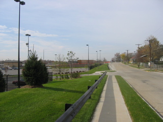
And finally we get to the point adjacent to the side of the Wal-Mart, the side with the automotive center and greenhouse. Changes in grade mean the home owners next door are not subjected to the sight of all the cars. Unfortunately they are subjected to the massive parking lot lights. This part of the street actually has good separation of the sidewalk from the street but the landscaping is done and street trees are not important. Street parking is prohibited.
I measured the width of the street at this point which is narrower than it is closer to Hanley. The street is 30ft wide – more than sufficient for parking on both sides. Just allowing street parking could have reduced some of the parking lot size. Many other cities have adopted guidelines for streets - click here to view.

But my going on about THF’s development not being pedestrian friendly is really a waste of time. It’s a fucking big box development – it isn’t supposed to be pedestrian friendly. You are supposed to drive there – even if you live a block away. They want you to drive a big SUV so you can buy lots of cheap goods. Like you are going to walk to Sam’s and carry back a 3-gallon tub of mayo?

The THF website says it best:

“When we drive down the street, we do not only see what is in front of us…we see the future.

We see growing communities where none exist. We imagine innovative ways to attract businesses that will invest in building successful operations in new communities. We see economic growth that attracts new residents, and results in new homes, new schools and new playgrounds.

When we drive down the street, we see much more than the potential for a new shopping center. We see – and build – developments that become the economic engine of the community.

Our projects turn out the way they do not just because we dream bigger or brighter. Our developments are successful because we have built a unique organization focused on consistently delivering a signature product. How? By executing better than everyone else.”

Wow, when we drive down the street. What about when we walk to the corner store? When we bike to the library? Nope. When we DRIVE. They see communities where none exist – aka sprawl. They see a world of continued sprawl that puts work, home, school and leisure in an auto-centric world that is the “economic engine of the community.” And when the fuel prices skyrocket these communities will come crashing down first.

Most of the region is so auto based I don’t know if it matters that THF wants to raze a VFW Hall in Arnold. But, the City of St. Louis is still quite urban in design so I ask that Kroenke/THF not try to help us out. Mr. Kroenke, we don’t need what THF has to offer.

Related Sites to visit:
• Sprawl-Busters
• Wal-Mart Watch
• Sprawl Watch
• Natural Resources Defense Council
• Smart Growth
• Congress for the New Urbanism
• New Urban News (free subscription with membership in CNU!)

Steve


I’m not picking on Brentwood. Really, I’m not.

November 10, 2004 Accessibility, Planning & Design, Plazas, St. Louis County, Suburban Sprawl Comments Off on I’m not picking on Brentwood. Really, I’m not.

This past Saturday (November 6th) I wrote about my dismay with the lack of pedestrian connection between Brentwood Promenade (Target/Trader Joe’s) and Brentwood Square (Whole Foods, REI, etc…). Less than a week later I look a bit closer at one part of Brentwood Square – the Bread Company.

In the interest of full disclosure I am a small shareholder of Panera (PNRA), the owner of the St. Louis Bread Co restaurants. OK, I’ve gotten that out of the way now I can bash the lack of connection to the surrounding neighborhoods.

For the record, Pace Properties is the developer/owner of Brentwood Square. Pace’s web site says, “The central location of Brentwood Square gives retailers an opportunity to access this highly desirable trade area – an area with density and wealth that is unmatched in the St. Louis market.” Density? Uh, OK. Compared to St. Peters maybe?!?

As a strip mall goes I actually like the building design of Brentwood Square. In a future blog entry I will go into more detail but I basically like the fact each store has a distinct look and size. Some stores are two stories tall while others are one story. This is closer to what a traditional main street would have looked like. But my like for the project stops there.

This entry focuses solely on pedestrian access from Brentwood to the Breadco. The picture below is looking North on Brentwood Blvd near the Breadco. In the background you can see two office buildings and new high-end apartments/condos. The question is how do you get from there to the restaurant for your pick two at lunch?
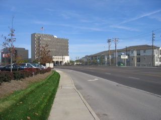
The closest pedestrian crossing for the above offices and apartments/condos is the main entrance two Brentwood Square. Granted you are crossing roughly 6 wide lanes of traffic which isn’t exactly conducive to walking. Let’s assume you don’t want to get your car out of the parking garage to drive across the street you decide to venture across Brentwood.

So you start walking down the sidewalk adjacent to Brentwood right? Maybe not. The sidewalk is not wide enough for you to walk side by side with your coworker. You are also next to traffic going at very high speeds so you don’t exactly feel safe. Walking on a good urban sidewalk you’ve got a row of street trees and a row of parked cars to separate you from the traffic. Not here. You are only a few feet away from a two ton SUV going 40mph.

But for sake of argument let’s say you take the risks and walk on the sidewalk along Brentwood. The picture below shows that you’ve got the Breadco in sight and you can taste that yummy soup and half sandwich (remember, I’m a share holder. Forget all about that low carb diet and go to Breadco).
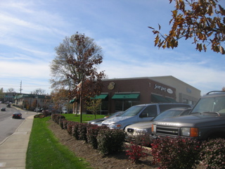
But wait, how do I as a pedestrian get from the sidewalk to the front door of Breadco? The front door is on the right side of the building hidden from view by the silver minivan. The Kinko’s location is the buff brick building behind the Breadco in the background.
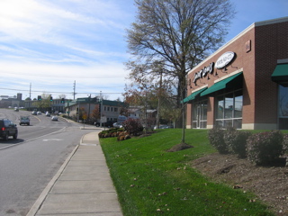
You keep walking because you can’t image the developer &/or city has all this public sidewalk and no way to get to the private area without walking over lawn and shrubs. You keep walking following the sidewalk. Oh look, there is the back of the Kinko’s store. You keep walking and eventually you’ve walked all the way around the Kinko’s store. So, the front door you could see from the public sidewalk is only accessible via sidewalk by going all the way around both buildings. Most folks would just walk through the grass and not think anything of it. But why? Is it too much to ask to be able to walk on a sidewalk to a restaurant?

If you look at the picture below you can see how close the public sidewalk is to the private developer sidewalk leading to the massive parking lot from the Breadco/Kindo’s. Yet the thought of connecting the two is a foreign concept.
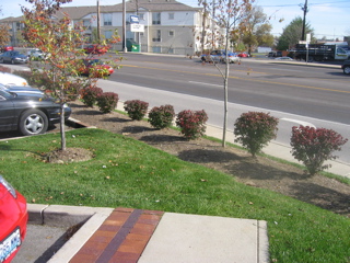
Public sidewalks in the suburbs are something that is there to make the suburbanites feel like they live in a walkable city. They don’t. Stop fooling yourselves folks!

Below is a picture taken in front of the Breadco facing North toward the remainder of Brentwood Square. The Viking store is the closet store to the Breadco across the parking lot. BTW, I love the Viking Store!!!
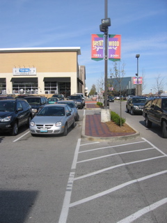
Ok, so the picture above is a pedestrian crossing connecting the Breadco to the stores to the North. I spent a half hour from noon to 12:30pm on Tuesday 11/9 observing people coming and going. I was pleasantly surprised to see many pedestrians coming from the North. But they were in suits so I doubt they had driving to the area to shop at REI. No, these were folks working in the office building in the background of the above picture and the two across the street in the first picture. The folks across the street realized when the get to this side of Brentwood they need to walk toward the REI store and then come South to the Breadco. That route keeps them on a sidewalk and not running circles around the Kinko’s.

Isn’t is great that a connection is made between the two sections of Brentwood Square and that so many people are walking from one area to another? Yes! But look closer at the picture below:
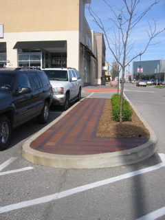
The architects and developer didn’t plan such a connection. When Brentwood Square opened a couple of years ago the brick pavers you see in these planted islands did not exist. The stripes on the asphalt were not there. People were naturally walking from point A to point B because driving from your office to the Breadco that you could see from your desk would be just silly. People did the natural thing and walked.

The sad part is the designers & developers in their original design failed to anticipate such a need. What is basic human nature was an afterthought. The other areas where pedestrian access was anticipated have curb ramps for wheelchair access as required by the ADA (Americans with Disabilities Act). But not here as this wasn’t anticipated as a pedestrian crossing. Basically the grass in the two islands between Breadco and Viking was getting trampled by the pedestrians that didn’t want to get his by cars in the adjacent drive so the developer solved the “problem” by adding the pavers.

I long for a day when suburban developers, architects, traffic engineers, city officials and the commercial tenants all think about how the neighbors access a development as a pedestrian. Is that asking too much?

Steve


Advertisement


[custom-facebook-feed]

Archives

Categories

Advertisement


Subscribe