Home » Suburban Sprawl » Recent Articles:

Will Fifth Third Bank At Loughborough Commons Connect To Sidewalk?

Has it really been nearly two full years since I’ve written about Loughborough Commons? It was December 2008 when I wrote about the new Burger King’s lack of pedestrian access despite the nearby sidewalk.

“Burger King has very generous provisions for the motorist but zip for the pedestrian. What pedestrians you might ask. Well, people do walk to Loughborough Commons. People also arrive by bus and bike. Yes, most use a car but we shouldn’t overlook those not driving private autos. Everyone spending money at Loughborough Commons is paying an extra tax to the Community Improvement district. Shouldn’t pedestrians expect some accommodation in return?”

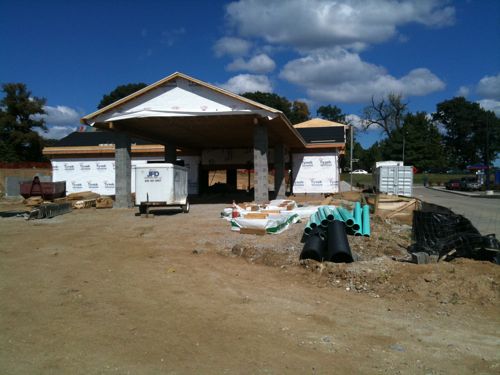
Of course, nothing was done to correct the lack of pedestrian access.  Now construction has started on the Fifth Third Bank for the parcel between the main entrance and the Burger King.  Here is what the site looked like in late 2008:

The bank building faces Loughborough but will be reached internally. The drive through lanes, not the front door is what is visible from the main drive.

img_0421

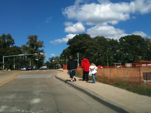
My assumption is the existing sidewalk will not be continued across the edge of the parcel and not up to the front door, a clear violation of the ADA.

img_0423

I was only at Loughborough Commons for a few minutes but I spotted pedestrians leaving as I was leaving. Walkability is not that difficult but it is obviously out of the mindset of civil engineers and the developers who hire them.

– Steve Patterson


New construction and predictions for 2050 and beyond

Nothing is getting built because of the economy, right? Wrong. Seems there are renovation & new construction projects popping up in neighborhoods throughout the city.

new construction in Lafayette Square
ABOVE: New construction in Lafayette Square

The following is a combination of an educated guess based on demographic forecasts, trends and wishful thinking.

I see the 21st century as a mirror of the 20th century.  The first half of the last century started with the earliest suburbs as a means of escaping the industrial city. The initial movement was limited to the wealthy but as time passed the growing middle class sought residences in the new suburbs.

This century I see the wealthy locating in walkable neighborhoods closer to the center and near mass transit.  But more and more people want to experience real places and they realize suburbia (driveable, not walkable) don’t offer the lifestyle they seek.  By 2050 I see the general public seeking to live & work in walkable locations with the option to use mass transit.

Those parts of our region, and other regions, which do not adopt a pedestrian-friendly form will be increasingly viewed as undesirable by most of the population.  The secluded residential subdivision of today that requires a 5-mile drive to reach the grocery store will be the slum of 2075.

During the second half of the 20th century walkable urban centers tried to remake themselves in a way to retain population.  The attempts, which made the core less walkable, failed to retain those who desired life in the new suburbs.  But this century the efforts to retrofit suburbia.

Ellen Dunham-Jones describes it best:

httpv://www.youtube.com/watch?v=J_uTsrxfYWQ

She mentions ArtSpace at Crestwood Court.

I’ve never been more optimistic than I am now.  I’ll be an old man by the time this all happens but I look forward to watching the change happen.

– Steve Patterson


New shopping center in Des Peres not reachable by pedestrians, many to blame

I don’t get out to suburbia often but when I do I stop to photograph the new construction that I see. Recently I visited The Shoppes at Tallbrooke in Des Peres MO (11698 Manchester Rd): 

Pretty ordinary wouldn’t you say? These are a dime a dozen in auto-centric areas of our region.  What is consistent is the new sidewalk along the major road, in this case, Manchester Rd:

Projects that “we’re walkable” image.  But this sidewalk is only about image and not about actually being walkable.

You see the sidewalk runs along the side of the road but a pedestrian on the sidewalk doesn’t have a walk to use to enter the development to patronize the retailers.  The blame falls to several: the developer, the architect, the civil engineer and the City of Des Peres.

Image: NAI/Desco

The site plan clearly shows the walk in front of the businesses but nothing connecting to the main road or either side road leading to the residential neighborhood to the south.  I expect the architects and civil engineers to include an ADA Access Route from the public sidewalk to the business entrances but all too often they don’t.

I am most angry with the City of Des Peres. I looked up their most recent Comprehensive Plan, from the 2003 document you get a sense that walkability was important but it is such a weak document it is no wonder all they got was the useless window dressing sidewalk that doesn’t connect to anything.  The following is selected text under the section “Planning Goals:”  (Bold added for emphasis)

Land Use
1. Attain the highest quality development for all land use classifications.
2. Enhance the value of residential properties.
3. Enhance community identity in the existing areas of Des Peres and develop that identity in newly annexed areas.
4. Guide urbanization consistent with the ecological capabilities of the land.
12. Limit commercial uses exclusively to the Manchester Road Corridor.

Transportation
4. Expand facilities for pedestrians and bicyclists.

Urban Design
1. Increase landscaping on both public and private properties along the Manchester Road streetscape.
2. Enhance the pedestrian facilities along the Manchester Road corridor.
4. Improve the quality of signage along Manchester Road.
5. Enhance architectural standards for buildings along the Manchester Road corridor.
6. Provide more human scale elements to the Manchester Road streetscape such as street furniture, art, lighting and signage.

Economic Development
4. Retain the retail sales and service identity of shopping centers in the City.
5. Increase employment within the City’s business district.
6. Promote the development of business establishments that service the needs of the local population.

Good stuff, they want pedestrian & bicycle facilities and they want to serve the local population — the folks that might actually walk to the businesses.  They want to expand sidewalks:

Residential area:

Objective 1: Expand the network of pedestrian sidewalks in the area.

You might think the document is very general and not that specific — until you read further:

When redevelopment or rehabilitation of commercial properties takes place, it is important that they follow architectural guidelines established for all buildings in the commercial area. The purpose of such guidelines is not to impose a certain architectural style on the area but to ensure that the varying styles of buildings in the area will be architecturally harmonious and pleasing. There should be a mixture of styles, colors and materials for each commercial building in the district. However the diversity among buildings should blend well throughout the district. The whole should be greater than the sum of its parts.

When either a new building is developed or an old building redeveloped, their design should be reviewed in the context of surrounding buildings and the area in general.

Architectural guidelines should focus on eliminating two areas of the architectural spectrum. They must eliminate designs on the extremes and designs in the center. The extremes represent cheap or unusual building materials, wide use of bright colors and odd design schemes. These buildings draw so much attention to themselves that the rest of the commercial district recedes into obscurity. The center of the spectrum represents the conformist, cookie-cutter building found in any suburban community. These buildings draw little attention to themselves because they can be found anywhere. They don’t add character or identity to a commercial district.

A lot of attention to architecture but nothing about being able to get anywhere on the expanded sidewalks.  I kept reading:

Ground signs are a separate structure located in the front yard of a site along Manchester Road. They primarily relate to the streetscape and not the building. The critical element in the design of these signs is ensuring that they are human scale and do not dominate the streetscape. These signs should be at the eye level of the motorist or the pedestrian. They should also be easy to read and understand. Excessive messages, font styles, small-scale lettering and colors unnecessarily clutter the appearance of a sign and make it confusing to motorists.

Oh I see, pedestrians get human scaled signs at eye level.  That is so much better than being able to walk to businesses on a sidewalk.  It gets better:

There should be some improvements to both the hardscape and landscaping along Manchester Road. More human scale elements need to be inserted into the area to make it more inviting for pedestrians. Although there is a sidewalk along both sides of Manchester Road, some segments are missing. The sidewalk needs to be extended in these areas. There should be a continuous sidewalk along both sides of Manchester Road throughout the planning area. The sidewalks along the roadway should be accented with pedestrian plazas at strategic intersections along the corridor. These small congregating areas would be approximately 500 sq. ft. in size. The area would be hard surfaced with a decorative material such as paving stones or stamped concrete. It would contain benches, trash receptacles and street art. The hard surface area would be ringed by plant material and accented with decorative street lamps. It is important for all of these plazas to be similar in design and materials to create continuity throughout the corridor.

Are they serious? Decorative lamps and “inserted” elements?  Some planners got paid good money to write this useless phrasing.

Paving stones of a consistent style and color should be inserted in the area of the streetscape between the sidewalk and the street curb. These areas vary in width along the corridor from 2-10 ft. They usually contain either asphalt or sod. The asphalt is unattractive and lacks flexibility as a material. These strips usually contain underground utilities where excavations are necessary. Asphalt does not lend itself well to surface patching, as it tends to fade over time. Sod is more attractive but not hearty enough to survive the difficult conditions present along a major arterial roadway. Salt, exhaust, debris and other materials destroy the sod over time.

They can go into this level of detail but the idea of suggesting that developments along Manchester Rd actually connect to the sidewalk isn’t mentioned.  Instead they’ve covered all those things that help create the appearance of walkability without, you know, actually being walkable.  It is no wonder this new strip center is so disconnected.

– Steve Patterson


Walkability/accessibility in auto-centric suburbia

I was in Chicago last weekend.  Saturday night we stayed at the new ALoft in Bolingbrook (map), near Ikea.

The location is highly auto-centric) but walkability/accessibility was given some minimal attention.  From our room I could see the sidewalk along the public road as well as the private sidewalk to the hotel. The above is the minimal I’d accept, not the goal.  All the buildings in the area are so far apart that no amount of perfectly green grass or upscale landscaping will make it a good walking environment.  These sidewalks are decoration, a feel-good measures to imply walkability.  Don’t get me wrong, it is better to have them than not, but hopefully we will cease building such environments completely.

To create walkable areas we must:

  • Reduce the amount of auto parking in private lots.
  • Reduce the distance between buildings.
  • Reduce the distance from the public sidewalk and the building entrance.
  • Allow on-street parking.

With every business having a huge parking lot the distances become to great to walk.  But if parking were scaled back they can be closer to each other and walking becomes a viable option.  The total parking in this area far exceeds the total number of cars at any given time.  By significantly limiting private off-street parking but permitting on-street parking you introduce affordable shared parking.  Shared parking is often thought of as a parking lot or garage structure but taking all the cars and spreading them out in a linear fashion along roads reduces the impacts from massive parking lots that  spread our destinations apart to the point we must drive to reach them.

– Steve Patterson


Transportation and the Urban Form

The host of this site, Steve Patterson, and I are both passionate about urban design issues. One area where we differ is how the interaction between transportation options and the urban form plays out in the real world. Steve, and others, believe that requiring “better”, more appropriate and/or more restrictive design standards, through efforts like moving to form-based zoning and reducing available parking, will somehow convince the uninformed public to become more enlightened and to change their ways.  I have a different perspective, that available transportation options inform the urban form, including our land use regulations and their application on a daily basis.

I’m not going to go back to the discovery of the wheel, but I am going to go back 150 years.  Prior to the Industrial Revolution / the American Civil War, transportation options were limited to human, animal, water or wind power – you could walk or row, ride a horse or a mule, use a sailboat or “go with the flow”.  The result was a world made up of farms, relatively small settlements, seaports, river ports and a few larger centers of banking, trade and government.  There was no zoning, as we know it, but we did have our westward expansion, with land being given away for free to anyone willing to “tame the wilderness”, through farming, ranching or mining.

Cities were just starting to build rudimentary water supply and sewer systems, and elevators and air conditioning were non-existent.  You got an urban environment marked by row houses, small, local retail establishments and tiny signs.  You didn’t have drive-throughs or dry cleaners, computers or gas stations; you did have hitching posts and coal for heat, telegraph and manure in the streets, Bob Cratchet and Tiny Tim.  You can find many preserved examples up and down the east coast, including Colonial Williamsburg.  And St. Louis started to grow as the Gateway to the West, primarily as a trading center and a transportation hub.  Examples around here include Soulard, Carondelet and Baden

The ability to capture the power of steam, through the boiler and the steam engine gave us railroads, cable cars and steam heat.  It also gave us the ability to run machinery with something other than water power, greatly expanding where factories could be located and how much they could produce.  More importantly, electricity was staring to be harnessed, with major improvements in generation, lighting and motors.  From the 1850’s through the 1890’s, city life changed rapidly.  Factories, along with their need for lots of workers, worked better in urban settings than in rural ones.  Cities like St. Louis became industrial centers as well as trading centers.

Quoting from a story in the 12/13/09 edition of the Daytona Beach News-Journal;

According to the Web site trolleystop.com, the first successful trolley system in the United States began operation in Richmond, Va. in 1887.  After the initial success in Richmond, almost all of the horse car lines in North America were converted to electric power.  The electric trolleys became so popular that the street railway industry experienced explosive growth almost overnight.  As the popularity of automobiles and buses boomed in the 1920s, however, most trolley companies began converting their lines to bus service.

That was certainly the case here.  We had multiple streetcar companies competing for riders and we saw explosive growth of streetcar suburbs, both inside and outside the city limits.

Streetcars and buses allowed workers to live further away from work.  You still needed to walk to the transit line, but it meant living within walking distance of your job was no longer an essential requirement.  People had more options, and many of those, that could afford to, moved out of the older, denser parts of town, leaving them to new waves of immigrants or to see them torn down and replaced by factories.  Retailers were still expected to offer home delivery, so stay-at-home moms (yes it’s a stereotype, but it was the reality) shopped for fresh food pretty much every day and kids walked or biked to neighborhood schools.  This was also the time when the first attempts at zoning started to occur, primarily to separate industrial uses from residential ones.

The next big “step forward” was Henry Ford’s efforts to produce an affordable automobile.  His success, in the 1920’s, was the next big step in the suburbanization of America and St. Louis.  Throughout south city one can find garages that are too small for many contemporary vehicles – they were built to shelter the vehicle that expanded Dad’s transportation options, Ford’s Model T.  The residential neighborhoods of that time were still walkable (with sidewalks) and they still had corner groceries, but they were growing less dense.

The next big impact on the urban environment was World War II, both directly and indirectly.  Factories moved from multi-story to single-story, sprawling structures.  The internal combustion engine became more reliable and synthetic rubber made tires much less of a pain in the a**.  Women entered the work force in large numbers and pent-up demand for consumer products continued to build.

Once the war ended, we experienced several decades of unprecedented prosperity, from the mid ’40’s through the ’70’s.  We built the interstate highway system and moms learned to drive.  FHA and VA loans favored single-family homes, primarily new, suburban ones, over denser, multi-family options.  We went from single-car families to 2-car families.  We embraced the suburban shopping center and the enclosed mall.

Just because it was a whole lot easier, people chose driving themselves over taking public transit.  They chose living in the new suburbs over living in established urban areas, especially those that had experienced decades of deferred maintenance (the Great Depression followed by wartime rationing).  Employers, schools and retailers all responded by offering more and more “free” parking, either by planning for it from the start, in new suburban developments, or by buying up and tearing down existing buildings in more-established urban areas.  This mobility also resulted in the Euclidean zoning that many of us are questioning today – it codified a preference for convenient parking over both density and walkability.

The end result is the world we live in today.  It reflects the hopes and aspirations of the majority of Americans, as reflected by the actions of our elected officials.  We trade sprawl and congested highways for the “freedom” to live where we want, work where we can find jobs and to shop at generic chains who have mastered the worldwide logistics supply chain.  We have seen St. Louis lose both population and jobs.  And we have two choices – we can continue to become more suburban, building more shopping centers, single-family homes and “free” parking.  Or we can redirect our efforts, differentiate ourselves from our suburban neighbors, encourage density and create viable transportation alternatives.

To attract people out of their cars and trucks won’t be easy.  There’s a real attraction to privacy, control and convenience.  But, as a big believer in the Law of Unintended Consequences, I find it interesting that more members of the Generation Y are willing to embrace mass transit.  It turns out that people who text, tweet and surf the mobile net would actually rather let someone else do the driving, IF they can figure out how to make it work.  Whether that involves reinventing Metro’s system and creating a market for higher densities or developing a taxi infrastructure that mimics that in New York, it appears that we may be on the cusp of a another significant change in how people want to live, work and commute.  Combine that with the growing success of, and the reliance many people have on, online shopping, and in many ways we’re returning to the “home delivery” model of yore.

Steve’s belief in the need for form-based zoning could very well be reflected in actual change, just not one driven by direct logic and/or nostalgia.  I doubt that we’ll see the imminent demise of the suburban shopping center or the type of store Schnuck’s or Direbergs typically builds.  But I can see a future where Transit Oriented Development will gain traction on both the residential side and on the employment/educational side – it’s actually slowly playing out here locally at the Barnes campus on Kingshighway.  The single-occupant vehicle could very well become an anachronism for the daily commute, saved only for shopping, recreation and regional out-of-town trips.  Whether it ends up being garaged for days at a time or rented only when needed will be a personal decision.  But these decisions will inform what “sells”, and in turn, what gets built, and ultimately, what our legislators will see a need to codify.

– Jim Zavist


Advertisement


[custom-facebook-feed]

Archives

Categories

Advertisement


Subscribe