Home » Travel » Recent Articles:

New Walgreens Opens Inside a Historic Bank, Rather Than Raze It

August 12, 2013 Featured, Retail, Travel 23 Comments

Competition is heating up as retailers try to add locations in an effort to avoid stagnant sales growth. Having saturated suburban markets with their standard formula, they’ve been trying to do the same as they move into the urban core. Cities, more dense and often filled with vacant historic buildings, present new challenges to big retailers with one-size-fits-all formulas.

More than a dozen years ago a small group of citizens, myself among them, helped block Walgreens from razing the South Side National Bank (SSNB) at Grand & Gravois. “Put a Walgreens in the old bank”, we said to Walgreens officials. Unwilling to listen, they built a typical store across Gravois, but not on the corner.
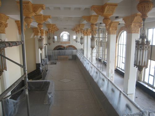
Lobby of the South Side National Bank on  2/28/2006
Lobby of the South Side National Bank on 2/28/2006

The Lawrence Group bought the SSNB, putting residential condos in the tower. Much of the retail space, including the magnificent lobby, remains vacant today.

A few years after attempting to raze the SSNB, Walgreens tried to raze the Gold Dome in Oklahoma City, located at NW 23rd & Classen.
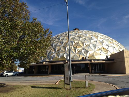
The 1958 Citizens State Bank in Oklahoma City is commonly known as the Gold Dome, click image for Wikipedia article.
The 1958 Citizens State Bank in Oklahoma City is commonly known as the Gold Dome

Walgreens was again met with citizen opposition:

Efforts to save the Gold Dome included picketing and marches, but in September 2001, a couple extended the efforts by writing a song. Also, an Oklahoma based company, Sonic Drive-In restaurants, offered up a billboard, located across the street from the Gold Dome, to the Citizens for the Golden Dome group. On the billboard was written “Stop the demolition of our historic landmark,” as well as the phone numbers for Bank One and Walgreens. (Wikipedia)

Today the Gold Dome is a central part of the neighborhood, now heavily inhabited by Chinese and other Asian nationalities, housing numerous businesses. Across one street is a typical CVS and across the other is a typical Walgreens, on the site of a former Beverly’s “Chicken in the Rough” restaurant.

In both cases a historic structure was saved, but the neighborhood was degraded by a standard suburban box(s). Both St. Louis & Oklahoma City didn’t care about anything besides the historic structure, or they were afraid to require something other than the standard prototype.

Fast forward a decade and we can look to a new Walgreens in Chicago that shows the retailer is willing to rethink their store design rather than forcing their standard box into a neighborhood. On a recent trip to Chicago this Walgreens was our first stop.
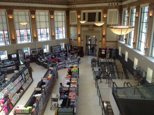
The former Noel State Bank is now a flagship Walgreens in the Wicker Park/Bucktown area of Chicago

In the 45 minutes we were on site I took 70 pictures, my boyfriend quickly understood why a Walgreens was the first place I wanted to visit on our first trip to Chicago together:

The uber-fancy flagship is part of a plan by Walgreens–now the nation’s largest drugstore–to cater to a higher tax bracket while giving its more than 100-year-old brand a dose of modern edge.

Walgreens has recently launched several “upscale” stores, including a multi-level flagship in downtown Chicago and a massive concept store on L.A.’s Sunset Blvd.

According to Crain’s Chicago Business, the opening of the latest flagship, nestled between the Windy City’s trendy Wicker Park/Bucktown neighborhoods, will be followed by roughly 10 more upscale stores stores in locations ranging from Hawaii to the Empire State Building in New York. (Huffington Post)
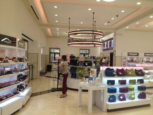
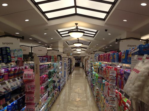
The upstairs mezzanine level is like a high-end department store cosmetics area
The basement level contains the pharmacy, over the counter medicines, and...
The basement level contains the pharmacy, over the counter medicines, toiletries, and…
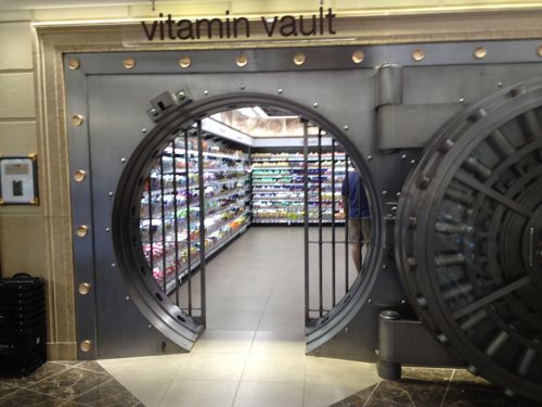
...vitamins! Walgreens cleverly reused the old vault for additional retail space
…vitamins! Walgreens cleverly reused the old vault for additional retail space
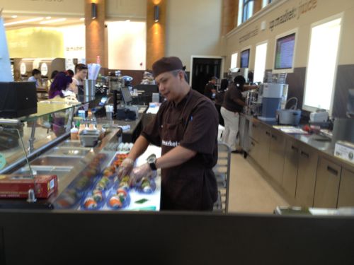
The chef prepares sushi while others get a beverage from the juice bar, frozen yogurt is in the background left

Now you might be thinking sure, in Chicago…developers are so much more enlightened in Chicago. Not so:

Many many years ago what is the Nobel Bank Building located at 1601 N. Milwaukee Avenue was, in fact, a bank. And more recently the building was the home of Midwest Bank; a full-service library quiet bank filled with friendly staff.

Several years ago, the building was bought by an investor with plans to add retail to that corner. His plans, however, were also contingent upon adding a massive parking garage right at the corner of North/Damen/Milwaukee. You can only imagine what that would have done to the traffic and congestion already filling the area. The end result would have been gridlock. Alderman Waguespak, thankfully, would not approve of the garage. So the investor abandoned the project.

The building sat vacant bordering on foreclosure. (source)

Developers, even those in Chicago, think massive parking garages are necessary in dense urban neighborhoods served by transit. True, even this Walgreens has an off-street parking lot.
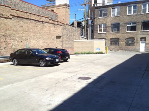
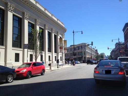
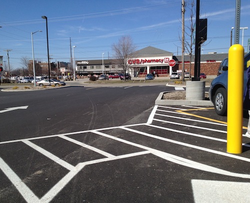
The lot has six regular spaces plus one disabled space, out of view to the left. That's it!
The lot has six regular spaces plus one disabled space, out of view to the left. That’s it! No drive through pharmacy either.
The busy corner has pedestrians, cyclists, and lots of auto traffic. The Walgreens is on the left.

Chicago knows to not let auto-centric developers gut their neighborhoods, thereby achieving a balance among users. We’ve had decades of gutting our neighborhoods for parking, we must now reverse course.

Kudos to Walgreens on this store!

— Steve Patterson
 

County Market Near Downtown Springfield IL Retrofits A Pedestrian Route

In March I posted about a new grocery store on the edge of downtown Springfield IL (map) that anticipated many customers on foot, but they expected these pedestrians to either use the automobile driveways or walk over curbs and through grass & lots of parking.  A few days after my post, Springfield Journal-Register columnist Dave Bakke wrote Some criticisms of Springfield justified mentioning my criticism, later Bakke followed up with Critique of Springfield’s image touches nerve.

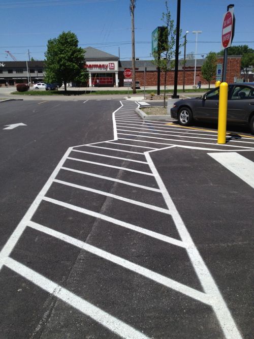
Here's what customers leaving the entrance facing Carpenter see now.
Here’s what customers leaving the entrance facing Carpenter see now.
Back in March the New County Market near downtown Springfield didn't have a route for pedestrians to/from the public sidewalk.
Back in March the New County Market near downtown Springfield didn’t have a route for pedestrians to/from the public sidewalk. The only provision was to reach disabled parking.

From this angle the change isn’t significant, no paint on asphalt will keep a distracted driver from hitting a pedestrian.  But look out toward the street and you’ll see new concrete.

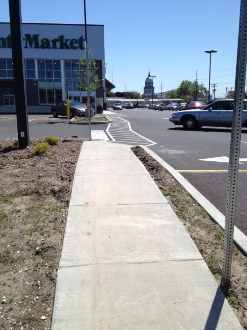
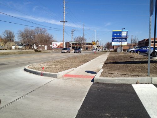
From the public sidewalk you can see the new route they added.
From the public sidewalk you can see the new route they added so pedestrians don’t have to compete with cars.

I appreciate the after the fact gesture, but this is a good example why pedestrian access, just like automobile access, must be planned from the beginning. The new concrete walk does not meet ADA guidelines, it is too steep in places. I didn’t have my digital level with me on our Mother’s Day trip, but I could tell by walking it.

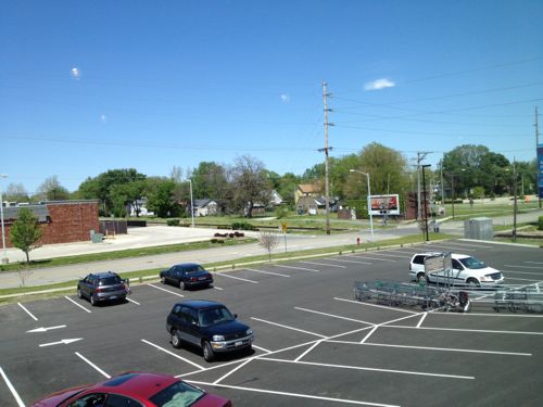
This route shown above is a consolation prize for pedestrians, it connects to Carpenter St only, not to 2nd St. Even if they retrofitted a route to 2nd it still wouldn’t be considered pedestrian-friendly. As I pointed out in my original post, the County Market in Champaign-Urbana is the model that should’ve been built in Springfield. It was built on a corner with direct access from both sidewalks. It also has a parking lot behind the building, with another entrance. Same number of entrances as the Springfield location, just arranged so customers arriving on foot or car are equally accommodated.

From the mezzanine you can see the route able-bodied pedestrians will likely take, cutting across the parking lot at a diagonal.

Springfield, like St. Louis and most cities, should not allow parking between the public sidewalk and buildings in areas where they seek to be pedestrian-friendly. In all other areas where public sidewalks are present/required they should require developers to actually connect to them. Public sidewalks are not window dressing, people actually use them.

If motorists were treated like pedestrians, no parking lot would have a driveway connecting to the public street. You’d be forced to drive over multiple curbs and through grass. All cars could be able to enter & exit, but 4X4 vehicles would have an easier time. While people could use parkings lot this way, they’d soon realize it wasn’t friendly and is potentially  damaging their vehicle. Those with high-clearance SUVs wouldn’t understand why a person driving a vintage MG Midget would complain, besides how often do you see one of those on the road… Why build costly driveways for the few people who have low cars?

Municipal zoning & building codes in cities coast to coast go to great lengths to detail every aspect of our arrival at developments by car: driveways, width of aisles, parking space dimensions, number of spaces, etc. Few say a word about arrival on foot.

It is no wonder so few people walk given our built environment.

— Steve Patterson
 

Boston’s Copley Square

April 16, 2013 Featured, Travel 2 Comments

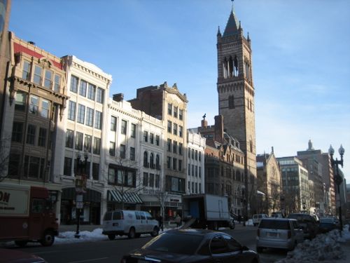
Watching the news yesterday I thought the block where the first bomb exploded in Boston looked familiar. I’d only been there once, just over 24 hours, in January 2008, just 2 weeks before my stroke.

I searched online for specifics on the location of the Boston Marathon finish line (see graphics from the Boston Globe’s here and NY Times here) and I quickly realized why I recognized the location, I had stayed the night at the finish line!

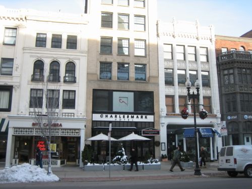
The Charlesmark Hotel at 555 Boylston St
The Charlesmark Hotel is basically the finish line point for the Boston Marathon.

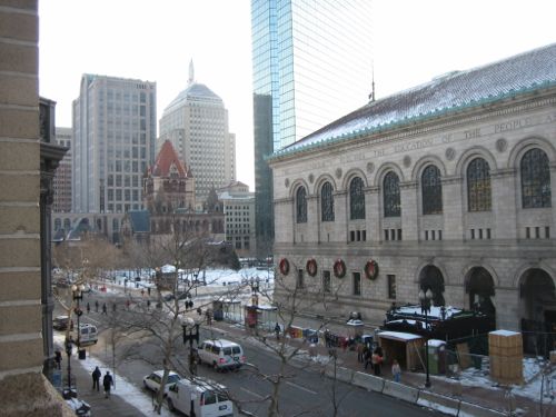
My room in the Charlesmark Hotel (655 Boylston St) was in the front, facing Boylston St and the Boston Public Library.  That night I had dinner at the Globe Bar & Cafe at 565 Boylston, facing Copley Square.  The next morning I got up early to see as much Boston as I could before my late afternoon flight back to St. Louis.

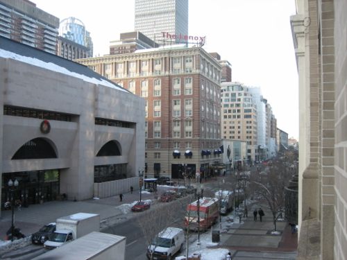
Looking west up Copley St from my hotel room. The first bomb went off in this area (right).
From what I've seen online so far the first bomb went off within the left side of this view of Boylston St.
From what I’ve seen online so far the first bomb went off within the left side of this view of Boylston St.


Looking east from my hotel room with Copley Square (left) and the Boston Public Library (right)
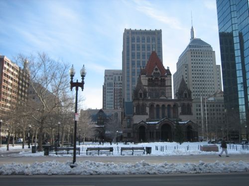
Looking east at Copley Square and Trinity Church
Looking east at Copley Square and Trinity Church by H.H. Richardson
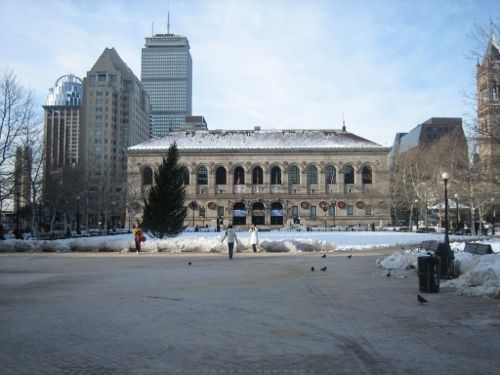
Looking west across Copley Square at the Boston Public Library
Looking west across Copley Square at the Boston Public Library by McKim, Mead and White

The Copley Square area was upscale and I felt safe walking around, the scale was very nice. The events of yesterday are not an indictment of the area, it was just a target because of the event.  I hope to return again!

My heart goes out to the victims and the people of Boston.

— Steve Patterson
 

Wayfinding In St. Louis

The St. Louis Convention & Visitors Commission has been rolling out a new wayfinding system in the region for a couple of years now. From a January 2011 Post-Dispatch editorial:

The St. Louis Convention and Visitors Commission has launched a $2.9 million initiative to design, build and install an attractive and comprehensive system of street, road and highway signs. The idea is to direct tourists and residents to a rich array of sites and attractions in the city of St. Louis and St. Louis County.

The project has been in the works since 2008. So far, about 300 signs — highway, street-level and pedestrian — have been installed or are slated for installation. The signs aren’t cheap: Fabricating and installing a large highway “guide” sign costs more than $20,000. (stltoday.com)

For example:

cvcwayfinding7
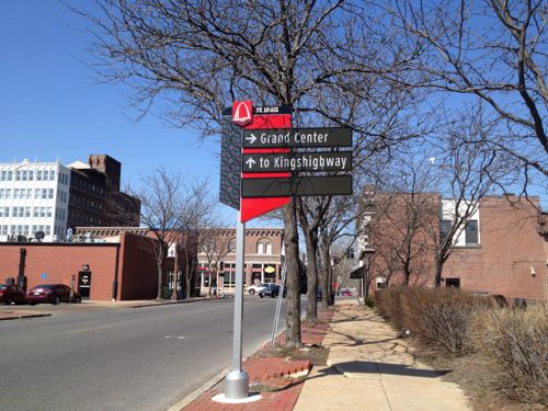
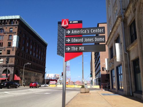
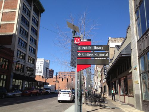
Wayfinding sign on Arsenal just east of Grand

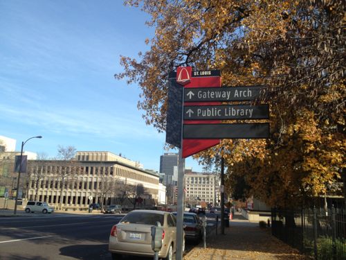
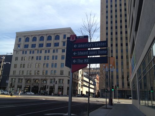
Lately these have begun to turn up downtown.

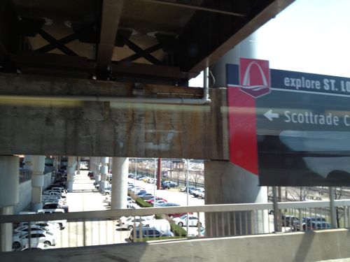
Large wayfinding sign (right) at the 14th Street exit from I-64
wayfinding olive
Wayfinding sign at Olive & 15th
wayfinding olive
Wayfinding sign at Olive & Tucker
Wayfinding
Wayfinding sign at Tucker & Washington
Wayfinding
Wayfinding sign at Washington between 13th & 14th

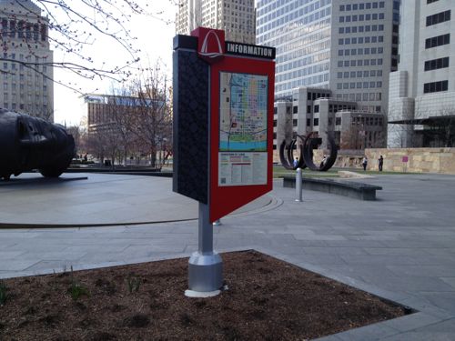
Until the other day all the signs I’d seen have been like the ones shown above, or larger highway exit signs. Them I finally spotted, at Citygarden, a sign to help pedestrians downtown.

wayfinding
Wayfinding sign at Citygarden

But it was placed in the middle of a planter bed so I wasn’t able to get close enough to evaluate its effectiveness. Great planning!

I get asked directions often and I enjoy helping others. Two common requests are for places very close to my loft: the Social Security office at  717 N 16th St and City Museum across the street at 701 N 15th St. The other day at 10th & Washington a woman asked where to find the “landmark Arch.” I pointed east on Washington Ave.  When she asked if she should then turn right I told her she’d see it.

The following describes the process that took place to establish the system:

The Missouri Department of Transportation, along with the CVC, St. Louis City, Laumier Place, Grand Center and Forest Park funded the research needed to implement the program. Three “attraction corridors” were created in determining the locations of the signs. The first corridor is Broadway, second is Grand, and third is Kingshighway, with all three connecting major attractions and districts in the city. The entire program, including the research to implement the program cost 1.5 million dollars. CVC did apply for grants but was not successful in receiving any funding. The CVC worked with MODOT to identify those organizations that would provide funding for the wayfinding program. An important goal of the program for MODOT was to reduce sign clutter on the interstates in order to comply with Federal Highway standards. (continue at Cherokee Street News)

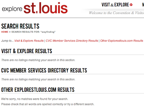
Hopefully I’ll be able to locate another pedestrian-oriented wayfinding map to evaluate. I don’t have a clear picture of the overall system and the CVC website wasn’t helpful.

Searching the CVC website for "wayfinding" and "way-finding" produced the same results.
Searching the CVC website for “wayfinding” and “way-finding” produced the same results.

Have you seen any of these new wayfinding signs? If so, what do you think?

— Steve Patterson
 

Springfield IL & Niemann Foods Don’t Understand Pedestrian-Friendly Design

Recently a reader in Springfield IL, the Illinois state capital 90 miles from St. Louis, alerted me to a new County Market grocery store about to open on the NW edge of their downtown. A local newspaper article  talked about the 11,000+ residents within a mile of downtown Springfield and 68,000+ within 5 miles. Tom Moore, director of the new store, was quoted:

“All day long, they come in and say, ‘When are you going to open?’” said Moore. “With the hospitals close by and the apartments close by, we’re expecting quite a bit of foot traffic here. “We’re targeting the whole downtown area, whether it’s the medical community or the neighborhoods.” (State Journal-Register)

Great, they recognize there are many people in the area and they expected lots of foot traffic. Memorial Medical is 2/10th of a mile to the north and St. John’s Hospital is a half mile directly east. County Market is a 100-store chain operated by Niemann Foods based in Quincy IL, an affiliate of Supervalu.  Supervalu is the parent company of St. Louis-based chains Save-A-Lot and Shop ‘N Save. More on the new market later. Springfield’s Regional/Urban Design Assistance Team (R\UDAT)  report from 2002 speaks briefly to making downtown pedestrian-friendly:

As a neighborhood, downtown Springfield should offer a pedestrian friendly environment with pleasant streetscapes, welcoming crosswalks, green space, or other “softscape” areas, parallel or diagonal parking as a buffer from vehicular traffic, adequate signage and easy to understand “way-finding” systems for visitors. The “way-finding” system should be easy to use, but should be somewhat unobtrusive in keeping with the neighborhood environment. Although the linkages are not yet established, the contiguous districts of commercial and historical importance in Springfield – the Lincoln home, the Capitol District – are very walkable from the central downtown core. A visitor will find it convenient to park in downtown Springfield and walk to these and other nearby attractions. Such programs as Lincoln Walks to Work and Looking for Lincoln will reinforce this walk-ability and contribute to the linkages between the downtown and the Lincoln home neighborhood. (Downtown as a Neighborhood)

In that same section they recognized the need to for additional retail to serve local needs, including a grocery store:

The retail mix should meet the needs of the downtown residents, the downtown employees, the residents in the neighborhoods surrounding downtown and downtown visitors and tourists. This mix should include coffee shops, gourmet retail and take out, bookstores, general grocery and merchandise, dry cleaners that offer bundle service, souvenir and general gift shops, ice cream, bakery and other service based businesses for residents. Bringing these uses into the downtown depends on achieving a larger resident population and the resulting greater purchasing power.

The Springfield Strategy 2020 report, completed in 2010, certainly says all the right things speaks more to making Springfield pedestrian-friendly:

“The Springfield of 2020 has preserved residential neighborhoods surrounding the downtown, which boosts pedestrian traffic in the downtown historic district and acts as a buffer to protect the downtown core.” (p23) “We believe that an effective transportation system must also include facilities to encourage biking and pedestrian traffic.” (p27) “The Springfield of 2020 will be pedestrian friendly with sidewalks being maintained, constructed and reconstructed when necessary throughout the city. This is but one way that the Springfield of 2020 will be know as a city that stresses better accessibility for all of its citizens. In addition, requirements for new subdivisions will be developed to encourage the development of amenities for walking and bicycling, as well as additional green space in all new subdivisions.” (p27) “The Springfield of 2020 will include bike paths downtown that have been sponsored and built by the city to encourage biking to area businesses and work places. The city will also develop new pedestrian walkways to encourage pedestrian traffic to historic and government sites so as to reduce downtown vehicular traffic and increase tourist use of area businesses.” (p27)

Great, Springfield seemed to know what was needed to achieve their objectives. Or not… The new County Market that’s expecting lots of pedestrians opened on March 8th, I visited on the 21st.

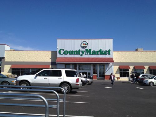
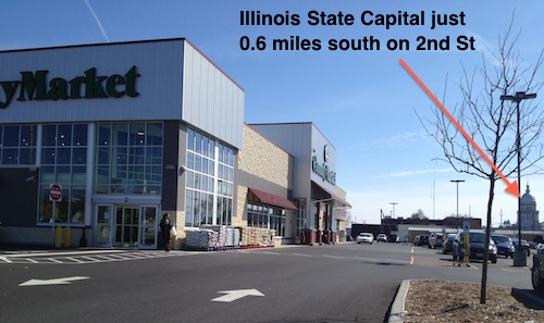
The main entrance faces west, with a surface parking lot between the 2nd Street public sidewalk and the door. No ADA accessible  route is provided.
The main entrance faces west, with a surface parking lot between the 2nd Street public sidewalk and the door. No ADA accessible route is provided.

Remember, they’re expecting lots of foot traffic to this store. But 2nd Street is a minor road, Carpenter Street is a main arterial. But access is no better from that new public sidewalk.

Looking east on Carpenter St from the County Market auto driveway
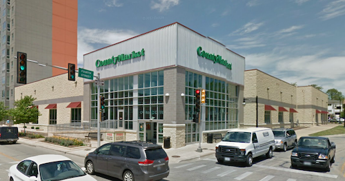
A second entrance to County Market is located on the corner, facing Carpenter St.
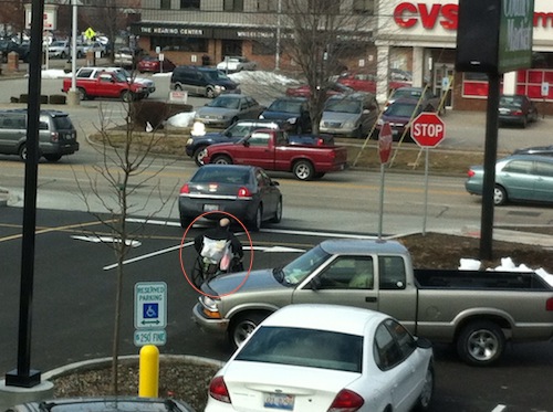
A second entrance to County Market is located on the corner, facing Carpenter St. Seeing the marking on the pavement you might think that was to guide pedestrians safely to the public sidewalk.
But it leads to disabled parking, not the sidewalk.

Again, they’re expecting lots of foot traffic yet they’ve made zero provisions for all these pedestrians to reach the store. Like so many places, the pedestrians will be forced to compete with the cars.

A customer in a manual wheelchair leaves the County Market via the auto exit on 3/8/2013, opening day. Photo by Steven Simpson-Black

Springfield wants to be pedestrian-friendly by 2020, but they allow this to happen? They also assembled the land and did a $2 million dollar TIF!

Planning and Economic Development Director Mike Farmer hopes it will act as a catalyst for further business growth near the city’s downtown and medical district.

Niemann Foods says 110 full and part-time staff have been hired from the area. The store’s floor plan and design has been called more “urban” than most County Market locations.

The smaller store features a coffee shop with drive-through window and upstairs lounge/dining area with free wireless internet access. A similar store has been built in the heart of the University of Illinois’ Champaign-Urbana campus. (WUIS)

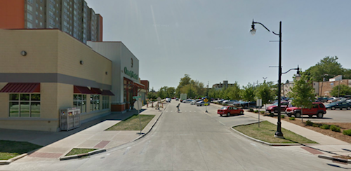
The County Market location at 331 E Stoughton St, Champaign, IL (Google Maps) has the same look, two entrances, and an upstairs — unfortunately that’s where the similarities end. Champaign’s corner entrance is on a different corner and placed at the intersection, while the main entrance faces a surface parking lot.

The secondary entrance to the County Market in Champaign IL helps define the street and welcomes pedestrians.  Source: Google Maps/Streetvew
The secondary entrance to the County Market in Champaign IL helps define the street and welcomes pedestrians. Source: Google Maps/Streetvew
The main entrance in Champaign fronts onto another street with the parking lot on the opposite side.
The main entrance in Champaign fronts onto another street with the parking lot on the opposite side. Source: Google Maps/Streetvew

The Champaign County Foods store lacks the two drive-through windows of Springfield — one for coffee and one for pharmacy. I’m pretty sure drive-through service windows decrease pedestrian traffic, not increase it.

Springfield & Niemann Foods had a chance to build a good urban prototype that would’ve been equally accessible by pedestrians and motorists, but they blew it big time. They need to at least provide an ADA Pedestrian Route from both Carpenter and 2nd Streets to each entrance.

Municipalities and businesses in the St. Louis region make the same mistakes too often.

– Steve Patterson


Advertisement


[custom-facebook-feed]

Archives

Categories

Advertisement


Subscribe