CITIRAMA A GOOD START, HBA’S BUILDERS DON’T QUITE GET IT
|
|
The former site of the infamous Gaslight Square district is now a residential street. The Home Builders Association of Greater St. Louis held the ‘Citirama‘ along a single block on Olive between October 8-24. Luckily, the presence of the existing street and alleys forbid the HBA and it’s member builders from subjecting us with the types of developments currently being built on greenfields at the far edges of the region.
The street is just that – an urban street that actually connects the city together. It is not isolated or locked behind a gate. Pedestrians, cyclists or motorists can freely make their way from one end to the next. This is completely opposite of today’s subdivisions which typically have a single entry off a major road. The suburban model is built for motorists only – pedestrians & cyclists need not apply.
The alley provides numerous benefits. First and foremost, the alley gets the garage at the back of the house where it belongs. It also moves trash & yard waste dumpsters off the public street. The absence of driveways, garage doors, and piles of trash greatly improve the friendliness of streets. A place where someone might actually want to walk to the store.
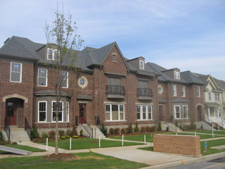
The photo below shows some of the new townhouses which are mixed in with new single family homes. In the ‘burbs such a mix is unheard of – the thinking is that to keep values up we need to separate each type of use from another. In a city the mix of residential styles is encouraged.
My main problem with the townhouses shown above is the builder’s selection of windows. They are white and they stand out like a sore thumb. For the doors at 2nd floor balconies have a nice dark taupe color and the front doors are stained. Combined with the dark brick the color palate is very pleasing and sophisticated – with the exception of those damn white windows. The white windows were chosen to save money and it shows. On a positive note, the builder selected appropriate window dividers – three vertical in the upper sash and no dividers in the lower sash. This is the most common type of window division found in St. Louis. The six over six divisions found in most new houses are completely inappropriate in the City of St. Louis.
Again, I’m really glad to see builders who normally only come into St. Louis for a ball game or annual HBA dinner actually building new homes within the city limits. However, I must point out details that in your typical suburban subdivision where everyone drives by just don’t seem to matter. But, you start building in a city where people actually walk on the sidewalks to get from point A to point B you must build to a higher standard.
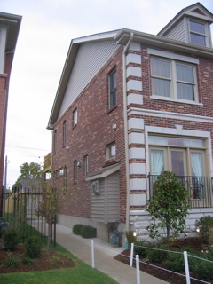
Above you will see the side of one of the new homes. On the positive we see windows & doors of the same color (and thankfully not white) as well as brick veneer continuing around the side. While I would have preferred to have seen the brick continue up the gable or perhaps something more interesting than the siding and lack of details I think it is a pretty good compromise. What jumps out to me is the vinyl-clad box containing the fireplace for the front room. This looks like a tumor that needs to be surgically removed. This may fly in St. Charles county but in a city with real architecture it just doesn’t work.
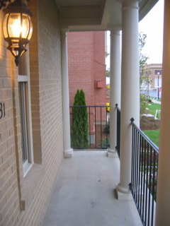
Below is a side-view picture of a front porch on a single family house. I didn’t bother taking the straight-on picture from the sidewalk because from that view it really looks nice. Urbanists, such as myself, think front porches are great social tools because they encourage interaction between the person on the porch and a stranger on the sidewalk. A front porch separates the public street from the private home.
But this builder gave this home a suburban rather than urban porch. This is a joke but nobody is laughing. If you are going to do a porch then do a porch – don’t give us half a porch.
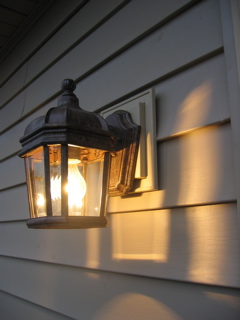
Details are very important but too often they are overlooked. The picture below is from a 2nd floor back deck. This detail probably exists on 99% of the new suburban houses in the region but by my taste it is an example of the lost art of craftsmanship.
The job of the vinyl plate behind the light fixture is to give the fixture a flat surface to mount against as well as to cover the edges of the electrical box. It does both of these jobs but fails to demonstrate proper proportion. Yes, I know, in the big scheme of things this really doesn’t matter. But, if you add up enough of the ‘doesn’t matter’ details and you’ve got a place that doesn’t matter.


