Home » Planning & Design » Recent Articles:

Ugly Addition Being Transformed Into New Entrance To Former Post-Dispatch Building, Square’s New St. Louis Offices

June 17, 2020 Downtown, Featured, Planning & Design Comments Off on Ugly Addition Being Transformed Into New Entrance To Former Post-Dispatch Building, Square’s New St. Louis Offices

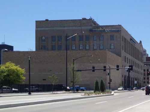
The work to modernize the former Post-Dispatch office building at 900 Tucker is well underway. Major alterations to a later addition at Tucker and Cole Street will be the biggest exterior change, as you’ll see below.
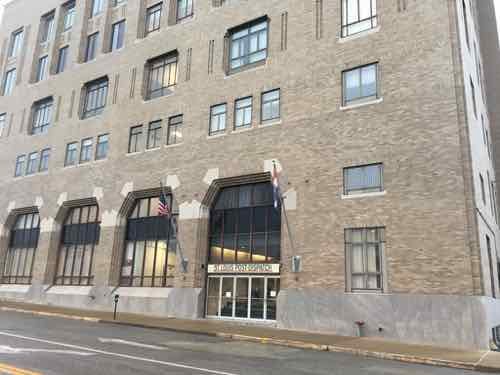
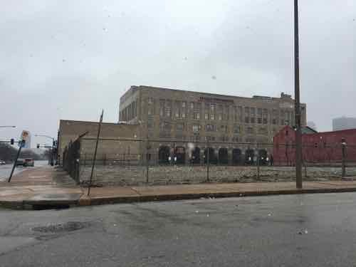
900 N Tucker, January 2019 photo
This January 2016 photo shows the Tucker side later windowless addition on the north end of the building.
This June 2012 photo shows the blank side along Cole Street.

More than five years ago the St. Louis Post-Dispatch announced it wanted to sell its building, to downsize.

Lee Enterprises, owner of the Post-Dispatch since 2005, announced Tuesday it is selling its building on 900 North Tucker Boulevard and searching for a new location.

The six-story building, completed in 1931, has been the newspaper’s headquarters since 1959, the year that the Post-Dispatch bought the property and printing equipment from the St. Louis Globe-Democrat, a now-defunct morning newspaper. (Post-Dispatch)

In August 2018 Jim McKelvey, via StarLake Holdings, was to buy the building, the Post-Dispatch was to remain as a tenant on the top two floors. The purchase closed in September 2018.

The Post-Dispatch decided to renovate and move to a vacant 1980s building a block to the east. StarLake Holdings became Starwood Group.  In July 2019 payment company Square announced it would relocate its St. Louis offices from the CORTEX area to 900 Tucker. Not really a surprise since McKelvey is a co-founder of Square, along with Twitter’s Jack Dorsey.
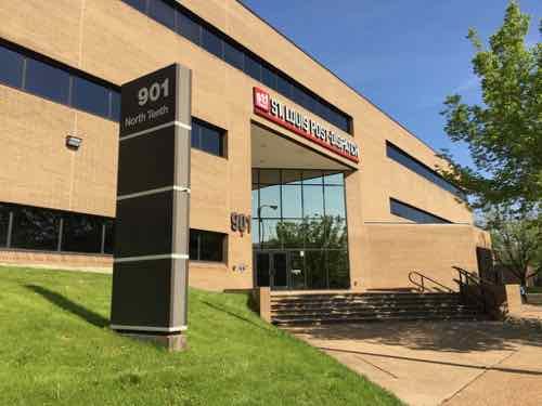
The Post-Dispatch’s 7th home, 901 N. 10th Street.

Once the Post-Dispatch moved into their newly renovated building a block away, work began on the old building.  Inside at first, but then to the addition.
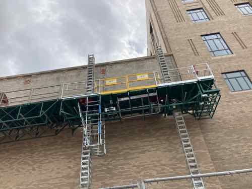
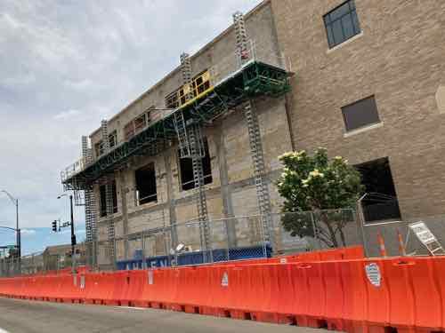
On May 16th I was driving home and noticed the buff veneer brick was being removed from the concrete block addition.
By May 30th the veneer brick had been removed from the entire west facade and window openings were being created in the block structure.
And window openings also on the north side, also on May 30th
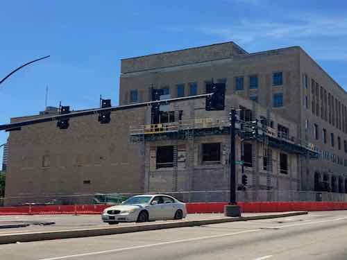
By June 3rd ground floor window openings had been created on both the Tucker & Cole facades. This view shows windows once existed on the Cole side, later bricked up.

I was very happy to see this windowless addition being opened up, but how would it be utilized? On June 7th I got my answer, turns out the main entry will move from Tucker at MLK to Cole Street.

The new lobby will not open to Tucker Boulevard on the west, but to Cole Street on the north. That is philosophical. McKelvey wanted the lobby to face Cole to recognize the untapped potential of the largely African American population on the north side. (Post-Dispatch)

That last line sounds like BS to me, a marketing explanation for what physically made sense with the structure — they wanted to keep the old lobby intact but not as a lobby, so they needed a new lobby. The north addition was their only option.
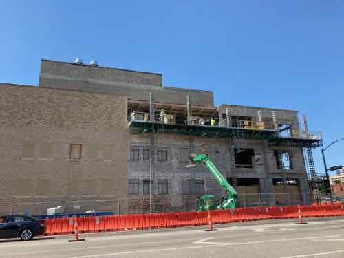
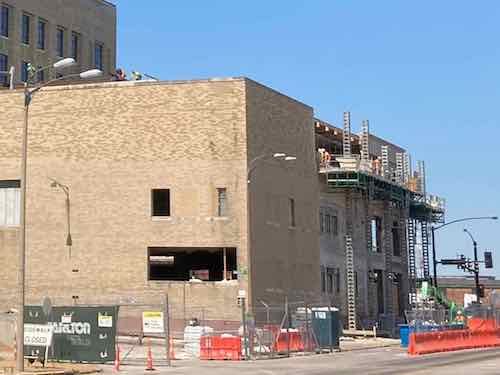
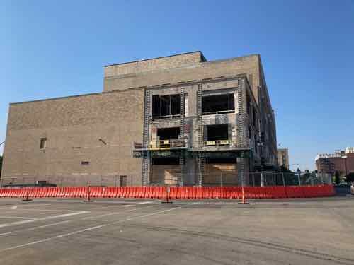
The morning of June 16th the work on the Cole facade continued. This time the block is being removed entirely. This suggests a different treatment for this section, all glass with the entrance at the sidewalk level is my guess
The view shows the east & north sides.

Given the historic nature of the 1931 original there was no room for anything creative on the exterior. This addition, however, is the perfect place to be creative.  I’m enjoying seeing it evolve.

In December 2011 I posted about how Tucker will become  Downtown’s New Entrance once the new bridge opened, this is the case for many. This new entrance will pop once completed, getting lots of eyes from drivers on Tucker.

In August 2012 I posted about filling in three blocks along Tucker — building new infill to enhance the urban feel of Tucker. Here’s a crude graphic I made at the time.
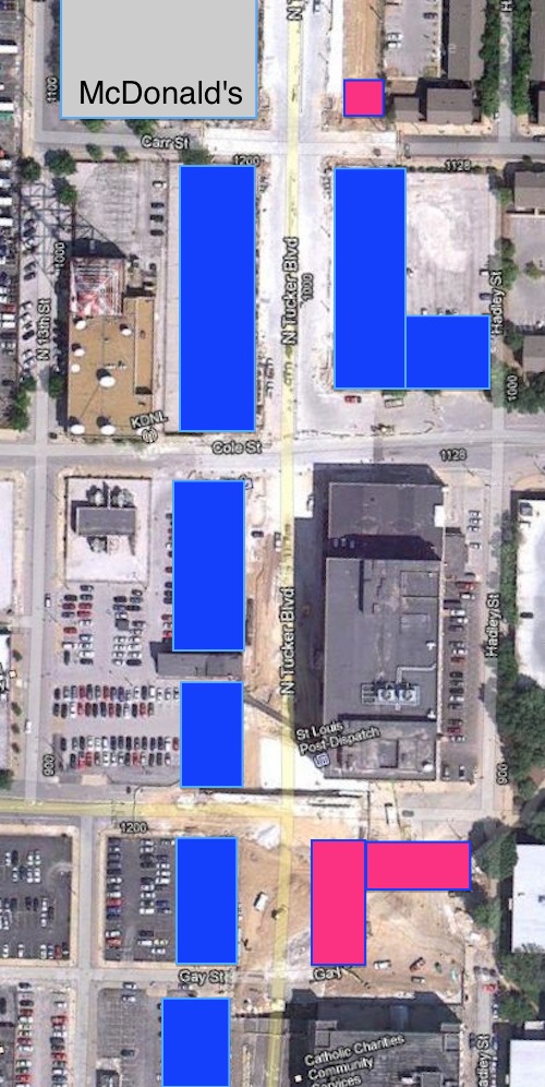
Aerial of a few blocks of north Tucker showing locations where infill buildings can easily be constructed (blue) and additional spots where they should be considered (red)

Hopefully we’ll see some infill on some of the parking lots, at least on the 3 other corners of Tucker & Cole. In a future post I want to talk about their proposed “innovation district” concept.

— Steve Patterson
 

Demolition of St. Louis Centre Bridge Over Washington Ave Began A Decade Ago

May 21, 2020 Downtown, Featured, History/Preservation, Planning & Design, Walkability Comments Off on Demolition of St. Louis Centre Bridge Over Washington Ave Began A Decade Ago

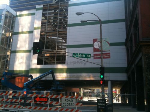
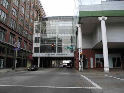
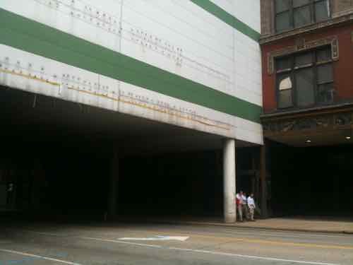
Ten years ago today work began on reversing a mistake that had been in place for 25 years prior — the pedestrian bridge over Washington Ave created a dark environment at the sidewalk level.

Taken two days before the bridge bash you can see how dark it was underneath

The “Bridge Bash” event started with comments from numerous white men, followed by Mayor Slay operating the wrecking ball, pyrotechnics made breaking glass a little more exciting.  Here’s the video I uploaded from the scene — the action starts at 8:45.

St. Louis Centre was part of the ‘bring the suburbs to the city’ movement. The inwardly focused mall was a killer to the sidewalks downtown — especially under the Washington & Locust wide bridges connecting to Dillard’s & Famous-Barr, respectively.

Looking west from 6th Street on May 22, 2010
Looking west from 6th Street May 2010
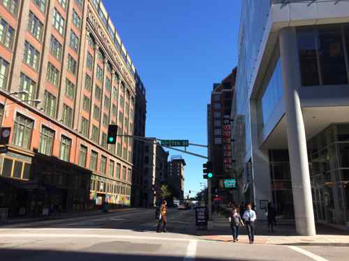
Looking east along Washington Ave from 7th, February 2006
Same view yesterday
Same view after the bridge was removed

Removal of this oppressive bridge and facing the ground level retail of the MX (formerly St. Louis Centre) has done wonders for this part of downtown. If only we hadn’t wasted decades trying to be like the burbs.

— Steve Patterson


Eads Bridge Pedestrian Path Finally Accessible Again After 4+ Years Inaccessible

May 14, 2020 Accessibility, Featured, Planning & Design, Walkability Comments Off on Eads Bridge Pedestrian Path Finally Accessible Again After 4+ Years Inaccessible

The renovation of the Arch grounds a few years back greatly improved accessibility for the public. Going from the top of the steps down to the riverfront used to be a major challenge if you were pushing a stroller, or using a wheelchair. New ramps now make it very easy.

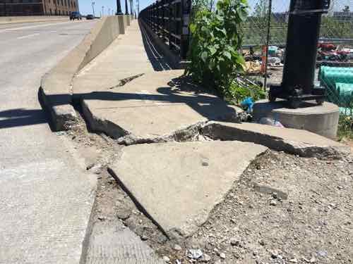
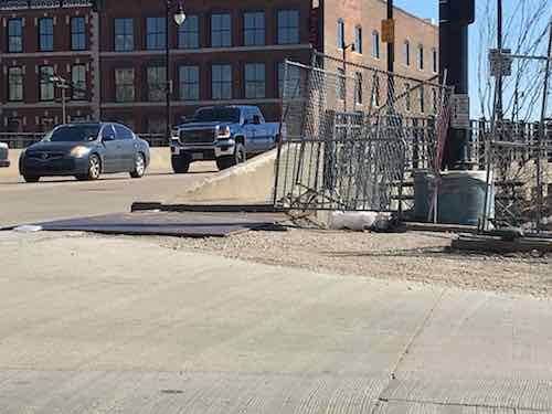
But the project accidentally cut off access to the pedestrian walkway on the Eads Bridge, as early as May 2015. This month it was finally rectified, though the solution created another problem.

Looking west heading into St. Louis from the Eads Bridge. May 13, 2020

Let’s do a quick recap of the problem caused when a contractor busted through into the light rail tunnel below.

The earliest I can find the issue on Google Street View is from May 2015, how much earlier it began is uncertain.

May 7, 2017 is my oldest photo of the problem. This is when I began conversations with various officials about being able to access the pedestrian walkway in my wheelchair.
By March 16, 2019 the broken concrete had been removed but the height from steel plate to bridge sidewalk was too much for 99.9% of wheelchairs.

In January of this year I posted about the problem, see Eads Bridge Remains Inaccessible Years After Arch Project “Completed”. I was told a fix was in the works, but I’d been hearing excuses since 2017.

A week ago a friend sent a pic to me showing work happening. Yay, finally! Yesterday I went by to see the result, approaching from the North.

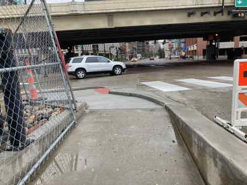
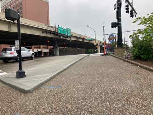
Approaching from Laclede’s Landing. I’m happy to see a smooth transition to the bridge, but the width of the crosswalk markings have no relationship to the width of the ramps on either end. 

I’m happy to report the accessibility is better than it ever was. The slopes, cross-slopes, ramps, etc. are all improved. I was very relived to be able to access the bridge. I then went to head West toward downtown.

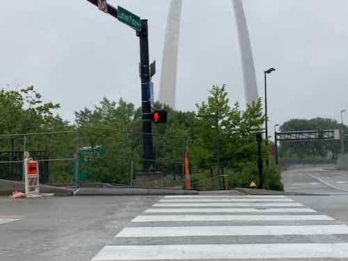
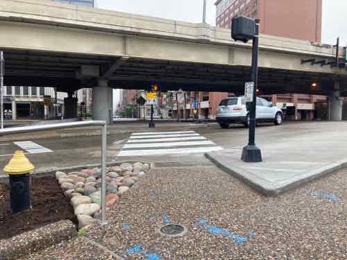
Approaching the corner from the Arch grounds. At left is the point to cross the street to head into downtown proper.
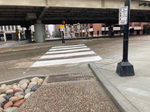
Here’s a more direct view. Like before, the crosswalk is much wider than the ramp, but that’s not the main problem.
The stupid “beg button” for a walk signal is set back too far from the curb — only by leaning and stretching could I reach it.

Walkable areas shouldn’t have buttons to get a walk signal — they should always come up in the cycle. But if you’re going to make us press these damn buttons at least place them where they can be reached! I can see bottlenecks here post-covid with lots of tourists coming and going.

— Steve Patterson


Aloe Plaza Nudes Unveiled Eight Decades Ago, MLS Coming

May 11, 2020 Downtown, Featured, Parks, Planning & Design Comments Off on Aloe Plaza Nudes Unveiled Eight Decades Ago, MLS Coming

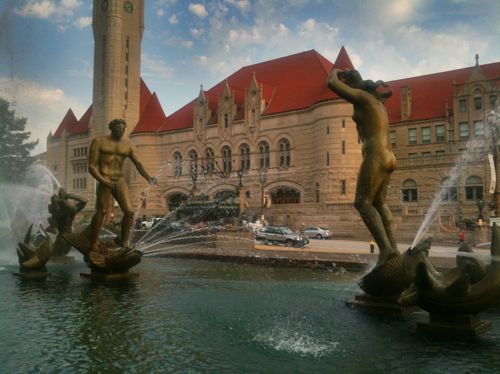
Eighty years ago today the nude sculptures in the Aloe Plaza fountain across Market Street from St. Louis Union Station were formally unveiled. The other figures in the fountain were unveiled the previous night.

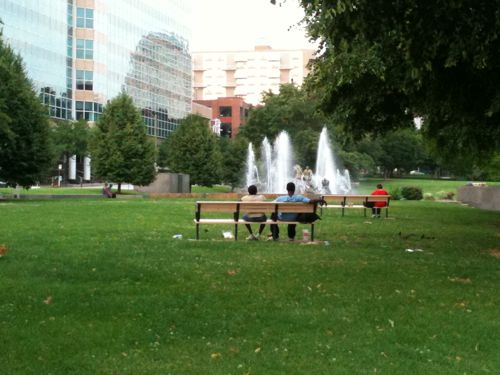
Carl Milles’ ‘Meeting of the Waters’ is the focal point of Aloe Plaza

Artist Carl Milles attended,  Edith Aloe (1875-1956) did the unveiling.

Edith Aloe, 64, was the widow of the man who two decades earlier pushed to raze buildings across from St. Louis Union Station — former president of the Board of Aldermen Louis P. Aloe (1867-1929). Mrs. Aloe was instrumental in Milles being selected to create the fountain.

Since then the plaza has largely remained unchanged. A wheelchair ramp was added years age to access the plaza from Market Street and a decade ago awful spot lights were installed. Why awful? The resulting light from overhead is so bright it overpowers the lighting within the fountain — prison yards likely have similar lighting schemes. Incredibly uninviting.

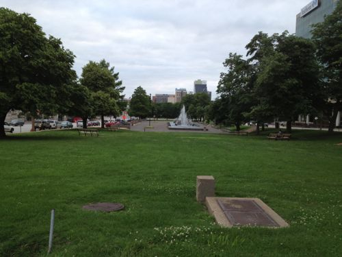
Aloe Plaza across from Union Station cleared away “undesirable” buildings, followed by decades more demolition creating the largely failed Gateway Mall

The view above is looking West from 18th Street in June 2013. Right now the new Major League Soccer (MLS) stadium is being built on the West side of 20th Street.

Looking West from Aloe Plaza as crews remove the old highway interchange and begin work on the stadium. April 24, 2020

The stadium will give the Gateway Mall a proper terminus, but will Aloe Plaza remain unused, unchanged?

We should begin thinking & talking about a major renovation of the 2-block long plaza. The fountain & sculpture are sacred, in my view. Everything else is negotiable.

Why?

Union Station has made major investments in replacing the failed train shed mall, uh, festival marketplace with an indoor aquarium & outdoor Farris wheel. The MLS stadium is an even bigger investment. Both will draw huge crowds. Aloe Plaza is located between them.

Aloe Plaza was designed as a tranquil passive space in a growing city of 800k plus. 2011 photo

The first question is if the space should remain passive or if it needs activity areas?

Obviously I think it needs a redesign with opportunities for programmed activity.  But what activities? Would programming & activities compliment or distract from the fountain?

Too bad the Gateway Mall Advisory Board was disbanded.

— Steve Patterson

SOURCE: May 11, 1940 (page 3 of 16). (1940, May 11). St.Louis Post-Dispatch (1923-2003) Retrieved from link.

PS: The 1940 census shows 64-year old widow Edith Aloe living in the Park Royal Apartments, 4605 Lindell Blvd. — apartment 414. Her rent was $125/month. Her 24-year old single maid Evelyn Iffrig also lived there. Evelyn married in 1946, so Edith would’ve needed a new maid. Evelyn died in 1995, her husband lived until 2006.


Urban Design After COVID-19: Restaurants & Carryout Windows

May 1, 2020 Featured, Planning & Design, Retail Comments Off on Urban Design After COVID-19: Restaurants & Carryout Windows

The current Coronavirus pandemic will change many things about our lives going forward, others not so much. Restaurants will likely see some of the biggest changes — both inside and out.

Restaurant owners/managers will have a standard table layout (packed) and a reduced capacity layout. Dividers, fake plants, etc might be pulled out of storage to use to keep the dining room from looking to sparse. Extra tables & chairs will go into the storage room, stacking/folding chairs saves space.

Hand washing at the entrance would be nice.

The biggest change may be placing a small kitchen up front, so a carryout window can be easily managed. For a few years now some restaurants have already operated with two kitchens: one for the dining room and another for carryout & delivery orders. This was a response to more and more customers taking food home to binge watch shows.

Placing the carry out/delivery kitchen in the right place would eliminate the need for customers to come inside. There could be a separate order window. Think if it like a brick & mortar food truck.

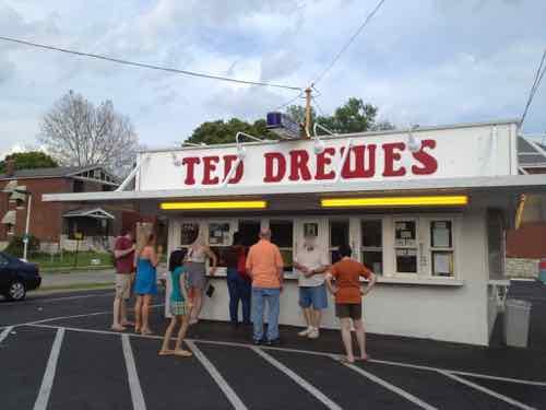
Ted Drewes has been serving frozen custard through a walk-up window for decades. Grand location in May 2013.

The walk-up window restaurant would have online ordering to reduce lines. Those located in walkable neighborhoods will need larger public sidewalks to allow for adequate space for customers and passing pedestrians. I love the idea of going from window to window getting different street foods. Pizza by-the-slice is a favorite.

None of this will happen quickly, but expect newly built/renovated restaurants to be physically different in response.

— Steve Patterson


Advertisement


[custom-facebook-feed]

Archives

Categories

Advertisement


Subscribe